Using icons for buttons is a very common scenario in Power Apps and Microsoft has provided the Icon control to accomplish just that. But… there are only 106 across 4 categories which isn’t a whole lot when it comes to icons. So if you are making anything of any complexity you’ve likely already run out. Fortunately, that’s
Easiest Solution
Just use their stupid icons
Custom Icons
But what if you don’t want to use one of the very few icons they’ve provided? What if you found Flicon and would like your app to match the rest of Office 365 and use the Fluent / UI Fabric icons? Or perhaps Font Awesome or the Noun Project or something your kid drew?
Fortunately, there are still options! There is a pretty easy option laid out in the OKish Solution below and then a PITA Solution that works but there are several steps involved. I’ve included both, but I definitely think the PITA Solution is the way to go until Microsoft figures out something better.
OK-ish Solution
Use images but be satisfied with Border or Fill effects
PITA Solution That Works
What if you want more than just a changing background or border? You know, like how the icons themselves work in Power Apps? For this, we’ll need a custom icon as an SVG. These steps could be adapted to work with a PNG image, but SVG is very common among icon sets and provides a better result overall.
1. Get an SVG Icon
First step, get your icon! Font Awesome and the Noun Project both provide all of their icons in SVG format. However, I recommend using the Fluent Icons provided by Microsoft since that’s what’s being used everywhere else. For that, let’s head over to Flicon.io.
If you haven’t used Flicon.io before, just search for an icon you want to use or browse with the categories. Once you’ve got an icon in mind, hover over it and switch to the Export tab. You can mess around with colors if you’d like, but it isn’t really necessary for what we’re doing. Just click Save as SVG:

2. Edit that Icon
We need to edit the SVG file before it’s ready to be used. There are plenty of tools out there to do that, but I use a free, open-source tool called Inkscape. You can download it directly from the site or just install it from the Microsoft Store.
Open your icon in Inkscape. One thing you’ll notice is that most of the icons are square, but the image isn’t always centered. Don’t worry, we’ll account for that to ensure our icon is a centered square.
In Power Apps we can use an SVG as the Image for an Image control. The Image control has HoverFill as we showed above. We’re going to take advantage of that and create an inverse of our icon. This means we’ll be creating an image that is the background and leaves the part of the icon we want displayed transparent. This allows us to set the “color” of the icon using the Fill and HoverFill properties!
3. Create a Box
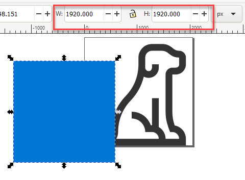
In Inkscape, draw a box (fill color doesn’t matter, but it shouldn’t have a stroke). The size doesn’t matter just yet. Grab the square tool and draw something. Don’t worry about making it perfectly square.

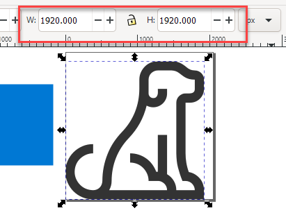
Click on your icon and look at the Width and Height displayed. Take note of the bigger of the two (mine happen to be the same):
Click on the square you just drew and put the value you just noted for both its width and height. Now you have a box sitting somewhere near your icon that is the same size as your icon’s largest dimension. If you want additional padding for your icon, add that to the box’s dimensions.
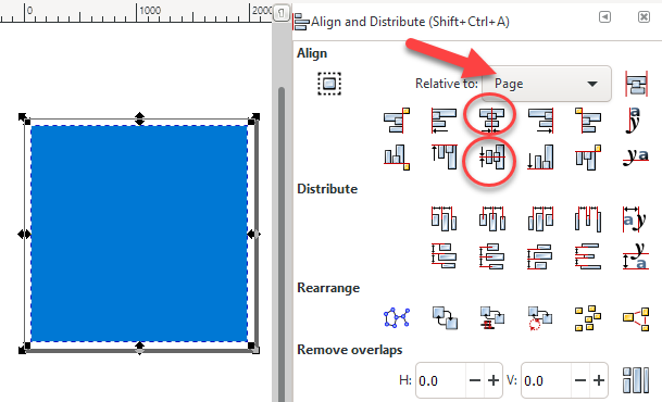
Now we’re going to line them up. Open the Align and Distribute panel (Object > Align and Distribute). Select both the box and your icon. Ensure the Relative to dropdown is set to Page then click the Center on Vertical Axis button followed by the Center on Horizontal Axis button. Your box should be totally covering your icon now.
4. Cut a Hole in a Box
With both the box and the icon selected (just select all if you clicked off of them), perform an exclusion (Path > Exclusion). You now have one object and it is the negative space around your icon (remember the color doesn’t matter).

You’ll notice we’ve got an extra space around the icon and the document size (seen as a black square above). This is because our icon wasn’t perfectly centered before. If your icon looks good, skip ahead. To fix it, however, go to Document Properties (File > Document Properties). In the Custom Size options group, expand the Resize page to content section and click Resize page to drawing or selection.

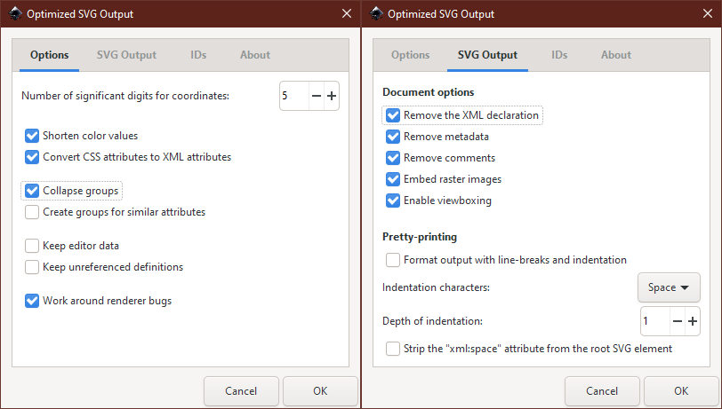
5. Optimize Your SVG
Let’s save our SVG. Although we can use the default format, there’s a lot of extra stuff added that we don’t need. So let’s Save as (File > Save As…) and change the type to Optimized SVG. In the dialog that pops up, here are the options I’ve chosen with the goal of reducing SVG complexity/length:
Let’s open up our SVG file using a text editor like Notepad. You should see some XML with a viewBox attribute and one or more paths. Let’s do a find for double quotes and replace them all with single quotes.
6. Use Your Icon in Power Apps
Although we can add an SVG file as media and use it that way, I like to have a little more control. So, let’s add an Image control to your App. In the Image property we’re going to replace SampleImage with some text. The first bit of text is just a string:
"data:image/svg+xml;utf8, "
This will let us use the SVG text directly. To do that we need to add the EncodeUrl function. So connect the text above with an & and enclose the SVG text (copied from notepad) in double quotes inside of the EncodeUrl function (don’t forget your closing double quote and parenthesis):
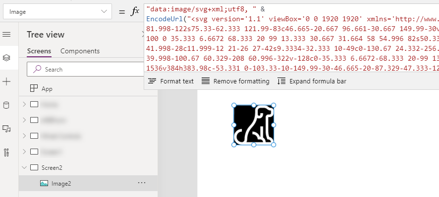
The icon is showing, wowee! Now we need to make that fill match the background (the black stuff shown above). So we can edit our SVG string to add fill='white' (or a HEX or RGBA value that matches your background which is white in my case).
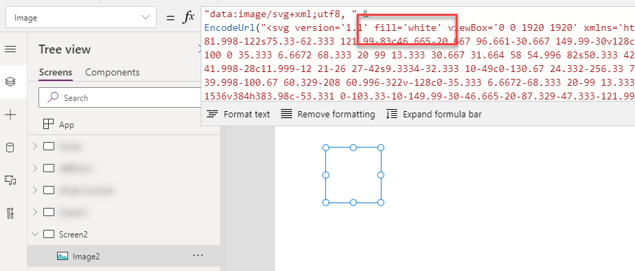
Where did that icon go?! It’s still there, it’s just being sneaky.
7. Add Some Color
Now for the magic! Set the Fill property for the Image control (shown as Color in the properties window for some reason) and your icon shows up! WOWEE!

Now set the HoverFill to some other color and hold Alt to see the magic.

Limitations
This is not a perfect solution and the fact that this is our best option is pretty frustrating. But… it gets the job done but with a few notable issues when compared to using the native icons:
- That’s an annoying amount of work for each icon
- No option to have the pointer cursor even when using it with an
OnSelectaction - Images sometimes get weird borders depending on the scaling
- You need to keep your image ratio the same to avoid the background leaking out (set the
WidthtoSelf.Heightand control just theHeight)
 The Chris Kent