Applies To: SharePoint 2010
Every list in SharePoint automatically comes with two date columns (Created & Modified). Often times other date columns get added in there and it can be nice to format these to make the lists more intuitive. Out of the box you can format these a few different ways (mostly whether to show the time or not). With a little XSL you can use the ddwrt:formatdatetime function to really customize things (you’ll see a couple of examples of this below) – but can’t we do more?
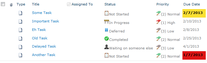
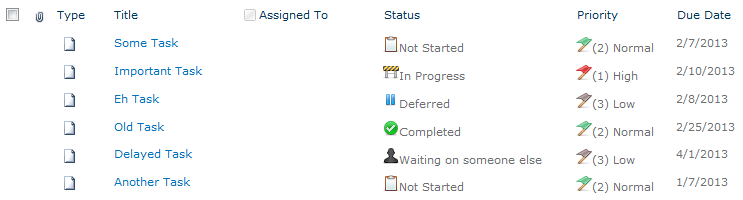
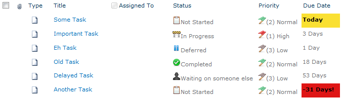
Large lists of data (whether they are numbers, statuses, dates, etc.) can be overwhelming. One of the greatest improvements we can make is to provide visual clues or analysis on this data to help end-users understand what they are looking at. When it comes to dates, what most people really want to know is what that date means relative to now. This is especially true when it comes to Due Dates such as seen in a Tasks list:

We’ve greatly improved the readability of this list with some quick icons as demonstrated in my previous post: Showing Icons in a List View, but those due dates don’t really mean much at quick glance. We can do a couple of things to make these instantly understandable. We can add some color to indicate when the due date is near and/or missed. Even more powerful is showing how much time is left until the Due Date.
Adding Some Color
Flagging these dates with some quick color is pretty straightforward using SharePoint Designer. Designer will be generating some XSL and we’ll take a look at it at the end of this section, but we’ll be using the wizards and so no knowledge of XSL will be needed.
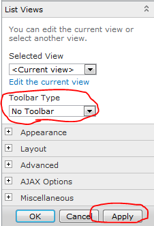
Open the site in SharePoint Designer (Site Actions > Edit in SharePoint Designer) and browse to the page/view you want to edit, or if this is a specific view just choose the Modify View dropdown and select Modify in SharePoint Designer (Advanced):
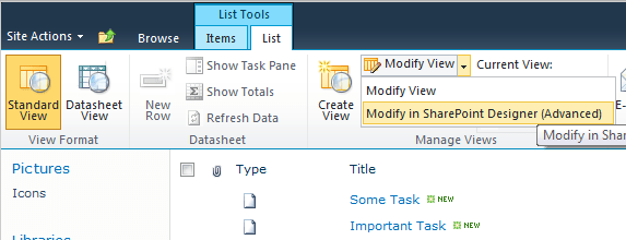
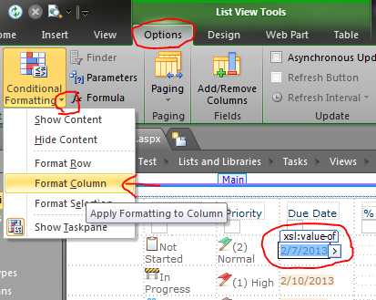
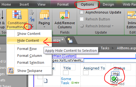
In Design view, click on one of the date values in the list and choose Format Column in the Conditional Formatting dropdown on the Options tab in the ribbon:

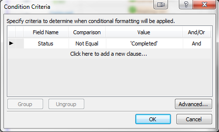
Our goal is to turn the cell red if the due date has passed; So in the Condition Criteria dialog set Field Name to Due Date, the Comparison to Less Than and the Value should remain the default of [Current Date]. Then press the Set Style button:
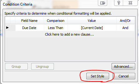
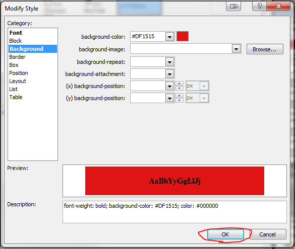
This formula reads: if the Due Date is older than (less) than now, set this style. We’re now setting up that style in the Modify Style dialog. In the Font category set the font-weight to bold (I’m also setting the color to Black since the default theme’s grayish font color doesn’t look great with a red background). Switch to the Background category and select a shade of red for the background-color and press OK:
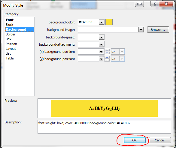
I also like to provide a little warning before things get past due; So let’s make things turn yellow on the Due Date. So again, click on one of the date values in the list and choose Format Column in the Conditional Formatting dropdown on the Options tab in the ribbon. In the Condition Criteria dialog set Field Name to Due Date, the Comparison to Equal and the Value should remain the default of [Current Date]. Then press the Set Style button:
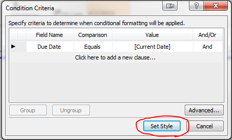
This formula reads: if the Due Date is today, set this style. We’re now setting up that style in the Modify Style dialog. In the Font category set the font-weight to bold (I’m also setting the color to Black since the default theme’s grayish font color doesn’t look great with the yellow background either). Switch to the Background category and select a shade of yellow for the background-color and press OK:
Save the view in Designer and refresh the view in the browser and you should see something similar to this (The date this screenshot was taken was 2/7/2013):
For those that are interested, here’s the XSL that designer generated:
<xsl:attribute name="style">
<xsl:if test="ddwrt:DateTimeTick(ddwrt:GenDisplayName(string($thisNode/@DueDate))) < ddwrt:DateTimeTick(ddwrt:GenDisplayName(string($Today)))"
ddwrt:cf_explicit="1">
font-weight: bold; background-color: #DF1515; color: #000000;
</xsl:if>
<xsl:if test="ddwrt:DateTimeTick(ddwrt:GenDisplayName(string($thisNode/@DueDate))) = ddwrt:DateTimeTick(ddwrt:GenDisplayName(string($Today)))"
ddwrt:cf_explicit="1">
font-weight: bold; color: #000000; background-color: #FAE032;
</xsl:if>
</xsl:attribute>
Relative Dates
With Due Dates there are 2 things you want to know: which ones have been missed and how much time is left. Quick color indicators are very effective in drawing the eye to important information and the red and yellow rules we put in place above help quickly answer the first question.
So how do we communicate how much time is left? Calculated columns are no help here (you can’t use Today and even when you hack it, they only get evaluated on modifications, NOT on view). The answer is some XSL tweaking. We won’t be using the same wizard-like interface as above, but I promise the type of XSL we’re going to be doing isn’t too scary.
The first thing we need to do is add some XSL templates to help us perform some basic date calculations. The easiest way is to use Andy Lewis’ DateTemplates. We’re going to pull out the needed templates and paste them directly into our XSL (since I’ve had a lot of trouble referencing external XSL when using Designer). Here’s the templates we want:
<xsl:template name="getDayDelta">
	<xsl:param name="paramDateA"/>
	<xsl:param name="paramDateB"/>
	<xsl:variable name="dateADays">
		<xsl:call-template name="countDaysInDateWithLeapYearDays">
			<xsl:with-param name="paramDate" select="$paramDateA"/>
		</xsl:call-template>
	</xsl:variable>
	<xsl:variable name="dateBDays">
		<xsl:call-template name="countDaysInDateWithLeapYearDays">
			<xsl:with-param name="paramDate" select="$paramDateB"/>
		</xsl:call-template>
	</xsl:variable>
	<xsl:value-of select="number($dateADays) - number($dateBDays)"/>
</xsl:template>

<xsl:template name="countDaysInDateWithLeapYearDays">
	<xsl:param name="paramDate"/>
	<xsl:variable name="year" select="substring-before($paramDate,'-')"/>
	<xsl:variable name="month" select="substring(substring-after($paramDate,'-'),1,2)"/>
	<xsl:variable name="day" select="substring(substring-after(substring-after($paramDate,'-'),'-'),1,2)"/>
	<xsl:variable name="rawYearDays" select="number($year) * 365"/>
	<xsl:variable name="rawLeapYears" select="floor($year div 4)"/>
	<xsl:variable name="centurySpan" select="floor($year div 100)"/>
	<xsl:variable name="fourCenturySpan" select="floor($year div 400)"/>
	<xsl:variable name="boolYearLeap">
		<xsl:call-template name="isLeapYear">
			<xsl:with-param name="paramYear" select="$year"/>
		</xsl:call-template>
	</xsl:variable>
	<xsl:variable name="yearLeapAdjust">
		<xsl:choose>
			<xsl:when test="$boolYearLeap = 1 and (($month = 1) or ($month = 2 and $day != 29))">-1</xsl:when>
			<xsl:otherwise>0</xsl:otherwise>
		</xsl:choose>
	</xsl:variable>
	<xsl:variable name="yearDays" select="$rawYearDays + $rawLeapYears - $centurySpan + $fourCenturySpan + $yearLeapAdjust "/>
	<xsl:variable name="monthDays">
		<xsl:call-template name="ConvertMonthToTotalDays">
			<xsl:with-param name="paramMonth" select="$month"/>
		</xsl:call-template>
	</xsl:variable>
	<xsl:variable name="totalDays" select="$yearDays + number($monthDays) + number($day)"/>
	<xsl:value-of select="$totalDays"/>
</xsl:template>

<xsl:template name="isLeapYear">
	<xsl:param name="paramYear"/>
	<xsl:choose>
		<xsl:when test="$paramYear mod 4 = 0 and ($paramYear mod 100 != 0) or ($paramYear mod 400 = 0)">1</xsl:when>
		<xsl:otherwise>0</xsl:otherwise>
	</xsl:choose>
</xsl:template>

<xsl:template name="ConvertMonthToTotalDays">
	<xsl:param name="paramMonth"/>
	<xsl:choose>
		<xsl:when test="$paramMonth=01">0</xsl:when>
		<xsl:when test="$paramMonth=02">31</xsl:when>
		<xsl:when test="$paramMonth=03">59</xsl:when>
		<xsl:when test="$paramMonth=04">90</xsl:when>
		<xsl:when test="$paramMonth=05">120</xsl:when>
		<xsl:when test="$paramMonth=06">151</xsl:when>
		<xsl:when test="$paramMonth=07">181</xsl:when>
		<xsl:when test="$paramMonth=08">212</xsl:when>
		<xsl:when test="$paramMonth=09">243</xsl:when>
		<xsl:when test="$paramMonth=10">273</xsl:when>
		<xsl:when test="$paramMonth=11">304</xsl:when>
		<xsl:when test="$paramMonth=12">334</xsl:when>
	</xsl:choose>
</xsl:template>
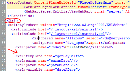
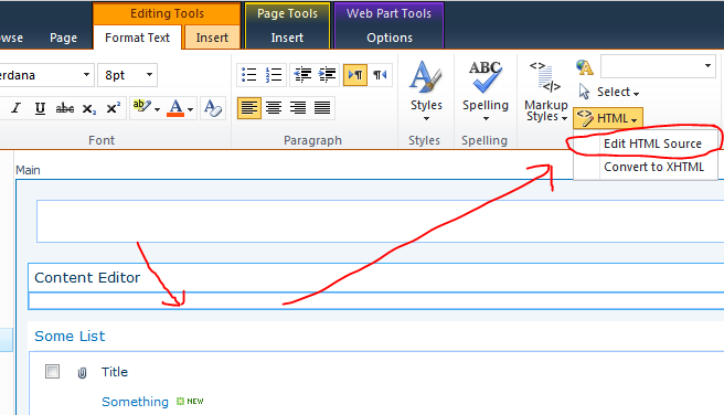
There are several templates above. We’re only going to call the getDayDelta function (it calls all the others). Copy the above XSL and in the Code view for your view of SharePoint Designer find the <Xsl> element. Skip a few lines down just past the last <xsl:param> element and paste the above. It should look something like this:

Just putting these templates in the XSL doesn’t actually do anything yet. So switch to the Split view and select one of the Due Date values. The corresponding XSL should be highlighted in the code section:
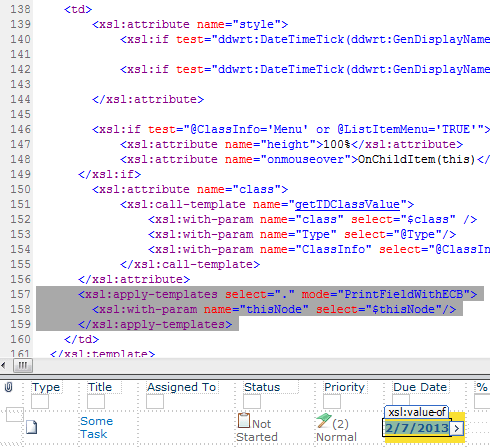
Replace the highlighted section from above with the following:
<xsl:variable name="DateDueDayDelta">
<xsl:call-template name="getDayDelta">
<xsl:with-param name="paramDateA" select="ddwrt:FormatDateTime(string($thisNode/@*[name()=current()/@Name]),1033,'yyyy-MM-dd')"/>
<xsl:with-param name="paramDateB" select="ddwrt:FormatDateTime(string(ddwrt:Today()),1033,'yyyy-MM-dd')"/>
</xsl:call-template>
</xsl:variable>
<xsl:choose>
<xsl:when test="$DateDueDayDelta=0">
<xsl:text>Today</xsl:text>
</xsl:when>
<xsl:when test="$DateDueDayDelta=1">
<xsl:text>1 Day</xsl:text>
</xsl:when>
<xsl:when test="$DateDueDayDelta=-1">
<xsl:text>Yesterday!</xsl:text>
</xsl:when>
<xsl:when test="$DateDueDayDelta<-1">
<xsl:value-of select="concat($DateDueDayDelta,' Days!')"/>
</xsl:when>
<xsl:when test="$DateDueDayDelta>1">
<xsl:value-of select="concat($DateDueDayDelta,' Days')"/>
</xsl:when>
</xsl:choose>
In lines 1-6 we’re calling the getDayDelta function from the DateTemplates and storing the value in a new variable called DateDueDayDelta. This value is the number of days between the first parameter, Due Date, and the second parameter, Today. We’re using the ddwrt:FormatDateTime function to ensure the parameters are in the form expected by the template. We’re also using the ddwrt:Today() function to get the current date.
Lines 8-24 is an XSL switch statement. We’re using it to give friendly text based on the number of days between. If the dates are the same, then we print “Today“. If the Due Date is still 1 day in the future, we print “1 Day“. If the Due Date is 1 day in the past (-1), we print “Yesterday!“. If the Due Date is even further in the past (< -1), we print “# Days!“. If the Due Date is more than a day away (> 1), we print “# Days“. This will probably make more sense if you just save the view and refresh it in the browser:

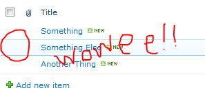
WOO HOO! That’s a huge improvement – but it could be better. Although I think it makes more sense to see the dates as relative for quickly glancing at the list, I don’t like losing that information altogether. So let’s put it back in as a tooltip.
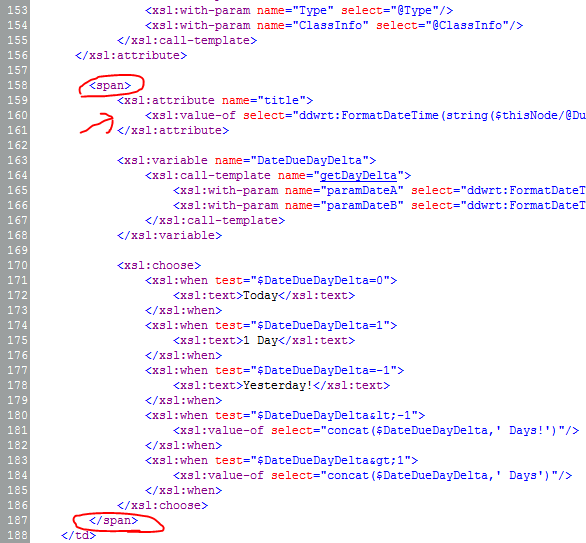
In the code view, right above where you pasted the <xsl:variable> element, paste the following:
<span>
	<xsl:attribute name="title">
		<xsl:value-of select="ddwrt:FormatDateTime(string($thisNode/@DueDate),1033,'dddd, M/d/yy ')"/>
	</xsl:attribute>
Then scroll down to the closing <xsl:choose> element and close the <span> tag. Altogether, things should look similar to this:
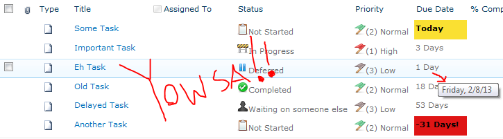
We just wrapped everything in a span so that we could set the title attribute (tooltip). We are again using the ddwrt:FormatDateTime function so that we can format the Due Date to show not just the date but the day of the week as well since this really helps people visualize the date when a calendar isn’t available. Save the view, refresh it in the browser and you should have something like this (The date this screenshot was taken was 2/7/2013):

You can quickly see how stacking these techniques can start to make lists much more intuitive and useful. WOWEE!


 The Chris Kent