Targeted JSLink for List View Web Parts

Introduction

Standard Client Side Rendering (CSR) is a powerful technology introduced in SharePoint 2013. Out Of The Box (OOTB) you can apply this technology to list view web parts through use of the JS Link property. Using this technique, developers can quickly and easily apply display logic through JavaScript.

Unfortunately, despite its continued support in SharePoint 2016 and Office365, CSR with list view web parts still suffers from a major flaw. When you have multiple web parts that display list items from lists that share a ListTemplateType and BaseViewID, OOTB CSR provides no way to correctly target your display logic (JSLink) to individual web parts.

How to Get the Code

The example code used in this document can be found in full as part of the csrShim repository:
https://github.com/thechriskent/csrShim/tree/master/Examples/Multiple%20List%20Views

The full project can be found on GitHub:
https://github.com/thechriskent/csrShim

You can download or clone the repository directly from that site. You can also view the code directly on the site.

The Problem

When a user adds 2 or more web parts displaying list items from a list that share a ListTemplateType and BaseViewID, standard CSR has no way of distinguishing between the web parts.

The result is that if only a single web part has a JS Link property specified, all matching web parts will be drawn with that logic (even ones intended to use the OOTB display!). If more than one web part has the JS Link property, then only the last one loaded will be applied.

This is especially problematic because custom lists all share a ListTemplateType of 100 and will present with a BaseViewID of 1. This issue often surprises developers that have developed their web part in isolation where they worked perfectly just to have them break entirely when placed on a page with other web parts.

A Demonstration

  1. We will add a web part using JSLink as configured in the List View Client Side Rendering (JSLink) Primer to have a web part using JS Link (The example code can be downloaded from the repository mentioned above):
    Single CSR
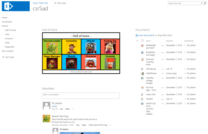
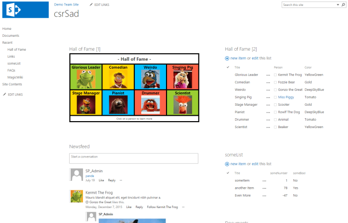
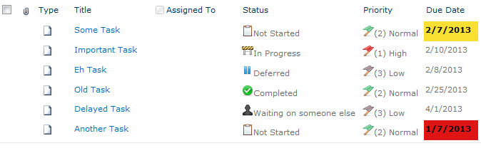
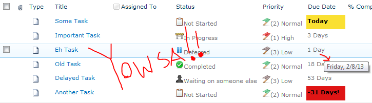
    This is a pretty standard team site page with a Site Feed, a Document Library, and a custom list with JSLink applied using standard CSR (Hall of Fame)
  2. Now if we add another Custom List web part (just an OOTB view):
    Broken CSR
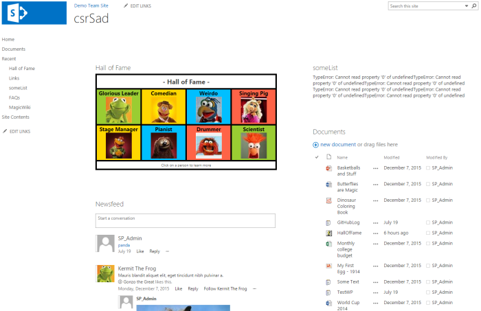
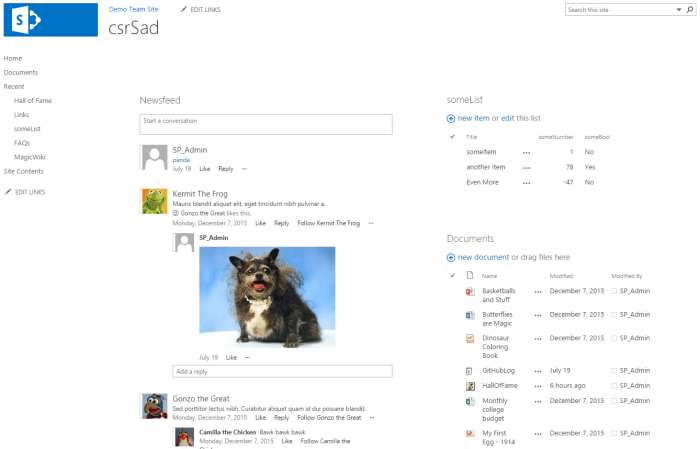
    Immediately we see the someList web part is full of errors (these are JS errors from missing fields where the CSR attempted to apply the JSLink file)
  3. Removing the Hall Of Fame web part from the page fixes the someList web part:
    No CSR Fixed

There are many solutions for this to be found online. Most of these solutions are hacky workarounds at best, at worst they create fragile code and dependencies on management code outside of the web parts themselves.

It is often suggested to “override” the standard CSR template registration function and then create your own system to route CSR requests by dynamically changing the BaseViewID of the ContextInfo (ctx) objects. This technique requires you to have knowledge ahead of time of all possible web parts on the page or to have some additional way to uniquely identify/register your parts. The override is just taking advantage of JavaScript’s ability to alter objects you don’t own and introduces serious risk to your solutions (upgrades, users adding unknown web parts, and more).

The Solution

Fortunately, there is a solution that addresses many of the risks laid out above. The best part is that it can be independently implemented for individual web parts. These web parts never need to know or care about other web parts on the page (no management system required).

The solution is to use csrShim with your list view web parts. csrShim was originally developed to bring CSR capabilities to web parts without JS Link properties (Content by Query Web Parts and XMLViewer), but it can easily be applied to XSLTListView web parts. When doing so, you can specify a BaseViewID that is not tied to the original value allowing you to target web parts very specifically to CSR templates!

In addition, using csrShim this way allows you to add as many web parts to the page with the same underlying ListTemplateTypes and BaseViewIDs as needed and each can direct which CSR (JSLink) should be used for themselves. This technique can even be used alongside the standard CSR JS Link usage without causing issues for those parts or themselves.

A Demonstration

  1. Going back to our csrSad page from above, let’s add the Hall Of Fame web part back to the page but this time we’ll skip specifying the JS Link property:
    No JSLink
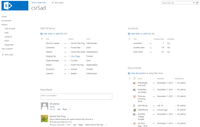
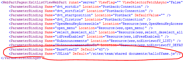
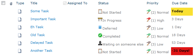
    When the JS Link property is not used, the OOTB views of custom lists can live side by side on a single page. But that’s not very exciting!
  2. Instead of specifying the JS Link property, we will specify the csrShim Parameters of BaseViewID and JSLink:
    Parameters
  3. Now when we refresh the page:
    WorkingWow
    Voila, someList web part is just fine! (If you don’t have any profile pictures showing up be sure you used the halloffame.js for this example)
  4. We can even add additional views of the Hall of Fame list:
    Multiple Hall Of Fame
    We could apply CSR to this web part without issue as well by simply specifying a different BaseViewID (assuming we wanted it to render differently).

Benefits

  • A single property is all that’s required to distinguish web parts (BaseViewID)
    • This property is exported with the web part so that it can be added to the web part gallery and safely added to any unknown page without causing conflict
  • Utilizes OOTB XSL system
  • Utilizes OOTB Rendering system

Drawbacks

  • Some properties must be accessed differently
    • An example can be seen with how the user id was pulled to generate the link for the hall of fame. Standard CSR provides an array of user objects with individual properties. csrShim provides multiple strings for those values. Using the ctx.csrShim boolean property, you can easily create a JSLink file that can handle either:
var sip, userId;
if(ctx.csrShim){
    sip = ctx.CurrentItem["Person.sip"];
    userId = ctx.CurrentItem["Person.id"];
} else {
    sip = ctx.CurrentItem.Person[0].sip;
    userId = ctx.CurrentItem.Person[0].id
}
  • Reliance on another component (csrShim)
    • To solve this problem, you would have to introduce something, likely something requiring more overhead and support issues
  • csrShim only returns a subset of properties that standard CSR returns (all list values are returned) but nearly every property used in rendering is included

Dates With Relative Countdowns and Pretty Colors in List Views

Applies To: SharePoint 2010

Every list in SharePoint automatically comes with two date columns (Created & Modified). Often times other date columns get added in there and it can be nice to format these to make the lists more intuitive. Out of the box you can format these a few different ways (mostly whether to show the time or not). With a little XSL you can use the ddwrt:formatdatetime function to really customize things (you’ll see a couple of examples of this below) – but can’t we do more?

Large lists of data (whether they are numbers, statuses, dates, etc.) can be overwhelming. One of the greatest improvements we can make is to provide visual clues or analysis on this data to help end-users understand what they are looking at. When it comes to dates, what most people really want to know is what that date means relative to now. This is especially true when it comes to Due Dates such as seen in a Tasks list:

TaskList

We’ve greatly improved the readability of this list with some quick icons as demonstrated in my previous post: Showing Icons in a List View, but those due dates don’t really mean much at quick glance. We can do a couple of things to make these instantly understandable. We can add some color to indicate when the due date is near and/or missed. Even more powerful is showing how much time is left until the Due Date.

Adding Some Color

Flagging these dates with some quick color is pretty straightforward using SharePoint Designer. Designer will be generating some XSL and we’ll take a look at it at the end of this section, but we’ll be using the wizards and so no knowledge of XSL will be needed.

Open the site in SharePoint Designer (Site Actions > Edit in SharePoint Designer) and browse to the page/view you want to edit, or if this is a specific view just choose the Modify View dropdown and select Modify in SharePoint Designer (Advanced):

ModifyView

In Design view, click on one of the date values in the list and choose Format Column in the Conditional Formatting dropdown on the Options tab in the ribbon:

FormatDate

Our goal is to turn the cell red if the due date has passed; So in the Condition Criteria dialog set Field Name to Due Date, the Comparison to Less Than and the Value should remain the default of [Current Date]. Then press the Set Style button:

ConditionCriteriaPastDue

This formula reads: if the Due Date is older than (less) than now, set this style. We’re now setting up that style in the Modify Style dialog. In the Font category set the font-weight to bold (I’m also setting the color to Black since the default theme’s grayish font color doesn’t look great with a red background). Switch to the Background category and select a shade of red for the background-color and press OK:

PastDueStyle

I also like to provide a little warning before things get past due; So let’s make things turn yellow on the Due Date. So again, click on one of the date values in the list and choose Format Column in the Conditional Formatting dropdown on the Options tab in the ribbon. In the Condition Criteria dialog set Field Name to Due Date, the Comparison to Equal and the Value should remain the default of [Current Date]. Then press the Set Style button:

ConditionCriteriaWarning

This formula reads: if the Due Date is today, set this style. We’re now setting up that style in the Modify Style dialog. In the Font category set the font-weight to bold (I’m also setting the color to Black since the default theme’s grayish font color doesn’t look great with the yellow background either). Switch to the Background category and select a shade of yellow for the background-color and press OK:

WarningStyle

Save the view in Designer and refresh the view in the browser and you should see something similar to this (The date this screenshot was taken was 2/7/2013):

TaskListWithColors

For those that are interested, here’s the XSL that designer generated:

<xsl:attribute name="style">
	<xsl:if test="ddwrt:DateTimeTick(ddwrt:GenDisplayName(string($thisNode/@DueDate))) &lt; ddwrt:DateTimeTick(ddwrt:GenDisplayName(string($Today)))"
	 ddwrt:cf_explicit="1">
		font-weight: bold; background-color: #DF1515; color: #000000;
	</xsl:if>
	<xsl:if test="ddwrt:DateTimeTick(ddwrt:GenDisplayName(string($thisNode/@DueDate))) = ddwrt:DateTimeTick(ddwrt:GenDisplayName(string($Today)))"
	 ddwrt:cf_explicit="1">
		font-weight: bold; color: #000000; background-color: #FAE032;
	</xsl:if>
</xsl:attribute>

Relative Dates

With Due Dates there are 2 things you want to know: which ones have been missed and how much time is left. Quick color indicators are very effective in drawing the eye to important information and the red and yellow rules we put in place above help quickly answer the first question.

So how do we communicate how much time is left? Calculated columns are no help here (you can’t use Today and even when you hack it, they only get evaluated on modifications, NOT on view). The answer is some XSL tweaking. We won’t be using the same wizard-like interface as above, but I promise the type of XSL we’re going to be doing isn’t too scary.

The first thing we need to do is add some XSL templates to help us perform some basic date calculations. The easiest way is to use Andy Lewis’ DateTemplates. We’re going to pull out the needed templates and paste them directly into our XSL (since I’ve had a lot of trouble referencing external XSL when using Designer). Here’s the templates we want:

<xsl:template name="getDayDelta">
	<xsl:param name="paramDateA"/>
	<xsl:param name="paramDateB"/>
	<xsl:variable name="dateADays">
		<xsl:call-template name="countDaysInDateWithLeapYearDays">
			<xsl:with-param name="paramDate" select="$paramDateA"/>
		</xsl:call-template>
	</xsl:variable>
	<xsl:variable name="dateBDays">
		<xsl:call-template name="countDaysInDateWithLeapYearDays">
			<xsl:with-param name="paramDate" select="$paramDateB"/>
		</xsl:call-template>
	</xsl:variable>
	<xsl:value-of select="number($dateADays) - number($dateBDays)"/>
</xsl:template>

<xsl:template name="countDaysInDateWithLeapYearDays">
	<xsl:param name="paramDate"/>
	<xsl:variable name="year" select="substring-before($paramDate,'-')"/>
	<xsl:variable name="month" select="substring(substring-after($paramDate,'-'),1,2)"/>
	<xsl:variable name="day" select="substring(substring-after(substring-after($paramDate,'-'),'-'),1,2)"/>
	<xsl:variable name="rawYearDays" select="number($year) * 365"/>
	<xsl:variable name="rawLeapYears" select="floor($year div 4)"/>
	<xsl:variable name="centurySpan" select="floor($year div 100)"/>
	<xsl:variable name="fourCenturySpan" select="floor($year div 400)"/>
	<xsl:variable name="boolYearLeap">
		<xsl:call-template name="isLeapYear">
			<xsl:with-param name="paramYear" select="$year"/>
		</xsl:call-template>
	</xsl:variable>
	<xsl:variable name="yearLeapAdjust">
		<xsl:choose>
			<xsl:when test="$boolYearLeap = 1 and (($month = 1) or ($month = 2 and $day != 29))">-1</xsl:when>
			<xsl:otherwise>0</xsl:otherwise>
		</xsl:choose>
	</xsl:variable>
	<xsl:variable name="yearDays" select="$rawYearDays + $rawLeapYears - $centurySpan + $fourCenturySpan + $yearLeapAdjust "/>
	<xsl:variable name="monthDays">
		<xsl:call-template name="ConvertMonthToTotalDays">
			<xsl:with-param name="paramMonth" select="$month"/>
		</xsl:call-template>
	</xsl:variable>
	<xsl:variable name="totalDays" select="$yearDays + number($monthDays) + number($day)"/>
	<xsl:value-of select="$totalDays"/>
</xsl:template>

<xsl:template name="isLeapYear">
	<xsl:param name="paramYear"/>
	<xsl:choose>
		<xsl:when test="$paramYear mod 4 = 0 and ($paramYear mod 100 != 0) or ($paramYear mod 400 = 0)">1</xsl:when>
		<xsl:otherwise>0</xsl:otherwise>
	</xsl:choose>
</xsl:template>

<xsl:template name="ConvertMonthToTotalDays">
	<xsl:param name="paramMonth"/>
	<xsl:choose>
		<xsl:when test="$paramMonth=01">0</xsl:when>
		<xsl:when test="$paramMonth=02">31</xsl:when>
		<xsl:when test="$paramMonth=03">59</xsl:when>
		<xsl:when test="$paramMonth=04">90</xsl:when>
		<xsl:when test="$paramMonth=05">120</xsl:when>
		<xsl:when test="$paramMonth=06">151</xsl:when>
		<xsl:when test="$paramMonth=07">181</xsl:when>
		<xsl:when test="$paramMonth=08">212</xsl:when>
		<xsl:when test="$paramMonth=09">243</xsl:when>
		<xsl:when test="$paramMonth=10">273</xsl:when>
		<xsl:when test="$paramMonth=11">304</xsl:when>
		<xsl:when test="$paramMonth=12">334</xsl:when>
	</xsl:choose>
</xsl:template>

There are several templates above. We’re only going to call the getDayDelta function (it calls all the others). Copy the above XSL and in the Code view for your view of SharePoint Designer find the <Xsl> element. Skip a few lines down just past the last <xsl:param> element and paste the above. It should look something like this:

DateTemplates

Just putting these templates in the XSL doesn’t actually do anything yet. So switch to the Split view and select one of the Due Date values. The corresponding XSL should be highlighted in the code section:

DueDateOriginalXSL

Replace the highlighted section from above with the following:

<xsl:variable name="DateDueDayDelta">
	<xsl:call-template name="getDayDelta">
		<xsl:with-param name="paramDateA" select="ddwrt:FormatDateTime(string($thisNode/@*[name()=current()/@Name]),1033,'yyyy-MM-dd')"/>
		<xsl:with-param name="paramDateB" select="ddwrt:FormatDateTime(string(ddwrt:Today()),1033,'yyyy-MM-dd')"/>
	</xsl:call-template>
</xsl:variable>

<xsl:choose>
	<xsl:when test="$DateDueDayDelta=0">
		<xsl:text>Today</xsl:text>
	</xsl:when>
	<xsl:when test="$DateDueDayDelta=1">
		<xsl:text>1 Day</xsl:text>
	</xsl:when>
	<xsl:when test="$DateDueDayDelta=-1">
		<xsl:text>Yesterday!</xsl:text>
	</xsl:when>
	<xsl:when test="$DateDueDayDelta&lt;-1">
		<xsl:value-of select="concat($DateDueDayDelta,' Days!')"/>
	</xsl:when>
	<xsl:when test="$DateDueDayDelta&gt;1">
		<xsl:value-of select="concat($DateDueDayDelta,' Days')"/>
	</xsl:when>
</xsl:choose>

In lines 1-6 we’re calling the getDayDelta function from the DateTemplates and storing the value in a new variable called DateDueDayDelta. This value is the number of days between the first parameter, Due Date, and the second parameter, Today. We’re using the ddwrt:FormatDateTime function to ensure the parameters are in the form expected by the template. We’re also using the ddwrt:Today() function to get the current date.

Lines 8-24 is an XSL switch statement. We’re using it to give friendly text based on the number of days between. If the dates are the same, then we print “Today“. If the Due Date is still 1 day in the future, we print “1 Day“. If the Due Date is 1 day in the past (-1), we print “Yesterday!“. If the Due Date is even further in the past (< -1), we print “# Days!“. If the Due Date is more than a day away (> 1), we print “# Days“. This will probably make more sense if you just save the view and refresh it in the browser:

TasksWithRelativeDates

WOO HOO! That’s a huge improvement – but it could be better. Although I think it makes more sense to see the dates as relative for quickly glancing at the list, I don’t like losing that information altogether. So let’s put it back in as a tooltip.

In the code view, right above where you pasted the <xsl:variable> element, paste the following:

<span>
	<xsl:attribute name="title">
		<xsl:value-of select="ddwrt:FormatDateTime(string($thisNode/@DueDate),1033,'dddd, M/d/yy ')"/>
	</xsl:attribute>

Then scroll down to the closing <xsl:choose> element and close the <span> tag. Altogether, things should look similar to this:

FinalDueDateXSL

We just wrapped everything in a span so that we could set the title attribute (tooltip). We are again using the ddwrt:FormatDateTime function so that we can format the Due Date to show not just the date but the day of the week as well since this really helps people visualize the date when a calendar isn’t available. Save the view, refresh it in the browser and you should have something like this (The date this screenshot was taken was 2/7/2013):

FinalTasksList

You can quickly see how stacking these techniques can start to make lists much more intuitive and useful. WOWEE!

Showing Icons in a List View

Applies To: SharePoint 2010

Displaying icons in a list view is a great way to make things immediately more understandable, look awesome and make things oh so pretty. It’s a pretty common request and there are some interesting methods out there to get it done. There’s everything from deployed solutions to give you specialized columns to throwing some magical jQuery on the page. I personally prefer to keep things simple with some quick use of conditional formatting in SharePoint Designer.

Technically this solution uses some XSL which I’ll show you at the end, but you don’t need to know anything about that to get it to work. A good example of a list this works really well for is a Task list. I most often show icons based on Choice columns (since there’s a nice one-to-one mapping between icon and choice value), but you can easily adapt this solution to apply icons based off of other calculations or combination of columns (for instance, showing a frowny face when a due date has been missed and the status is not completed).

Here’s the standard Tasks list that we’re going to iconize:

BasicTaskList

Right away you’ll notice there’s at least 2 easy targets for icons. Both the Status and the Priority columns would really get a big upgrade if turned into icons.

You can put your icons wherever you want, but the easiest place is going to be a picture library right on the site. So create a new picture library called Icons (Site Actions > More Options > Library > Picture Library):

PictureLibrary

Head to the Icons library you just added and upload some icons. We’re going to upload 5 status icons and 3 priority icons. They should all be the same size (16×16 works well, but I’ll leave that up to you). There’s plenty of great icon sets out there (famfamfam and all it’s varients work very well). I’ll be using icons from the Fugue Icons collection since they look nice, there’s tons of them and they’re free:

Status Icons Priority Icons
  • StatusNotStarted  StatusNotStarted.png
  • StatusInProgress  StatusInProgress.png
  • StatusDeferred  StatusDeferred.png
  • StatusWaiting  StatusWaiting.png
  • StatusCompleted  StatusCompleted.png
  • PriorityLow  PriorityLow.png
  • PriorityNormal  PriorityNormal.png
  • PriorityHigh  PriorityHigh.png

Now that the icons are uploaded, it’ll be easy to select them in Designer (You can also have designer upload them directly from your computer while you’re working but there is a bug that sometimes keeps the path relative to your machine rather than the picture library).

Open the site in SharePoint Designer (Site Actions > Edit in SharePoint Designer) and browse to the page/view you want to edit, or if this is a specific view just choose the Modify View dropdown and select Modify in SharePoint Designer (Advanced):

ModifyView

The basic steps we are going to perform 8 times (one for each image):

  1. In Design view click in one of the cells for the column we are iconizing (Status or Priority)
  2. On the Insert tab in the ribbon, choose Picture:

    InsertPicture
  3. Choose the Icons library (double-click), and pick the appropriate icon image:
    OpenPicture
  4. Fill out the Accessibility Properties dialog with the appropriate information:
    AccessibilityProperties
  5. With the new icon selected, type the value in the title field of the Tag Properties window (This will be the tooltip):TitleProperty
  6. With the new image still selected, choose Hide Content in the Conditional Formatting dropdown in the Options tab on the ribbon:
    HideContent
  7. In the Condition Criteria dialog, select the Field Name as the column, the Comparison as Not Equal and the Value to the value the icon should represent. This basically says when the value of this field isn’t the value this icon is meant for, then don’t show this icon:
    ConditionCriteria
  8. Repeat for all remaining icons

Once you save in SharePoint Designer you should see something like this on the page (after a refresh of course):

TasksWithIcons

That’s it, so super pretty! I’d recommend taking the actual text values away (you’ve got them in the tooltip) or at least adding some spacing.

For those that are interested, what designer’s really doing is generating some XSL templates for you. It’s the equivalent of choosing Customize Item in the Customize XSLT dropdown on the Design tab and adding some extra XSL. The XSL we’re talking about is a simple <xsl:if> element with the <img> tag inside. For instance the Completed Status icon looks like this in XSL:

<xsl:if test="not(normalize-space($thisNode/@Status) != 'Completed')"
  ddwrt:cf_explicit="1">
  	<img alt="Complete" longdesc="Complete"
  	  src="../../Icons/StatusCompleted.png" width="16" height="16"
  	  title="Complete" />
</xsl:if>

XSL isn’t nearly as scary as it seems, but Designer does a pretty good job of wrapping up a lot of basic formatting and conditional checks with some nice wizards – so why not use them?

Links List with Favicons and Under the QuickLaunch

Applies To: SharePoint

SharePoint has a handy list called Links that makes putting together a list of links with a display name pretty simple. Since it’s a normal list you can use views or even XSLT to make it look nice wherever you display it on the page. By default, here’s what a small links list looks like using the Summary View:

It’s not too bad, especially for a simple team site. But with just a little extra work you can have that same list of links display with their favicons and you can move them to some relatively unused real estate – under the QuickLaunch, and on every page in your site.

I’m combining these techniques because that was what I did. Fortunately, you can use the bulk of my tips to get nearly any web part to show up below the QuickLaunch. You can also just use the Favicon information to make your link display snazzy. Also, although I’m demonstrating all of this in SharePoint 2010, you should be able to do everything in SharePoint 2007 as well.

Displaying a Web Part Beneath the QuickLaunch

In order to place a Web Part below the QuickLaunch, you’re going to have to edit the Master Page. There are a couple of options. You can add a Web Part Zone and then customize this area on a page by page basis, or you can do what I’m going to demonstrate: add a specific web part to every page on your site.

Open your site in SharePoint Designer (Site Actions -> Edit in SharePoint Designer). Choose Master Pages in the Navigation pane and right-click on v4.master and choose Copy then right-click and choose Paste. Right-click on the new Master Page, v4_copy(1).master, and choose Rename. Once you’ve renamed it, right-click on it and select Edit File in Advanced Mode:

Depending on your site’s settings, you might have to check it out. If so, make sure you check it back in when done and verify you’ve published a major version so that those without full control can see your changes.

We’re going to place our web part right below the quicklaunch. So scroll down to approximately line 594 (in Code view) where you should see two closing divs shortly below the PlaceHolderQuickLaunchBottomV4 UIVersionedContent control. If you want your web part to be included in the leftpanel then press enter after the closing div in line 592, if you want it placed below the box press enter after the closing div in line 594:

Type <br /> and press enter again. Press Save. You’ll get a warning about customizing the page, go ahead and click Yes.

Now switch to the Insert ribbon and select Web Part > Content Query:

Switch to the Design view and right-click on your new web part and choose Web Part Properties. In the dialog window expand the Query section. Choose Show items from the following list under Source and click Browse… and choose your Links list.

Expand the Presentation section. Set Sort items by to <None> (This is to ensure the custom ordering allowed by Links lists is used). Uncheck the Limit the number of items to display checkbox.

In the Fields to display section enter Url [Custom Columns]; for the Link and remove the Title entry:

Choose any other display options you want (I expanded Apperance and chose Chrome Type: None). Press OK to close the dialog. Save the master page. In the navigation pane on the left, right-click on your master page and choose Set as Default Master Page:

Now when you refresh your site you should see the changes (Be sure to publish a major version and/or check in the file if required to ensure everyone can see it):

Adding Favicons to the Links

The above screenshot is pretty cool. Unfortunately, instead of using the display text, it just uses the link. It also doesn’t open the links in a new window. We’ll fix these issues and add a favicon using some simple XSL.

I found the basic XSL to fix the Links display on Marc D Anderson’s blog who apparently got it from this Microsoft forum thread. We’re going to straight up copy that XSL and tweak it just a little to add our favicons. Here’s our customized XSL:

<xsl:template name="LinkList" match="Row[@Style='LinkList']" mode="itemstyle">
	<xsl:variable name="SafeLinkUrl">
		<xsl:call-template name="OuterTemplate.GetSafeLink">
			<xsl:with-param name="UrlColumnName" select="@URL"/>
		</xsl:call-template>
	</xsl:variable>
	<xsl:variable name="DisplayTitle">
		<xsl:call-template name="OuterTemplate.GetTitle">
			<xsl:with-param name="Title" select="@URL"/>
			<xsl:with-param name="UrlColumnName" select="'LinkUrl'"/>
		</xsl:call-template>
	</xsl:variable>
	<xsl:variable name="TheLink">
		<xsl:value-of select="substring-before($DisplayTitle,',')"/>
	</xsl:variable>
	<div id="linkitem" class="item link-item" style="padding-left:10px;">
		<xsl:call-template name="OuterTemplate.CallPresenceStatusIconTemplate"/>
		<img src="http://www.google.com/s2/favicons?domain_url={$TheLink}" align="middle" style="padding-right:2px;" />
		<a href="{$TheLink}" target="_blank" title="This link opens in a new window">
			<xsl:value-of select="substring-after($DisplayTitle,',')"/>
		</a>
	</div>
</xsl:template>

The main changes I made were the additional padding added to the div in line 16 to get everything to line up with the QuickLaunch links and the img element in line 18.

The img element uses a special link from Google (found on the Coding Clues blog) concatenated with our link’s URL. This link allows us to dynamically retrieve the favicons without having to store them within SharePoint or maintain them as links get added or changed.

So where do we put the above XSL? In your site collection’s Style Library there is a folder called XSL Style Sheets. Open the ItemStyle.xsl file and scroll all the way to the bottom. Just before the final node, </xsl:stylesheet>, paste the above XSL. Since this is just a named template, this won’t affect anything else within your site collection. Upload the changed ItemStyle to the XSL Style Sheets folder and make sure to Publish a major version of the file so everyone can see it:

Now we need to tell our Links Content Query web part to use this item style. So, back in SharePoint Designer, right-click on your Content Query web part and choose Properties. Scroll down to ItemStyle and change it from Default to LinkList:

Save the master page and refresh your site and you should see something similar to this:

Isn’t that pretty!? Now everyone loves you!

Open a Link in SharePoint 2010’s Modal Dialog

Applies To: SharePoint 2010

Recently I’ve been customizing the XSLT of some of my XsltListViewWebParts. Getting all of that to work is worth another post in itself, but I wanted to talk briefly about a small frustration I had. I was customizing an announcement’s list part and I stripped out most of the nearly 1700 lines of XSLT used by default. However, one of the things I liked was being able to open the announcement in the modal dialog (sometimes called the Lightbox or the popup window):

Some searching through the autogenerated XSL for my view, I came across this section in the LinkTitleNoMenu.LinkTitle template:

<a onfocus="OnLink(this)" href="{$FORM_DISPLAY}&amp;ID={$ID}&amp;ContentTypeID={$thisNode/@ContentTypeId}" onclick="EditLink2(this,{$ViewCounter});return false;" target="_self">
	<xsl:call-template name="LinkTitleValue.LinkTitle">
		<xsl:with-param name="thisNode" select="$thisNode"/>
		<xsl:with-param name="ShowAccessibleIcon" select="$ShowAccessibleIcon"/>
	</xsl:call-template>
</a>

I’m going to dissect what’s happening in terms of XSL for the next couple of paragraphs. If you’re just looking for the format needed, skip to the Link Format section.

Basically this is the link that gets generated inside the view’s table. The call-template element is used to fill the contents (link text), but I already had that covered and am mostly just interested in the formatting of the link to do the modal dialog magic.

Some quick experimentation shows that the onfocus call was not needed for the popup (This is what causes the menu to display and the box around the row in a standard view). Also not needed is the target=”_self” since this is equivalent to leaving the target attribute out entirely. There are really just 2 key items:

HREF

This is the URL to display in the modal dialog. In this case, it’s generated using a number of variables defined automatically. The $FORM_DISPLAY is the absolute path to the item display page. The $ID is generated using a simple Template call (we’ll come back to this). and the $thisNode/@ContentTypeId is pulling the ContentTypeId attribute from the current Row element in the $AllRows variable populated by the dsQueryResponse XML. For now, all you need to know is that it is automatically finding the display form URL and populating the necessary ID and ContentTypeId query strings for the specific item URL.

OnClick

This calls the EditLink2 javascript method defined in Core.js. This extracts the link with the webpart’s ID ($ViewCounter) and shows it in the modal dialog. Then it returns false to prevent the browser from following the link like normal.

Trying to implement this exactly in my code wasn’t too hard. Unfortunately, it wouldn’t load in the popup and always just opened the page directly. Doing some searching, I came across a quick explanation and solution on technet. The EditLink2 function attempts to use a window object referenced by my webpart’s id ($ViewCounter). Whatever code sets this all up wasn’t firing in my XSL causing the window reference to be NULL and making the function default to just opening the link. Instead of tracking it down somewhere in the default generation, I did something similar to the proposed solution on technet.

Link Format

Ultimately my goal was to have a link generated using this format:

<a href="http://mysharepoint.com/sites/thesite/_layouts/listform.aspx?PageType=4&amp;ListId={SomeGUID}&amp;ID=SomeID&amp;ContentTypeID=SomeContentTypeID" onclick="ShowPopupDialog(GetGotoLinkUrl(this));return false;">Click Me</a>

So, I’m using the same link generation (but this could be any link). The real difference is that instead of calling EditLink2 I’m calling ShowPopupDialog. For the URL, I’m using a technique found in the EditLink2 method of calling GetGotoLinkUrl which extracts the URL from the link element.

XSL Implementation

To get this to work in XSL, you can do something similar to this:

<xsl:for-each select="$AllRows">
	<xsl:variable name="thisNode" select="."/>
	<xsl:variable name="link">
		<xsl:value-of select="$FORM_DISPLAY" />
		<xsl:text>&amp;ID=</xsl:text>
		<xsl:call-template name="ResolveId">
			<xsl:with-param name="thisNode" select ="$thisNode"/>
		</xsl:call-template>
		<xsl:text>&amp;ContentTypeID=</xsl:text>
		<xsl:value-of select="$thisNode/@ContentTypeId"/>
	</xsl:variable>

	<a onclick="ShowPopupDialog(GetGotoLinkUrl(this));return false;">
		<xsl:attribute name="href">
			<xsl:value-of select="$link"/>
		</xsl:attribute>
		<xsl:text>View Announcement</xsl:text>
	</a>
</xsl:for-each>

In the above XSL, we’re looping through each row returned by your view’s CAML query. We setup a link variable that builds the full HREF attribute in lines 3-11. The thing to note is the call to the ResolveId template to pull the item’s ID from the row. This is a standard template that will automatically be referenced as long as you keep the standard includes (main.xsl and internal.xsl).

Then we generate the actual html link in lines 13-17 using the $link variable we created above. This could be consolidated some, but hopefully it’s relatively easy to follow in this format.

That’s it! Now you can generate those links using XSL or follow the link format to make them on your own (like in a content editor web part).