I love Microsoft PowerToys. There are a ton of awesome tools included (and it’s FREE!) but my favorite is the Color Picker. Just hit WIN + Shift + C to get a quick dropper to pick a color from anywhere on your screen!
By default, the Color Picker returns the Hex value of the code and copies it to your clipboard. If that’s what you’re looking for, awesome!
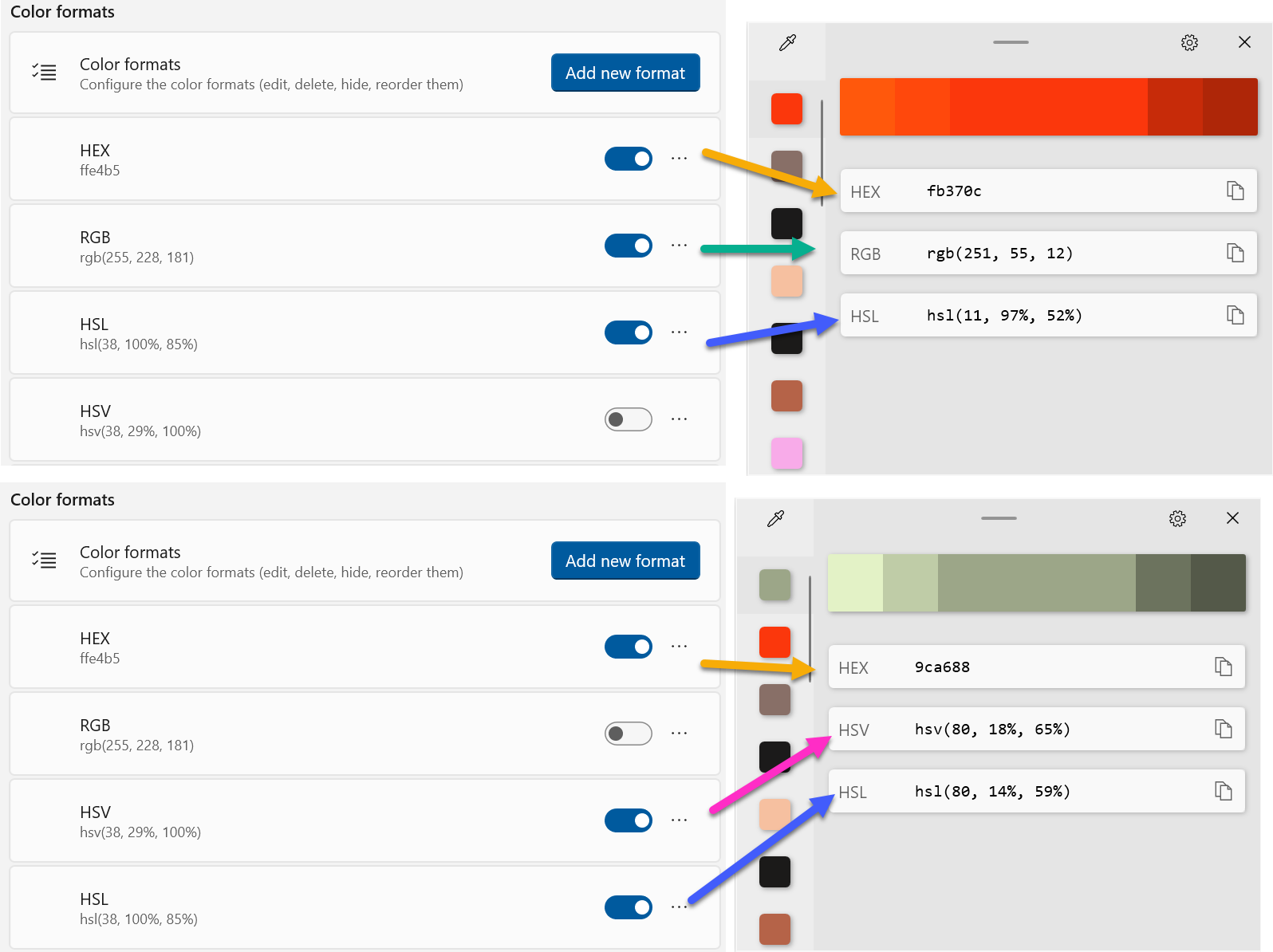
I, however, wanted it to include the hash in front so that I could immediately use the value in my List Formats (instead of FFFFFF for white, I want #FFFFFF).
So, I opened the PowerToys settings and navigated to the Color Picker section.
In the Color formats group you can see lots of standard formats and you can use the toggles to add/remove them or even reorder them in the results dialog.
Awesome! However, there still isn’t an option for the HEX value preceeded by the hash symbol. Fortunately, there’s an Add new format button! Click that to open a fancy dialog.
As you can see from all the parameters and options, this thing is super flexible. Our format is “relatively” straight-forward. Name the format #HEX and paste #%ReX%GrX%BlX for the Format value then click Save:
Your new format is now active and at the top of the list! To have it be the default format copied to your clipboard, choose it in the dropdown under Picker behavior:
That’s it! Now you’re color picker is even better. Oh yeah!!!
Despite Microsoft’s claims, things work differently in the Native client vs Teams on the web and it can be hard to troubleshoot. Having access to the developer tools like you do in the browser can make solving some of those a little easier.
If you are using the Classic Teams client, you can find instructions here for the developer tools: DevTools for Microsoft Teams tabs. Good luck!
Create the Configuration File
Perhaps to make the process feel even more developery or maybe because having a simple toggle in the interface seemed too hard, Microsoft now requires a configuration file to enable the dev menu.
Create a file called configuration.json in notepad, vscode, or whatever text editor you like. Put this inside it:
{
  "core/devMenuEnabled": true
}
Save this file to %localappdata%\Packages\MSTeams_8wekyb3d8bbwe\LocalCache\Microsoft\MSTeams
Be sure you quit teams entirely. Remember, Teams is sneaky and just closing the main window won’t do it. Go to the icon in the system tray (might be hidden by default) and right-click on the Teams icon and choose Quit:
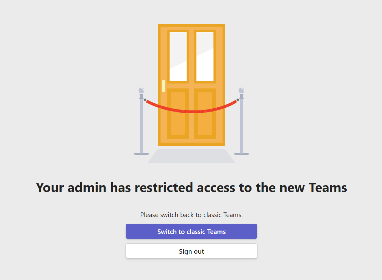
Reopen teams (Make sure it’s the new one with the flashy New written on it):
For some reason, I got this message when I first did this:
I clicked Sign out and when I signed back in everything was fine. Hopefully, you don’t get the above.
Enable Dev Tools
You might think you could right-click on the icon in the task bar and enable them, but we’d both be wrong.
Instead, right-click on the Teams icon in the system tray (like we did earlier) and you should now have an Engineering Tools menu with all sorts of goodies including the Open Dev Tools option we’ve been looking for:
That’s it! You should be able to open the developer tools (in a separate window) and inspect your elements as expected. Here’s me using it to find out what went wrong with my SPFx tab:
Now it’s time to extend our binary conversions a little farther to allow us to get the binary value of an ASCII Character just like you’ve always wanted! Again, allow me to give another unclear reassurance that there are legitimate reasons why you would do these things and I promise the next part in this series will make that clear.
There’s no reason for this dog with a bowtie, but there’s also no reason not to have a dog with a bowtie
Let’s do it!
I recently needed to get the binary value of an ASCII character (as you do). So, I just figured I’d get the ASCII value for a character and then use my handy Integer to Binary conversion method to take care of it. As you have likely guessed (by the fact the I’m writing a whole post about it), this wasn’t nearly as straightforward as I had thought.
Background Stuff
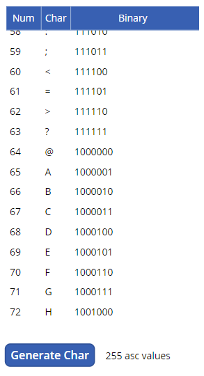
If you know the ASCII code (value) for a character, Power Apps makes it very easy to get that character by using the Char function. You can literally use Char(65) and you’ll get A. Nearly every language that has this function has its reverse usually called something like Asc and you could call that with A and get 65. But if you’ve been using Power Apps for very long you’re likely not surprised to learn that Power Apps has no equivalent function. Blarg!
A quick search came across this excellent article by Tim Leung, Text – How to convert a character to its ASCII numeric value. In this post, Tim lays out a method to generate a collection using the Char function against numbers 0-255 that can then be used to lookup the ASCII value and he does it all in a single line. If that’s all you’re here for, then click on that link and you’re done. In our case, we need to go just a little farther and be able to get the binary equivalent of the ASCII value for a character so we’ll be combining Tim’s technique with our integer to binary conversion logic laid out previously.
Building the Collection
To make this a little more understandable, I’m going to break this down into pieces. The first is the generation of a collection that will contain the values. Later I’ll show you how to use the collection to get individual values.
I’ve setup a beautiful Canvas Power App with this screen:
A DataTable with its Items set to the asc collection, a label that counts the values for debugging and a button to generate the collection
I’ve done this all in a button to make it easier to demonstrate but in reality you’d probably put this code in your App.OnStart if using it frequently. You wouldn’t need any of the other controls above either.
For those that read the last part in this series, we will be reusing / adapting some of that code. You don’t need to read that article to get this to work but it would probably help make sense of this stuff.
Here’s the code from the OnSelect of that button:
This file contains hidden or bidirectional Unicode text that may be interpreted or compiled differently than what appears below. To review, open the file in an editor that reveals hidden Unicode characters.
Learn more about bidirectional Unicode characters
Lines 1-9 – This is the same code we used previously to generate a collection of binary digits and their positional values (worth). The last article went into more depth about what these lines do. For our purposes, this is a necessary step to be able to get the binary values.
Unlike the last article, we set the Sequence to have 8 records starting at 7 and decreasing by 1. This is because we only care about 255 characters (8 bits) but if you were looking to increase that range for your ASCII table you’d need to increase the size here as well.
Line 11 – We are using a temporary collection (intToBinary) to store results as we calculate the binary equivalent of the ASCII value. So, we clear it out before starting.
Line 12 – We need to initialize/clear our asc collection which is the actual collection we are building.
Line 13 – We start a ForAll loop using the Sequence function to generate a temporary collection of 255 numbers starting at 1.
Lines 14-18 – Using the With function allows us to setup some local variables that we’ll be using in our other calculations.
firstDigit is set to the total number of rows in the binaryDigits collection minus one. This allows us to know what the “size” of the number will be without having to hardcode it.
input is set to the number we get from the Sequence function. This is the ASCII value and what we’ll be using in our binary conversion.
itbOffset is the current number of rows in the intToBinary collection. We store this because we cannot clear a collection within a ForAll yet we need to use it 255 times. So we store the offset to know which set of records in our collection apply to which value.
Lines 19-28 – We start a nested ForAll loop against our binaryDigits collection. It’s this loop that will do the conversion of the ASCII value that we’ll be referencing later. The details of what this code is doing were covered in the last article.
Line 29 – This is where we actually build the record for an individual ASCII value and store it in the asc collection
Line 30 – We store the number from the Sequence function as Num and this is the ASCII value. If you only need the binary value this step can be eliminated.
Line 31 – We use the Char function to get the character value for the ASCII value
Line 32 – We pull the binary value we calculated above out of the intToBinary collection using the LastN function to only pull those values after our itbOffset to ensure we only get the binary conversion calculation values for the number we’re on. There is extra code here to trim the leading zeros from the binary values. Again, more details on how this code works can be found in the previous article.
Using the Collection
You can use the collection by pulling values using the LookUp function. For instance, if we wanted to pull the ASCII value for the letter A we could write LookUp(asc,Char="A").Num and the result would be 65. If we wanted the binary value we would modify it to LookUp(asc,Char="A").Binary and the result would be 1000001
That’s it! Now you can get the binary value of any character’s ASCII code – WOWEE!!
Want to learn how to use this collection to do more stuff that probably has no place in Power Apps? Come back for Part 4: Calculating a DJB2 Hash in Power Apps!
I had the opportunity to speak at the M365 Collaboration Conference in Las Vegas this past week and it was awesome! I loved seeing all the friends I haven’t been able to see and I always enjoy the energy and excitement of a bunch of people gathered to learn and teach about stuff we all care about.
I helped teach 2 full day workshops and was able to once again give one of my favorite sessions: Advanced List Formatting. I love presenting this session because it’s demo heavy and it’s so fun being creative with lists and watching people’s eyes light up at all the possibilities.
The Grammys were happening at the same time. People were wearing the fanciest, most expensive Halloween costumes you could imagine!
For those that are interested, my Advanced List Formatting slides can be downloaded here:
Feel free to use the slides in your own presentations (internally or externally). If you feel like giving me credit, that’s great! But it’s not required. Sharing is caring afterall! The slides have several extra slides we didn’t go over (I prefer the demos) that will hopefully provide some additional insight. Feel free to reach out with questions.
Here is the list of samples I used in the demos so you can recreate what we went over:
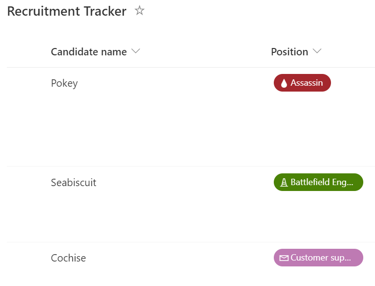
Recruitment Tracker – We took the out of the box recruitment tracker list template and customized the existing column formats using the design panel to add icons to our choice fields. Then we went into Advanced Mode and swapped out the icons with ones we picked out from flicon.io
Number Battery– We replaced our percent column with a Battery display
Multi-Person Facepile– We simplified the multi-select person field with the facepile format
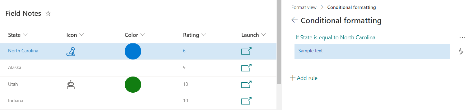
Field Notes – We looked at adding conditional rules to format our rows and also demonstrated a deep link into a custom Power App using the Launch Power App Button sample
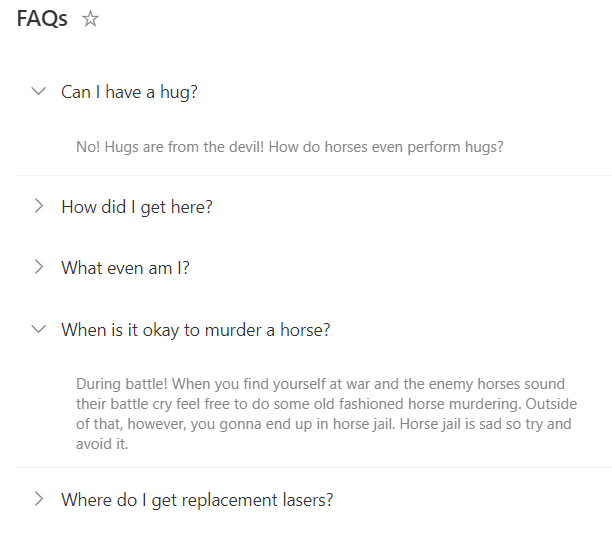
Grouped FAQs – We looked at how we can use groupProps to customize grouped fields to create a miniature application. We also briefly looked at an alternative FAQ Format
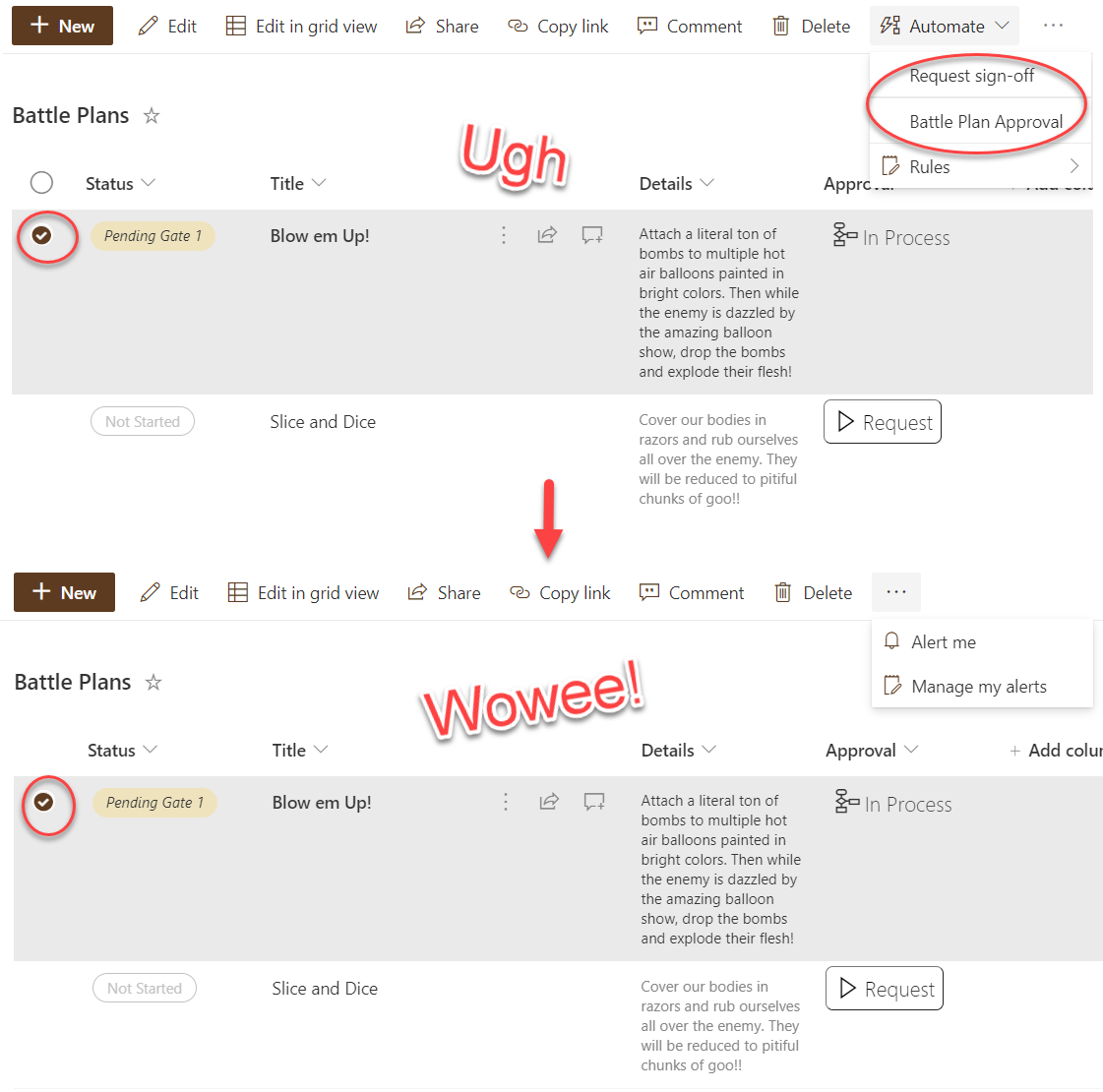
Flow Status – We looked at how we can conditionally launch flows and display a dynamic flow chart to represent flow progress as well as a link to the exact flow instance
CommandBar Hide Automate – We expanded the flow status sample shown above to conditionally hide the Automate button when an item is selected
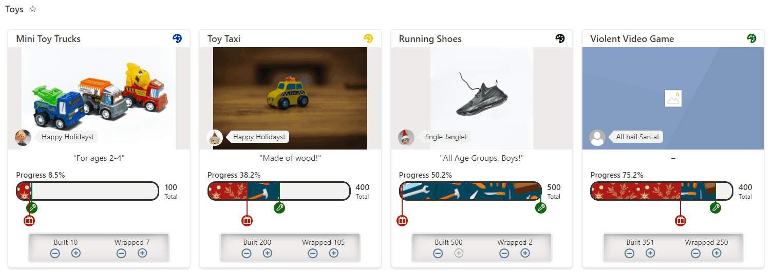
Elf Progress Board – We looked at building multi-layered progress bars, randomization, and inline editing with the elf progress board
Row Actions – We looked at the different default row actions and demonstrated live list updates and format rerendering
Random Item – We looked at how we can use layering and randomization to pick a random list item (turkey fact) to show on a page
Content Navigator – We demonstrated how to setup 2 views on a list and use them in conjunction as webparts on a page to enable simple navigation
Video Navigation – We showed how to use the list webpart with a dynamic connection to the embed webpart to create a custom video navigation application
Dashboard – We built a “dashboard” by using multiple webparts each showing different views of the same list all using different formats
Using icons for buttons is a very common scenario in Power Apps and Microsoft has provided the Icon control to accomplish just that. But… there are only 106 across 4 categories which isn’t a whole lot when it comes to icons. So if you are making anything of any complexity you’ve likely already run out. Fortunately, that’s
Easiest Solution
Just use their stupid icons
Custom Icons
But what if you don’t want to use one of the very few icons they’ve provided? What if you found Flicon and would like your app to match the rest of Office 365 and use the Fluent / UI Fabric icons? Or perhaps Font Awesome or the Noun Project or something your kid drew?
Fortunately, there are still options! There is a pretty easy option laid out in the OKish Solution below and then a PITA Solution that works but there are several steps involved. I’ve included both, but I definitely think the PITA Solution is the way to go until Microsoft figures out something better.
OK-ish Solution
Use images but be satisfied with Border or Fill effects
PITA Solution That Works
What if you want more than just a changing background or border? You know, like how the icons themselves work in Power Apps? For this, we’ll need a custom icon as an SVG. These steps could be adapted to work with a PNG image, but SVG is very common among icon sets and provides a better result overall.
1. Get an SVG Icon
First step, get your icon! Font Awesome and the Noun Project both provide all of their icons in SVG format. However, I recommend using the Fluent Icons provided by Microsoft since that’s what’s being used everywhere else. For that, let’s head over to Flicon.io.
If you haven’t used Flicon.io before, just search for an icon you want to use or browse with the categories. Once you’ve got an icon in mind, hover over it and switch to the Export tab. You can mess around with colors if you’d like, but it isn’t really necessary for what we’re doing. Just click Save as SVG:
2. Edit that Icon
We need to edit the SVG file before it’s ready to be used. There are plenty of tools out there to do that, but I use a free, open-source tool called Inkscape. You can download it directly from the site or just install it from the Microsoft Store.
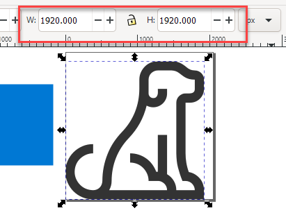
Open your icon in Inkscape. One thing you’ll notice is that most of the icons are square, but the image isn’t always centered. Don’t worry, we’ll account for that to ensure our icon is a centered square.
In Power Apps we can use an SVG as the Image for an Image control. The Image control has HoverFill as we showed above. We’re going to take advantage of that and create an inverse of our icon. This means we’ll be creating an image that is the background and leaves the part of the icon we want displayed transparent. This allows us to set the “color” of the icon using the Fill and HoverFill properties!
3. Create a Box
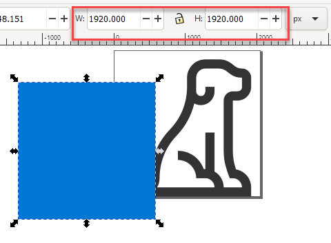
In Inkscape, draw a box (fill color doesn’t matter, but it shouldn’t have a stroke). The size doesn’t matter just yet. Grab the square tool and draw something. Don’t worry about making it perfectly square.
Click on your icon and look at the Width and Height displayed. Take note of the bigger of the two (mine happen to be the same):
Click on the square you just drew and put the value you just noted for both its width and height. Now you have a box sitting somewhere near your icon that is the same size as your icon’s largest dimension. If you want additional padding for your icon, add that to the box’s dimensions.
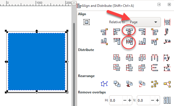
Now we’re going to line them up. Open the Align and Distribute panel (Object > Align and Distribute). Select both the box and your icon. Ensure the Relative to dropdown is set to Page then click the Center on Vertical Axis button followed by the Center on Horizontal Axis button. Your box should be totally covering your icon now.
4. Cut a Hole in a Box
With both the box and the icon selected (just select all if you clicked off of them), perform an exclusion (Path > Exclusion). You now have one object and it is the negative space around your icon (remember the color doesn’t matter).
You’ll notice we’ve got an extra space around the icon and the document size (seen as a black square above). This is because our icon wasn’t perfectly centered before. If your icon looks good, skip ahead. To fix it, however, go to Document Properties (File > Document Properties). In the Custom Size options group, expand the Resize page to content section and click Resize page to drawing or selection.
5. Optimize Your SVG
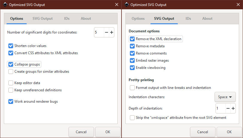
Let’s save our SVG. Although we can use the default format, there’s a lot of extra stuff added that we don’t need. So let’s Save as (File > Save As…) and change the type to Optimized SVG. In the dialog that pops up, here are the options I’ve chosen with the goal of reducing SVG complexity/length:
Let’s open up our SVG file using a text editor like Notepad. You should see some XML with a viewBox attribute and one or more paths. Let’s do a find for double quotes and replace them all with single quotes.
6. Use Your Icon in Power Apps
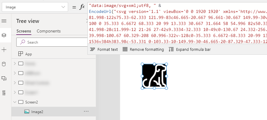
Although we can add an SVG file as media and use it that way, I like to have a little more control. So, let’s add an Image control to your App. In the Image property we’re going to replace SampleImage with some text. The first bit of text is just a string:
"data:image/svg+xml;utf8, "
This will let us use the SVG text directly. To do that we need to add the EncodeUrl function. So connect the text above with an & and enclose the SVG text (copied from notepad) in double quotes inside of the EncodeUrl function (don’t forget your closing double quote and parenthesis):
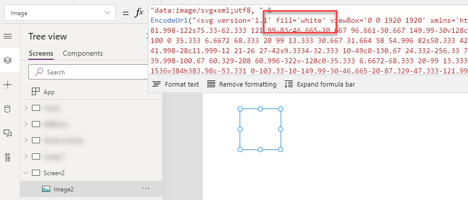
The icon is showing, wowee! Now we need to make that fill match the background (the black stuff shown above). So we can edit our SVG string to add fill='white' (or a HEX or RGBA value that matches your background which is white in my case).
Where did that icon go?! It’s still there, it’s just being sneaky.
7. Add Some Color
Now for the magic! Set the Fill property for the Image control (shown as Color in the properties window for some reason) and your icon shows up! WOWEE!
Now set the HoverFill to some other color and hold Alt to see the magic.
Hold down Alt to test it right in the Editor
Limitations
This is not a perfect solution and the fact that this is our best option is pretty frustrating. But… it gets the job done but with a few notable issues when compared to using the native icons:
That’s an annoying amount of work for each icon
No option to have the pointer cursor even when using it with an OnSelect action
Images sometimes get weird borders depending on the scaling
You need to keep your image ratio the same to avoid the background leaking out (set the Width to Self.Height and control just the Height)
I was recently asked to write a PowerShell script that identified a bunch of pages and emailed them. They wanted the emails to include the Banner Image (the page/news thumbnail). No problem, I’ll just grab the handy BannerImageUrl field and stick it in some HTML, right? Nope.
Although you can certainly create an email with images using the URL, unless the user is logged in, those images will cause a bunch of authentication errors. This is especially a problem for people checking their email on their phones. Sadness!
Fortunately, you can grab those images in PowerShell and convert them to base-64 strings. That way the authentication for the images is only needed when running the script and not when the user opens the email.
Here’s a basic script that covers the concept using PnP PowerShell:
This file contains hidden or bidirectional Unicode text that may be interpreted or compiled differently than what appears below. To review, open the file in an editor that reveals hidden Unicode characters.
Learn more about bidirectional Unicode characters
In the Gist above, the HTML value is put in your clipboard. This is just to make it easy to prove it works. Run the script, paste the result in codepen in a browser where you are not authenticated to the site and witness the magic!
The key bit is the setup of the web client (lines 8-10) and the call to convert the downloaded data (line 18). You can easily wrap this logic up inside a foreach loop to process all your pages/news and build a nice html based email. Wowee!
You may have noticed that your classic administration links are now missing from the SharePoint Administration center. Good luck editing your search schema or creating an app catalog now!
I have no idea why this was removed and hope this is corrected soon. Seems like a mistake to me even if the goal is to eventually roll out updated versions. Fortunately, if you happen to have the old links you can still visit them. Surely you bookmarked them all?!
No need to excessively weep! Reduce your wailing to dry sobs because here are the links to the missing admin pages. Copy them and paste them after your sharepoint admin domain (see below for an example).
infopath /_layouts/15/TenantForms.FormServer.aspx
user profiles /_layouts/15/tenantprofileadmin/manageuserprofileserviceapplication.aspx
bcs /_layouts/15/bdc/TA_BCSHome.aspx
term store /_layouts/15/termstoremanager.aspx
records management /_layouts/15/TA_OfficialFileAdmin.aspx
The Embed web part for modern pages lets you display content from secure websites right on your page. Want to show a YouTube video? Grab the embed code from youtube.com and slap it in the Embed web part. Wowee!
By default, modern pages support 30+ sites including the most common like YouTube, Vimeo, TED, and internal domains like Stream and OneDrive. But what about when you’ve got content from a site not on this list? You’ll end up with an error similar to this:
Don’t cry! Wipe those tears off that wet face! If you just need to allow the domain for a single site, the instructions are right there (here’s a quick summary):
Go to Site Settings
Click on HTML Field Security under Site Collection Administration
Type the domain from the error message (no https://) into the box and click Add
Click OK
Give it another try
But wait… Corporate just rolled out a video hosting platform for the enterprise and they want all sites to be able to embed content from this new site. Does the thought of repeating the above steps hundreds or even thousands of times make you weep in despair? Smack those tears off your moistened face!
Here’s a quick snippet of PowerShell which will show you how to add it to multiple sites:
This file contains hidden or bidirectional Unicode text that may be interpreted or compiled differently than what appears below. To review, open the file in an editor that reveals hidden Unicode characters.
Learn more about bidirectional Unicode characters
In the PowerShell above, I’m using PnP PowerShell. You can technically do this without PnP PowerShell since it’s just CSOM, but… why would you make your life harder?
Here’s what’s happening:
The list of sites in line 1 is just an array of the URL portion of the site after /sites/. You could easily alter this to grab all associated sites for a hub or to get all sites within a classification, etc. But I find a simple list of URLs works pretty well.
We connect to the site in line 9 and grab the site object in line 11
We get the Client Context in line 12
We create a new ScriptSafeDomainEntityData object and set the only part we care about, DomainName, to the URL from the error message before
Then in line 17 we use the Create method to add it to the list of domains (there’s no problem if the site already has that domain, it won’t be added twice)
We execute the query for the client context to save our changes in line 19
Finally we disconnect from the site in line 21 and move on to the next site
You can easily adapt the script above as part of your provisioning process to ensure that new site have the correct domains whitelisted as well. So fun!
Now you can take content from all over the web and mash it together to bring all the relevant stuff directly to your users. WOWEE!


 The Chris Kent