A few weeks back I demonstrated how to work with multi-select person or choice fields using indexOf to perform startsWith or contains checks to make some pretty cool formats.
While these are still valid techniques, they have some limitations that the new forEach property and the related operator, loopIndex, can solve. Specifically, applying formatted elements for each value of a multi-select field!
The Problem
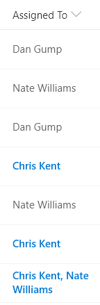
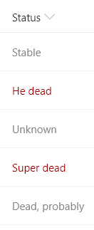
I previously created a sample, multi-person-currentuser, that allows you to highlight a multi-person field when one of the users is the current user. The results end up looking something like this:
This sample takes advantage of the contains logic previously discussed by looking for the indexOf the @me (current user’s email address) within a flat string generated using the join operator:
multi-person-currentuser
{
  "$schema": "https://developer.microsoft.com/json-schemas/sp/column-formatting.schema.json",
  "elmType": "div",
  "txtContent": "=join(@currentField.title, ', ')",
  "attributes": {
    "class": "=if(indexOf(join(@currentField.email,';'), @me) != -1, 'ms-fontColor-themePrimary ms-fontWeight-semibold', '')"
  }
}
Works pretty well and if that’s all you need, go grab that sample!
But what if we could take it further than just displaying the fields as a string? What if we could apply elements for each item? Well… good news, that’s exactly what the new forEach property allows us to do!
The forEach Property
The forEach property is not yet part of the schema (so don’t be surprised if it gets highlighted as invalid in something like VS Code). You can use it within column formatting or inside of your rowFormatter for view formatting.
The forEach property allows you to create virtual fields that you can access within an element. The element where you add the property (along with all of it children) are rendered once for each item within the array (array refers to the collection of selected people or choices).
Because the element is rendered multiple times, you must have a containing element. This is why if you attempt to use the forEach property in the root element, you’ll get an error.
The forEach property’s value is a simple sentence in the form virtualFieldName in ArrayField. Let’s look at an example.
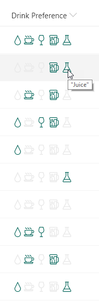
For this first example we’ll use a simple multi-select choice field. In this case we’ve just made the choices some letters. Here it is with no formatting applied:
Now let’s apply a format using the forEach property:
multi-choice-foreach:
{
  "$schema": "https://developer.microsoft.com/json-schemas/sp/column-formatting.schema.json",
  "elmType": "div",
  "children": [
    {
      "forEach": "choiceIterator in @currentField",
      "elmType": "div",
      "txtContent": "[$choiceIterator]",
      "attributes": {
        "class": "ms-bgColor-themePrimary ms-fontColor-white",
        "title": "='I am the letter ' + [$choiceIterator]"
      },
      "style": {
        "width": "16px",
        "height": "16px",
        "text-align": "center",
        "margin": "1px"
      }
    }
  ]
}
Here’s what that looks like:
So what did we do? As mentioned above, you can’t apply forEach to the root element. So we created a div and then gave it a single child. However, by using forEach within the child we’re using this element as a template that will be repeated within the root container once per selected choice.
The forEach value requires you to provide the virtual field name followed by the word in and concluding with the name of the array to loop over. In this case, as seen on line 6, we are using choiceIterator as the virtual field name and our array is the @currentField (this could have just as easily been another array field in your view using the [$FieldName] syntax).
Note that the virtual field name should be unique. It is possible to clobber your other fields if you use the same name as one of the internal names of your fields! This means that if you use Title then you’ll no longer have access to the actual Title field’s value! This will be true even after the loop completes. So choose carefully. I find it best practice to use either the field name or type followed by the word Iterator. This has the added benefit of making it obvious that you are retrieving a loop value within your element – but that’s up to you.
Now that we’ve added the forEach property, we can access the virtual field anywhere within our template object (and its children) just like it was any other field! You can see this in the txtContent property on line 8 and we even use it in an expression within the title property to create a nice tooltip on line 11.
Taking it further with loopIndex
Back to our person example from above, wouldn’t it be great to do more than simply show their names? There’s another sample called person-roundimage-format that applies the standard circle image for users. Using the techniques above we can quickly convert it to support multi-select person fields (add a forEach and change our field accessors):
{
  "$schema": "https://developer.microsoft.com/json-schemas/sp/column-formatting.schema.json",
  "elmType": "div",
  "children": [
    {
      "forEach": "personIterator in @currentField",
      "elmType": "div",
      "style": {
        "width": "32px",
        "height": "32px",
        "overflow": "hidden",
        "border-radius": "50%",
        "margin":"2px"
      },
      "children": [
        {
          "elmType": "img",
          "attributes": {
            "src": "='/_layouts/15/userphoto.aspx?size=S&accountname=' + [$personIterator.email]",
            "title": "[$personIterator.title]"
          },
          "style": {
            "position": "relative",
            "top": "50%",
            "left": "50%",
            "width": "100%",
            "height": "auto",
            "margin-left": "-50%",
            "margin-top": "-50%"
          }
        }
      ]
    }
  ]
}
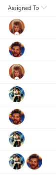
Here’s what that looks like:
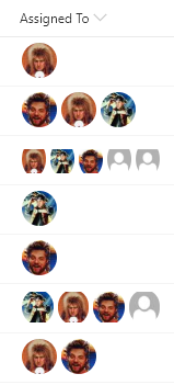
Now the images are showing up and we even get multiple when more than one person is selected! But what happens when we have lots of selections? The results aren’t great and give us all a sad:
You can see that up to 3 people looks just fine, but 4+ starts to have some weird squishing (and nobody likes weird squishing). So we need some way of knowing how many people we have for an item and which one we are on in the template.
Fortunately, you can use the length and loopIndex operators to accomplish this!
The length operator will provide the total number of items in an array (it does NOT provide string length). We can use this value to determine when we shouldn’t show an element (to remove face 4, 5, 6, etc.).
The loopIndex operator provides us with the zero-based index of where we are in the forEach loop. To use it, simply provide it the virtual property name you want to get the index of (since you can nest multiple forEach loops) as a string. So, in our case we can use "=loopIndex('choiceIterator')".
We’re going to base our solution on the UI Fabric Facepile with descriptive overflow. In order to do that, we want to accomplish the following:
- Show 1 to 3 faces without change (that seems to work great)
- Never show more than 3 circles
- Replace the third circle with a descriptive overflow circle when there are 4 or more people selected
The first case we’ve got handled. The second can be done by using "display":"none" as mentioned in my last post. The third requires an alternate element that only shows when there are 4 or more people and we are on the 3rd person.
multi-person-facepile:
{
  "$schema": "https://developer.microsoft.com/json-schemas/sp/column-formatting.schema.json",
  "elmType": "div",
  "children": [
    {
      "forEach": "personIterator in @currentField",
      "elmType": "div",
      "style": {
        "width": "32px",
        "height": "32px",
        "overflow": "hidden",
        "border-radius": "50%",
        "margin": "2px",
        "display": "=if(loopIndex('personIterator') >= 3, 'none', '')"
      },
      "children": [
        {
          "elmType": "img",
          "attributes": {
            "src": "='/_layouts/15/userphoto.aspx?size=S&accountname=' + [$personIterator.email]",
            "title": "[$personIterator.title]"
          },
          "style": {
            "position": "relative",
            "top": "50%",
            "left": "50%",
            "width": "100%",
            "height": "auto",
            "margin-left": "-50%",
            "margin-top": "-50%",
            "display": "=if(length(@currentField) > 3 && loopIndex('personIterator') >= 2, 'none', '')"
          }
        },
        {
          "elmType": "div",
          "attributes": {
            "title": "=join(@currentField.title, ', ')",
            "class": "ms-bgColor-neutralLight ms-fontColor-neutralSecondary"
          },
          "style": {
            "width": "100%",
            "height": "100%",
            "text-align": "center",
            "line-height": "30px",
            "font-size": "14px",
            "display": "=if(length(@currentField) > 3 && loopIndex('personIterator') == 2, '', 'none')"
          },
          "children": [
            {
              "elmType": "span",
              "txtContent": "='+' + toString(length(@currentField) - (2))"
            }
          ]
        }
      ]
    }
  ]
}
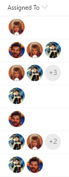
Here’s what that looks like:
Here’s what we did:
- On line 14, we added a
display property to our template element to set the value to none if the loopIndex is greater than or equal to 3 (keep in mind that the index starts at zero so we’re basically saying never show items 4 and up) - On line 31, we added a similar
display property to our img element to set the value to none if the number of items is greater than 3 and the loopIndex >= 2. This allows us to show it as normal if there are 3 or less people selected but when there are 4 or more, we don’t want to show that 3rd person. - On lines 34-54 we add our descriptive overflow element. This is a gray circle that says how many more people were selected than are shown.
- On line 46, we once again take advantage of the
display property to ensure that the overflow element is only shown when there are more than 3 people selected and we are on the 3rd element (loopIndex = 2). - We use the
join operator to create a tooltip with everybody’s name in it on line 37. - We determine the number of additional people by simply subtracting 2 (since we know how many we are showing) from the
length of the array. Notice that the 2 is wrapped in parenthesis. This is to combat an issue with the subtraction operator.
While that certainly isn’t the simplest sample in the world, it demonstrates common list formatting patterns such as conditional display, element loops, and customization based on loop position.
This opens up even more possibilities in the already awesome List Formatting world! Whoo!!


 The Chris Kent