Extending the List of Sites You can Embed From in SharePoint Using PowerShell

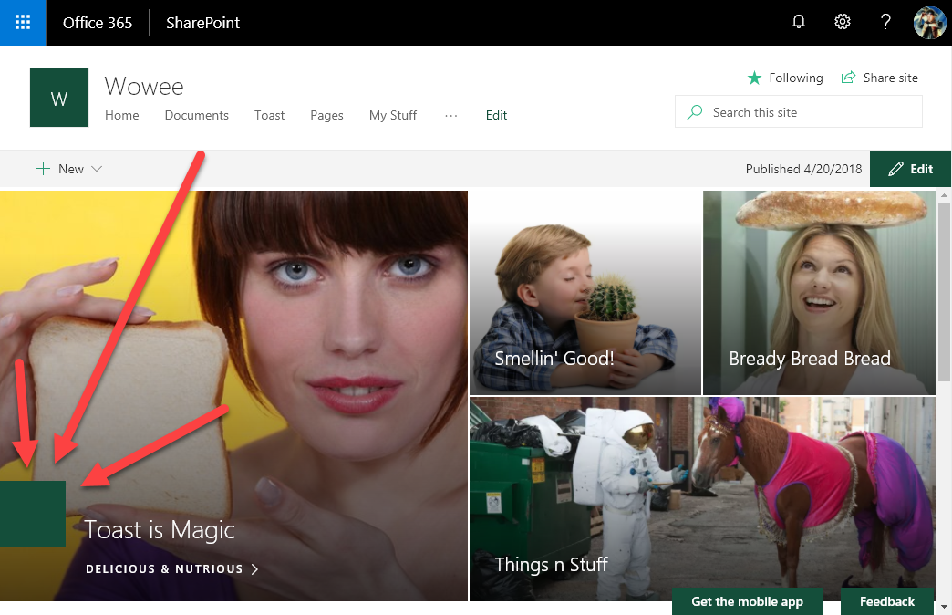
The Embed web part for modern pages lets you display content from secure websites right on your page. Want to show a YouTube video? Grab the embed code from youtube.com and slap it in the Embed web part. Wowee!

By default, modern pages support 30+ sites including the most common like YouTube, Vimeo, TED, and internal domains like Stream and OneDrive. But what about when you’ve got content from a site not on this list? You’ll end up with an error similar to this:

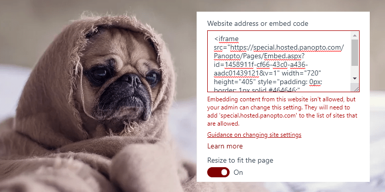
Don’t cry! Wipe those tears off that wet face! If you just need to allow the domain for a single site, the instructions are right there (here’s a quick summary):

  • Go to Site Settings
  • Click on HTML Field Security under Site Collection Administration
  • Type the domain from the error message (no https://) into the box and click Add
  • Click OK
  • Give it another try

But wait… Corporate just rolled out a video hosting platform for the enterprise and they want all sites to be able to embed content from this new site. Does the thought of repeating the above steps hundreds or even thousands of times make you weep in despair? Smack those tears off your moistened face!

Here’s a quick snippet of PowerShell which will show you how to add it to multiple sites:

$SiteUrls = @("HR","Accounting","IT")
foreach($SiteUrl in $SiteUrls) {
Write-Host ForegroundColor Cyan "Applying to $SiteUrl"
$FullSiteUrl = "https://superspecial.sharepoint.com/sites/$SiteUrl"
Connect-PnPOnline $FullSiteUrl ErrorAction Stop
$site = Get-PnPSite Includes CustomScriptSafeDomains
$ctx = Get-PnPContext
$ssDomain = [Microsoft.SharePoint.Client.ScriptSafeDomainEntityData]::new()
$ssDomain.DomainName = "special.hosted.panopto.com"
$site.CustomScriptSafeDomains.Create($ssDomain)
$ctx.ExecuteQuery()
Disconnect-PnPOnline
}

In the PowerShell above, I’m using PnP PowerShell. You can technically do this without PnP PowerShell since it’s just CSOM, but… why would you make your life harder?

Here’s what’s happening:

  • The list of sites in line 1 is just an array of the URL portion of the site after /sites/. You could easily alter this to grab all associated sites for a hub or to get all sites within a classification, etc. But I find a simple list of URLs works pretty well.
  • We connect to the site in line 9 and grab the site object in line 11
  • We get the Client Context in line 12
  • We create a new ScriptSafeDomainEntityData object and set the only part we care about, DomainName, to the URL from the error message before
  • Then in line 17 we use the Create method to add it to the list of domains (there’s no problem if the site already has that domain, it won’t be added twice)
  • We execute the query for the client context to save our changes in line 19
  • Finally we disconnect from the site in line 21 and move on to the next site

You can easily adapt the script above as part of your provisioning process to ensure that new site have the correct domains whitelisted as well. So fun!

Now you can take content from all over the web and mash it together to bring all the relevant stuff directly to your users. WOWEE!

Dog, Pug, Bitch, Pet, Animal, Obedient, Funny, Cute

Customizing the Flow Panel with List Formatting actionParams

I’ve covered launching a flow for a list item using List Formatting a number of times, along with conditionally launching a flow, and recently I even showed how to take advantage of background list updates with automatic format updates using Flow.

In this post I’ll demonstrate some new tweaks the team has made that lets you customize the flow panel itself using list formatting!

Specifically, you can now provide custom text for the panel header and/or the run flow button:

This goes a long way to making the flow panel less scary. The words “Run flow” don’t mean a whole lot to users. Even if you’ve named your flow well, it can still be confusing. Now you can make things even easier by providing context and meaning directly in the panel. You could even customize these values based on values of the list item!

Customizing the Flow Panel

Here is a very basic flow button Column Format from the generic-rowactions sample:

{
  "$schema": "https://developer.microsoft.com/json-schemas/sp/column-formatting.schema.json",
  "elmType": "button",
  "customRowAction": {
    "action": "executeFlow",
    "actionParams": "{\"id\":\"f7ecec0b-15c5-419f-8211-302a5d4e94f1\"}"
  },
  "attributes": {
    "class": "ms-fontColor-themePrimary ms-fontColor-themeDark--hover",
    "title": "Launch Flow"
  },
  "style": {
    "border": "none",
    "background-color": "transparent",
    "cursor": "pointer"
  },
  "children": [
    {
      "elmType": "span",
      "attributes": {
        "iconName": "Flow",
        "class": "ms-font-xxl"
      }
    }
  ]
}

The part we’re interested in is line 6, the actionParams. The actionParams property is currently only used for the executeFlow action. It is an escaped JSON string (the double quotes have a slash in front of them). And thus far, it’s been used to specify the ID of the flow.

Now you can specify the headerText and the runFlowButtonText properties inside of actionParams as well! Here’s what that looks like using the above format:

{
  "$schema": "https://developer.microsoft.com/json-schemas/sp/column-formatting.schema.json",
  "elmType": "button",
  "customRowAction": {
    "action": "executeFlow",
    "actionParams": "{\"id\":\"f7ecec0b-15c5-419f-8211-302a5d4e94f1\", \"headerText\":\"Do the things and stuff\",\"runFlowButtonText\":\"Lazerify!\"}"
  },
  "attributes": {
    "class": "ms-fontColor-themePrimary ms-fontColor-themeDark--hover",
    "title": "Launch Flow"
  },
  "style": {
    "border": "none",
    "background-color": "transparent",
    "cursor": "pointer"
  },
  "children": [
    {
      "elmType": "span",
      "attributes": {
        "iconName": "Flow",
        "class": "ms-font-xxl"
      }
    }
  ]
}

The ID is always required but you can specify either or both of the headerText and runFlowButtonText to provide that customization:

Escaped PropertyWhat it does
IDThe ID of the flow to run. This is required.
headerTextReplaces the big text at the top of the panel with whatever you specify.
runFlowButtonTextSets the text of the primary button with whatever you specify.

Some things to keep in mind:

  • headerText will wrap if you get especially wordy:
  • But just because you can, doesn’t mean you should. It’s best to keep the header as short and concise as possible. (for anyone who wants to ignore me, I’ve found I had no problem displaying 5000+ characters)
  • runFlowButtonText will also allow you to put a large amount of text in the button, but it looks terrible because the cancel button wraps below it somewhere around 14-16 characters:
  • Unlike the headerText, runFlowButtonText will eventually just run off the screen as it never wraps to a new line.
  • Changing these properties does nothing to obscure connection details or the name of the Flow (yay!)
  • The headerText is shown even the first time a flow is executed (when the user is asked about the connections used), but as you might expect, the runFlowbuttonText is not:

This is a fantastic addition by the team! Making a flow button that simplifies launching a flow for an item is a great way to increase adoption, decrease confusion, and impress your boss! Special thanks to Cyrus Balsara (Microsoft) for letting me know about these awesome changes!

Alternating Row Styles with List Formatting

An easy way to make your list views far more readable is to provide alternating styles between rows. This is especially helpful for wide lists with lots of columns.

Importantly, the alternating colors need to alternate regardless of the content of the list items. This means that even with changing sorts and filters applied, the alternating styles should remain consistent. Up until a few days ago, this wasn’t possible with List Formatting. However, thanks to a new operation and magic string, applying alternating styles is super easy!

Although you can use this same basic concept for advanced visualizations within column formatting or row format style view formatting, the most common usage is to apply a color across the whole row for every other row. That’s what I’ll demonstrate here using a row class style view format.

@rowIndex

A new magic string has been added that will provide you the index (relative to the view) for a given row. The index starts at 0. So, when a view is rendered, the row at the top has a @rowIndex of 0, the next is 1, the next is 2 and so on. If the sort changes, whatever row just became the new top row has a @rowIndex of 0.

We can see this in action with a simple column format:

{
  "$schema": "https://developer.microsoft.com/json-schemas/sp/column-formatting.schema.json",
  "elmType": "div",
  "txtContent": "@rowIndex"
}
The @rowIndex value remains consistent based on render position!

Awesome! But just showing the index isn’t very helpful. Fortunately, a new operation has been added that makes using this value in an expression super easy.

Modulus (Remainder)

The modulus operator is the % sign. This operator returns the remainder left over when one operand is divided by a second operand. Here are some examples:

ExpressionResult
“=13 % 5”3
“=0 % 2”0
“=1 % 2”1
“=2 % 2”0
“=3 % 2”1

It’s those last 4 examples that are particularly relevant for us. By using the remainder operator with the second operand of 2, we can consistently get results for every other value!

Alternating Row Class

View formats provide an additionalRowClass property that allows us to apply a class(es) to whole rows. We can even do this conditionally! So, using what we learned above we can use this simple format to apply a class to every other row:

alternating-rowclass:

{
  "$schema": "https://developer.microsoft.com/json-schemas/sp/view-formatting.schema.json",
  "additionalRowClass": "=if(@rowIndex % 2 == 0,'ms-bgColor-themeLighter ms-bgColor-themeLight--hover','')"
}

We are checking to see if the remainder of dividing the @rowIndex by 2 is 0 (even numbers will be 0 and odd numbers will be 1). When it’s 0, we use the UI Fabric theme classes to apply a theme color across the whole row. We also add an additional class to add a hover effect as well. Here’s the result:

So beautiful!
On the fly sorts? No Problem!
On the fly filters? No Problem!

That’s all there is to it!

Thank you SPTechCon Austin!

I had the honor of attending and speaking at SPTechCon West this week. It was great! I attended several really awesome sessions, attendees were super engaged, and I even got some sweet swag. Even better? I crushed Vlad Catrinescu at Mario Kart on the same big screen we both presented on the next day.

Getting the Most out of SharePoint Patterns and Practices (PnP)

Photo via David Warner II

On Monday I presented one of my favorite sessions. This session is like a sampler platter of the awesome stuff the PnP team and community has made available for everyone to use and learn from. There were lots of people who hadn’t heard of PnP, which means their jobs are now going to be so much easier. Whoo!

There was a lot of great feedback and participation. People were very excited about Page Transformation for Modernization and, as always, PnP PowerShell. The samples and contribution opportunities were also of great interest.

Slides: Getting the Most out of SharePoint Patterns and Practices

List Formatting in O365 and 2019

Earlier today I got to present on my other favorite topic: List Formatting. Unfortunately, I got over ambitious and tried to fill my session with tons of information AND demos. I ran out of time. Sadness.

It was a big crowd and lots of people were very excited about the amazing things you can do with List Formatting. I had lots of people asking questions afterwards and even helped setup some formats for attendees right in the room. That’s the power of List Formatting, we can apply them with no installations, deployments, or admin privileges!

Slides: O365 List Formatting

Thank you so much to all the attendees, speakers, sponsors, and organizers. SPTechCon has lots of user targeted information, but so many of the sessions went into a lot of depth that I left with lots of great tips and I’m sure everyone else did too!

New List Formatting Magic String @currentWeb!

There are several special string values that can be used within both view and column formatting. The most common is, of course, @currentField which will return the value of the field you are formatting in column formatting or the title field in view formatting.

These “magic strings” are placeholders for contextual information that are replaced when the format is applied. For instance, @now will be replaced with the exact date/time the format is rendered. This is really helpful to provide dynamic formats.

While poking around today, I found a new one! @currentWeb can now be used to return the absolute url for the site! This is the equivalent of the page context’s webAbsoluteUrl.

Why is this exciting? Previously, you had 2 options when trying to link to something on your site or pulling in an image and they each had major drawbacks:

  • Hardcode the Base URL (https://tenant.sharepoint.com/yourresource)
    • Pro: You’ll always get the image/link you wanted
    • Con: Your format can’t be reused on other sites without manually fixing these links
  • Use a Relative URL (../../yourresource)
    • Pro: Your format is reusable across sites
    • Con: Your URLs are dependent on your relative location. So if someone uses your format within a web part on a different level of your site (folder), your URLs could break

Now, by using @currentWeb, you can have all the good with none of the bad!

For instance, just recently I demoed a quick tip on the PnP call that showed you how to use a relative URL to reference a local image in order to keep the format generic enough to be used with PnP Remote Provisioning. Now my dots can just be replaced with @currentWeb!

Here’s the original relative URL in the contenttype-format view formatting sample:

  "elmType": "img",
  "attributes": {
    "src": "='../../Shared Documents/Fruit/' + if([$ContentType]=='Apple',[$AppleType],[$OrangeType]) + '.png'"
  },

Again, that works fine as long as the format is being applied at the same relative distance from the image files. But now, we can just write:

  "elmType": "img",
  "attributes": {
    "src": "=@currentWeb + '/Shared Documents/Fruit/' + if([$ContentType]=='Apple',[$AppleType],[$OrangeType]) + '.png'"
  },

Now, the resulting URL will always resolve to my images regardless of where in the site my format is being rendered!

Here’s an even simpler example for when I want to link to a document in my documents library:

{
  "$schema": "https://developer.microsoft.com/json-schemas/sp/column-formatting.schema.json",
  "elmType": "a",
  "attributes": {
    "href": "=@currentWeb + '/Shared Documents/MyDoc.pdf"
  }
}

What a great addition! Now List Formatting is even more powerful!

Note: @currentWeb is only supported in SharePoint Online and is not available in SharePoint 2019

Update!

See this demoed on the PnP Call (Live from MVP Summit):

Love List Formatting?

Join the Bi-weekly (every other Thursday) SharePoint Patterns and Practices special interest group for general development call where I will be presenting a new List Formatting Quick Tip on each call!

Also, come get the full picture in my sessions about List Formatting at the SharePoint Conference in Las Vegas in May, or the European Collaboration Summit in Germany in May:

Setting the Accent Color of Your Modern Site’s Custom Theme

Modern pages in Office 365 let you “Change the Look” by providing a number of themes (sets of colors) that can be applied to your site (available from the gear menu in the top-right of the screen). The interface is pretty slick, it takes immediate effect, and the default options are so much better than those weird sets of themes from the classic days.

You can even do minor customization by clicking the customize link under your chosen theme. You can choose from one of the preselected primary colors and an accent color (designed to match your primary). Generally, these colors are great and have been selected to look good in most scenarios.

CustomizeColorsInUI

But I can’t pick the exact shade of red marketing has decreed that all things must be! Fortunately, you can create your own theme with the exact colors you want. You can even generate these using the UI Fabric Theme Generator. This is pretty easy, and Mikael Svenson wrote up a nice guide on doing this using PnP PowerShell.

If you follow his guide, and the official documentation, you can easily get a nice custom theme. However, one annoying and not obvious part is setting the accent color. If you use the generated theme you might end up with something like this:

SoPrettyDefault

For this theme, I used the Theme Generator. By default, you specify the primary color (the big rectangle on the left in the theme) and then all the other colors are variations of it. However, you can click on any of the generated colors to override them. I did this as you can see above by overriding themeSecondary (2nd box in the theme) and themeTertiary (3rd box in the theme):

SoPrettyFabricPalette

But what about that 4th box, the accent color? This wasn’t part of the generator and I couldn’t find it documented anywhere. You also don’t get the nice Customize link to let you set it. Instead, the accent color is set to the same as the primary color. This results in things like that weird square in the hero part being the exact color as your buttons, etc.:

StupidAccentFailure

Turns out setting this isn’t hard, it’s just not obvious. All you do is add an “accent” value to your generated list of colors like so:

@{
"themePrimary" = "#144e3a";
"themeLighterAlt" = "#d8f5eb";
"themeLighter" = "#b4ecd8";
"themeLight" = "#90e2c6";
"themeTertiary" = "#edd249";
"themeSecondary" = "#6b4130";
"themeDarkAlt" = "#30bb8a";
"themeDark" = "#279770";
"themeDarker" = "#1e7355";
"neutralLighterAlt" = "#f8f8f8";
"neutralLighter" = "#f4f4f4";
"neutralLight" = "#eaeaea";
"neutralQuaternaryAlt" = "#dadada";
"neutralQuaternary" = "#d0d0d0";
"neutralTertiaryAlt" = "#c8c8c8";
"neutralTertiary" = "#a6a6a6";
"neutralSecondary" = "#666666";
"neutralPrimaryAlt" = "#3c3c3c";
"neutralPrimary" = "#333333";
"neutralDark" = "#212121";
"black" = "#1c1c1c";
"white" = "#ffffff";
"primaryBackground" = "#ffffff";
"primaryText" = "#333333";
"bodyBackground" = "#ffffff";
"bodyText" = "#333333";
"disabledBackground" = "#f4f4f4";
"disabledText" = "#c8c8c8";
"accent" = "#B81344";
}

Adding that last line results in this:

SoPrettyWithAccent

WithAccent

Looks like there are a couple of other values you can add (and possibly more) such as “neutralSecondaryAlt”, “blackTranslucent40”, and “error”. Just like most of the entries, however, it’s not totally obvious when they’re used.

Now you no longer have an excuse not to set that sweet accent color to the boring shade dictated by your corporate style guide!

Use Font Awesome icons in Column Formatting

Applies to: Office 365

I was reading through the issue list on the sp-dev-column-formatting repository and came across a question from Marc Anderson about using icons from external sources – specifically Font Awesome.

The good news is this is totally possible! In fact, I’ve just submitted a sample that addresses Marc’s use case of having a color-coded, custom icon display for a Gender column using Font Awesome icons:

screenshot

The bad news is this isn’t nearly as simple as just specifying the iconName attribute like you do with UI Fabric Icons (but it isn’t that hard either).

The basic idea

One of the awesome things about column formatting is the ability to use an inline SVG element as one of the elmType values. Inside you can add a path element and specify the d attribute.

However, one of the not so awesome things about column formatting is that that is currently about as fancy as you can get with SVGs. The biggest hurdle in this case is the lack of a viewbox attribute. So we’ll have to adjust our icon SVG to not rely on the viewbox for proper scaling and then extract the d attribute for use in our format.

It’s really not as scary as that might have sounded.

Once we have the path instructions for our icon(s) we can use them like any other value with conditional operators and more. In fact, we can even dynamically build those paths if we want to get crazy about it (In fact, this is exactly how the Donut wizard in Column Formatter works).

Get the SVG for an icon

Many icon providers will allow you to download the SVG version of an icon. Both Material icons and Font Awesome allow this and there are many more. You can even mix and match since you aren’t bringing in a dependency on the actual fonts, you’re just using the SVG for individual icons.

For this post, we’ll be using Font Awesome. Here’s how to get an SVG for one of their icons:

  1. From the Font Awesome site, find the icon you want to use in your format and click on it
  2. Click the Download SVG button:
    DownloadSVG
  3. If you haven’t paid for a pro license, you’ll be prompted with an attribution notice. Click Agree & Download the SVG and the file will either open in the browser (in which case, right-click and save) or download directly

Unlike traditional images, you won’t actually upload this file anywhere and you won’t be using it in the src tag of an img element. Instead, we’ll be pulling the instructions directly out of the file (which is actually an XML file).

Format & extract path

Unfortunately, Font Awesome icons rely on a viewbox attribute (like they should) and so they won’t scale properly without some manipulation since we can’t specify the viewbox. We’ll use a free, open-source tool to do this called Inkscape:

  1. Open the icon SVG in Inkscape
  2. We’ll adjust the page size to have the path coordinates drawing at a 1:1 scale instead of relying on the viewbox translation. So choose File > Document Properties to open the Document Properties dialog
  3. Under Custom Size, set the Width and Height both to 13px (or whatever size you are wanting, this is just the default size of icons in column formatting). The Viewbox should also have the same width and height:
    SVGDocumentProperties
  4. Close the Document Properties dialog
  5. That tiny square under your icon is the actual document, so let’s scale down our object to fit. Select the icon object.
  6. In the toolbar, click the lock next to the W (width) property to lock the icon’s ratio:
    LockRatio
  7. Set either the W or the H property (whichever is bigger) to 13
  8. Set both X and Y to 0
  9. You’ll probably want to zoom in now
  10. If it is square, skip to step 12. Otherwise, you’ll want to align the icon either horizontally or vertically as needed. You can do this using the Align and Distribute dialog. Choose Object > Align and Distribute
  11. In the Relative To dropdown select Page then click the Center on vertical axis button if your icon is tall (Y>W) or Center on horizontal axis button if your icon is fat (W>Y):
    AlignAndDistribute
  12. Save your SVG
  13. Open the SVG file in a text editor like VS Code
  14. Scroll down to the only path element (near the bottom) and copy everything in the d attribute:
    ExtractPath

Using the path in a format

Instead of a span with an iconName attribute, you’ll use an svg with a path and a d attribute. A quick example should help clear that up.

Here is a simple format that shows an icon along with the current field’s value. A span with an iconName attribute is used (along with some padding and color) for the icon and then another span to show the field’s text (gist here):

IconFormat

Here’s what that looks like using the fly icon from Font Awesome (gist here):

svgIconFormat

Here’s what’s different:

  • The icon span has been replaced with an svg element
  • We have to specify the height and width since SVG’s have a large default size
  • Instead of the color style attribute, we use fill
  • We add a child element of path and set it’s d attribute to a complicated value (pulled from the icon’s SVG file) instead of a simple icon name

So… not as easy, but this opens up tons of options!

Fortunately, conditionally selecting an icon stays relatively simple since column formatting always allows either an operation or a value. So, where you might have used a conditional statement for the iconName attribute, you can just do the same thing for the d attribute.

Here’s what that looks like in the generic-svgicon-format sample:

ConditionalD

The icons shown here and included in the gist code were adapted from Font Awesome which is available under the Creative Commons Attribution 4.0 International license.

What’s new in Column Formatter 1.2?

Applies to: Office 365

Column Formatter 1.2 is now available! Column Formatter is the Easy editor for modern listview Column Formatting. It is a free webpart available from SharePoint PnP that brings the full power of VS Code editing while providing easy to use templates and browsers all within the browser – and now it’s even better!

Quick start

What’s new

Editor properties

Layout options

A height property was added in 1.1, and with 1.2 Column Formatter now supports full-width sections. With these changes you can dramatically increase the size of the editor on your page:

FullCanvasish

Line Numbers

You can optionally enable line numbers in the editor. This is especially helpful when working with longer formats:

PropertyLineNumbers

Indent Guides

The editor has always had indent guides on by default, but now you can disable them if you prefer a “cleaner” code surface:

PropertyIndentGuides

Mini Map

You can optionally enable the Mini Map navigation/preview in the editor. This is especially helpful for quickly scrolling through long formats:

MiniMap

Site column saving/loading

In addition to downloading, copying to the clipboard, saving to a document library, and applying directly to a list field, you can now save your format at the Site Column level. You can even have those changes pushed to all lists that are using your column!

ApplyToSiteColumn

You can, of course, also load site column formats as needed.

Wizards

With v1.2, Column Formatter now has 14 wizards/templates covering every column type:

WizardCoverage

New wizard: Donut

The new Donut wizard for number columns allows you to create dynamic donut or pie charts:

WizardDonut_Display

You can provide a custom range, size, colors, value display, and more.

This wizard is adapted from the number-piechart sample by Aaron Miao.

New wizard: Start Flow

The new Start Flow wizard makes it easy to create an inline button to launch a flow for a selected item:

WizardStartFlow_Options

Just provide the Flow id and then quickly customize the look and feel to make launching flows even easier for users.

This wizard is adapted from the generic-start-flow sample by Yannick Borghmans.

New template: Overdue Task

The new template Overdue Task takes the concept of highlighting a due date when it’s past due and demonstrates how to add an additional condition based on another column. In this case, the due date will only be highlighted if it’s both past due AND the status column isn’t Complete:

WizardOverdueTask

New wizard: Twitter Pic

The new wizard Twitter Pic makes displaying Twitter profile pictures super easy:

WizardTwitterPic_Options

Now it’s even easier to go bug Marc or write a Dear Vesa style tweet!

Localization

Column Formatter is now more accessible than ever!

Thanks to PooLP, Column Formatter is available in French. Magnifique!

French

Also, thanks to Thomas Goelles, we’ve got German as well. Glücksschweine!

German

Everything else

  • Theme options have moved to the property pane to clean up the editor and to ensure preferences are saved as expected.
  • Each wizard has it’s own documentation page.
  • In fact, there’s quite a bit more documentation in general.
  • New wizard controls made for reuse:
    • Standard colors dropdown (UI Fabric colors)
    • Icons dropdown (UI Fabric icons)
    • Spin button with suffix
  • Updated solution to use SPFx 1.4.1 and PnPJS
  • Several minor bugs were murdered
  • The Mini Map wizard was renamed to Tiny Map to avoid confusion with the new editor feature

Conclusion

If you’re interested in contributing, please do! If you find any bugs or have ideas or are lonely or have questions or whatever, please post in the Issues list – it is greatly appreciated!

Let me know what you think, thanks!

Thank you O365 Seattle!

Last week while attending the MVP Summit, I had the honor of presenting at the O365 Seattle meetup as part of their MVP night.

I presented O365 Column Formatting with Column Formatter. It seemed to resonate well and I think more people with take advantage of both O365 Column Formatting and the PnP Column Formatter.

O365SeattlePresentation
Photo by Tom Resing

There were other great presentations by Kevin Crossman and Seb Levert along with a great Q&A with a full panel of MVPs from across the globe.

MVP Panel
Photo by Tom Resing

It was a fantastic event and I was grateful to be a part of it. My only regret is that I was on an early flight out and had to skip SharePint. Thank you to the organizers, MVPs, and all the attendees!

Resources:

Column Formatting Client-Side Web Part: Column Formatter

Applies To: Office 365

Update

This solution is now officially a part of SharePoint PnP! Please use this repo for all updates, issues, contributions, and more. Whoo Whoo!


Modern listviews support the addition of custom formatting for most field types. This is an awesome feature designed to make custom formatting simpler and less administratively difficult than packaged solutions.

Unfortunately, the tooling is still very minimal. Users are given a simple text field within a panel to paste the JSON code and a preview and save button. The panel is clearly not designed to enable editing meaning that not only do users have to write code, they have to find someplace to do it.

The official suggestion is to use VS Code which will provide some auto completion using the standard schema. However, there are several downsides to this approach:

  • Requires a desktop client to be installed
    • Non developers that may have hung on past the initial mention of JSON are mostly gone by now
  • Once you do get VS Code up and running and begin editing your JSON:
    • The intellisense and syntax checking are very limited
    • There is no preview of your format
    • While some examples exist, there’s still a huge learning curve

I previously released a verbose schema which makes editing in VS Code a lot easier, but still doesn’t solve the preview problems, learning curve, or the need to use a tool outside of O365.

Column Formatter

ColumnFormattingChristmas4

Column Formatter is a SharePoint Framework client-side webpart I’ve created using React and Redux. It’s designed to give the full power of VS Code editing while providing easy to use templates and wizards all within the browser! The goal is to make writing and applying Column Formatting easier and quicker for both developers and end users.

Development Details

I originally set out to make an Application Customizer SPFx extension that would sit directly on the modern listview page. Unfortunately, there aren’t APIs available (at least that I could find) to load the CustomFormatter library on the page if none of the columns are using it yet, nor a way to trigger applying the formatting to the listview without actually changing the field’s CustomFormat value.

So I’ve extracted the CustomFormatter library into my project and am faking it by providing it only the dependencies it actually needs. While this gives me full control to enable “as you type” live preview of rendering, it also means that things could get out of sync with O365 development. For now, I’ll do my best to keep things updated but ultimately I’d like to be able to load the office CustomFormatter module on demand.

Similarly, I had to extract the styles of the modern listview and the unique classes for CustomFormatter.

The editor is a custom build of the Monaco Editor (the editor that powers VS Code). Getting this built as a module that worked in SPFx was a real challenge, but worth it because of the immense power it adds.

This was my first experience with Redux. It was hard to wrap my head around at first and there is a significant amount of boilerplate code required (largely to play nice with Typescript), but I wouldn’t do any React webpart of even minor complexity without it! It simplifies state management and makes additional iterations of features much easier.

What’s next

There are a few templates and wizards included currently, but there are way more that could be added. I plan to keep adding these and am open to both pull requests and suggestions.

DataBarsWizard
Wizards make it easy to generate Column Formatting without writing any code

TrendingTemplate
Templates provide you with starter code and sample data

I have submitted this webpart as an entry in the Hack Productivity 3 hackathon (Go vote for it, please!) which is why it’s currently hosted on my github. I’d like to get it included in SharePoint PnP if they’re open to it, although I’m not sure where it should go just yet.

More Information

You can find a lot more details about features and how to use Column Formatter in the ReadMe in the repo. I also created a demonstration video that covers a lot of the features: