Setting the Accent Color of Your Modern Site’s Custom Theme

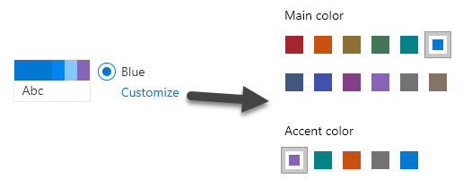
Modern pages in Office 365 let you “Change the Look” by providing a number of themes (sets of colors) that can be applied to your site (available from the gear menu in the top-right of the screen). The interface is pretty slick, it takes immediate effect, and the default options are so much better than those weird sets of themes from the classic days.

You can even do minor customization by clicking the customize link under your chosen theme. You can choose from one of the preselected primary colors and an accent color (designed to match your primary). Generally, these colors are great and have been selected to look good in most scenarios.

CustomizeColorsInUI

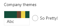
But I can’t pick the exact shade of red marketing has decreed that all things must be! Fortunately, you can create your own theme with the exact colors you want. You can even generate these using the UI Fabric Theme Generator. This is pretty easy, and Mikael Svenson wrote up a nice guide on doing this using PnP PowerShell.

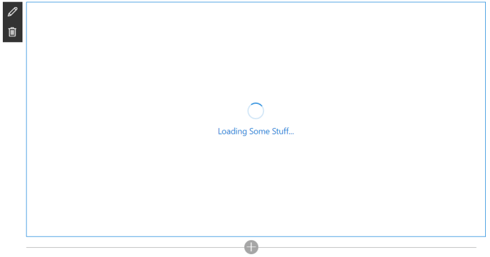
If you follow his guide, and the official documentation, you can easily get a nice custom theme. However, one annoying and not obvious part is setting the accent color. If you use the generated theme you might end up with something like this:

SoPrettyDefault

For this theme, I used the Theme Generator. By default, you specify the primary color (the big rectangle on the left in the theme) and then all the other colors are variations of it. However, you can click on any of the generated colors to override them. I did this as you can see above by overriding themeSecondary (2nd box in the theme) and themeTertiary (3rd box in the theme):

SoPrettyFabricPalette

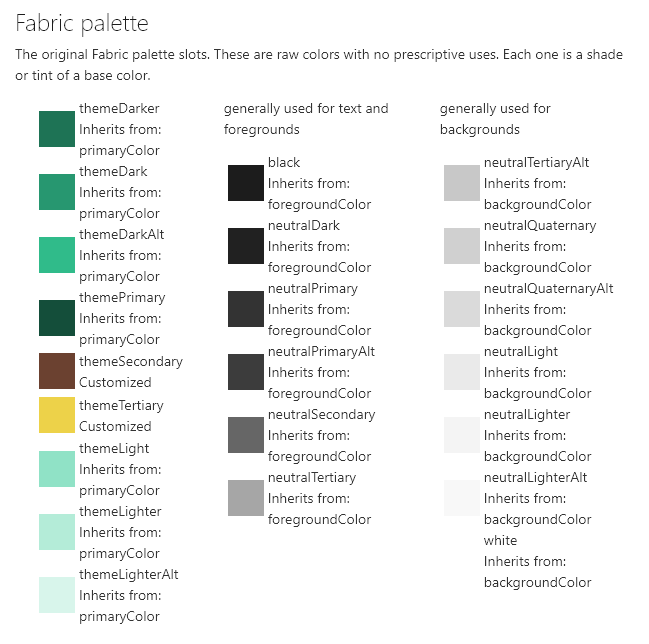
But what about that 4th box, the accent color? This wasn’t part of the generator and I couldn’t find it documented anywhere. You also don’t get the nice Customize link to let you set it. Instead, the accent color is set to the same as the primary color. This results in things like that weird square in the hero part being the exact color as your buttons, etc.:

StupidAccentFailure

Turns out setting this isn’t hard, it’s just not obvious. All you do is add an “accent” value to your generated list of colors like so:

@{
"themePrimary" = "#144e3a";
"themeLighterAlt" = "#d8f5eb";
"themeLighter" = "#b4ecd8";
"themeLight" = "#90e2c6";
"themeTertiary" = "#edd249";
"themeSecondary" = "#6b4130";
"themeDarkAlt" = "#30bb8a";
"themeDark" = "#279770";
"themeDarker" = "#1e7355";
"neutralLighterAlt" = "#f8f8f8";
"neutralLighter" = "#f4f4f4";
"neutralLight" = "#eaeaea";
"neutralQuaternaryAlt" = "#dadada";
"neutralQuaternary" = "#d0d0d0";
"neutralTertiaryAlt" = "#c8c8c8";
"neutralTertiary" = "#a6a6a6";
"neutralSecondary" = "#666666";
"neutralPrimaryAlt" = "#3c3c3c";
"neutralPrimary" = "#333333";
"neutralDark" = "#212121";
"black" = "#1c1c1c";
"white" = "#ffffff";
"primaryBackground" = "#ffffff";
"primaryText" = "#333333";
"bodyBackground" = "#ffffff";
"bodyText" = "#333333";
"disabledBackground" = "#f4f4f4";
"disabledText" = "#c8c8c8";
"accent" = "#B81344";
}

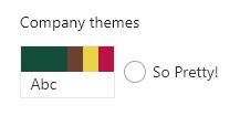
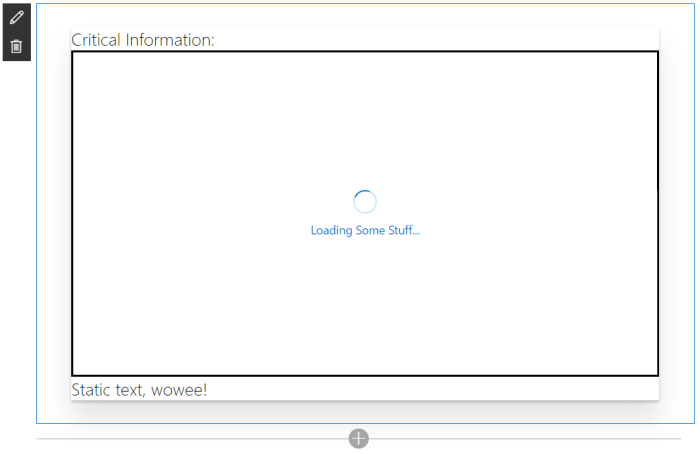
Adding that last line results in this:

SoPrettyWithAccent

WithAccent

Looks like there are a couple of other values you can add (and possibly more) such as “neutralSecondaryAlt”, “blackTranslucent40”, and “error”. Just like most of the entries, however, it’s not totally obvious when they’re used.

Now you no longer have an excuse not to set that sweet accent color to the boring shade dictated by your corporate style guide!

What’s new in Column Formatter 1.2?

Applies to: Office 365

Column Formatter 1.2 is now available! Column Formatter is the Easy editor for modern listview Column Formatting. It is a free webpart available from SharePoint PnP that brings the full power of VS Code editing while providing easy to use templates and browsers all within the browser – and now it’s even better!

Quick start

What’s new

Editor properties

Layout options

A height property was added in 1.1, and with 1.2 Column Formatter now supports full-width sections. With these changes you can dramatically increase the size of the editor on your page:

FullCanvasish

Line Numbers

You can optionally enable line numbers in the editor. This is especially helpful when working with longer formats:

PropertyLineNumbers

Indent Guides

The editor has always had indent guides on by default, but now you can disable them if you prefer a “cleaner” code surface:

PropertyIndentGuides

Mini Map

You can optionally enable the Mini Map navigation/preview in the editor. This is especially helpful for quickly scrolling through long formats:

MiniMap

Site column saving/loading

In addition to downloading, copying to the clipboard, saving to a document library, and applying directly to a list field, you can now save your format at the Site Column level. You can even have those changes pushed to all lists that are using your column!

ApplyToSiteColumn

You can, of course, also load site column formats as needed.

Wizards

With v1.2, Column Formatter now has 14 wizards/templates covering every column type:

WizardCoverage

New wizard: Donut

The new Donut wizard for number columns allows you to create dynamic donut or pie charts:

WizardDonut_Display

You can provide a custom range, size, colors, value display, and more.

This wizard is adapted from the number-piechart sample by Aaron Miao.

New wizard: Start Flow

The new Start Flow wizard makes it easy to create an inline button to launch a flow for a selected item:

WizardStartFlow_Options

Just provide the Flow id and then quickly customize the look and feel to make launching flows even easier for users.

This wizard is adapted from the generic-start-flow sample by Yannick Borghmans.

New template: Overdue Task

The new template Overdue Task takes the concept of highlighting a due date when it’s past due and demonstrates how to add an additional condition based on another column. In this case, the due date will only be highlighted if it’s both past due AND the status column isn’t Complete:

WizardOverdueTask

New wizard: Twitter Pic

The new wizard Twitter Pic makes displaying Twitter profile pictures super easy:

WizardTwitterPic_Options

Now it’s even easier to go bug Marc or write a Dear Vesa style tweet!

Localization

Column Formatter is now more accessible than ever!

Thanks to PooLP, Column Formatter is available in French. Magnifique!

French

Also, thanks to Thomas Goelles, we’ve got German as well. Glücksschweine!

German

Everything else

  • Theme options have moved to the property pane to clean up the editor and to ensure preferences are saved as expected.
  • Each wizard has it’s own documentation page.
  • In fact, there’s quite a bit more documentation in general.
  • New wizard controls made for reuse:
    • Standard colors dropdown (UI Fabric colors)
    • Icons dropdown (UI Fabric icons)
    • Spin button with suffix
  • Updated solution to use SPFx 1.4.1 and PnPJS
  • Several minor bugs were murdered
  • The Mini Map wizard was renamed to Tiny Map to avoid confusion with the new editor feature

Conclusion

If you’re interested in contributing, please do! If you find any bugs or have ideas or are lonely or have questions or whatever, please post in the Issues list – it is greatly appreciated!

Let me know what you think, thanks!

Thank you O365 Seattle!

Last week while attending the MVP Summit, I had the honor of presenting at the O365 Seattle meetup as part of their MVP night.

I presented O365 Column Formatting with Column Formatter. It seemed to resonate well and I think more people with take advantage of both O365 Column Formatting and the PnP Column Formatter.

O365SeattlePresentation
Photo by Tom Resing

There were other great presentations by Kevin Crossman and Seb Levert along with a great Q&A with a full panel of MVPs from across the globe.

MVP Panel
Photo by Tom Resing

It was a fantastic event and I was grateful to be a part of it. My only regret is that I was on an early flight out and had to skip SharePint. Thank you to the organizers, MVPs, and all the attendees!

Resources:

Stopping the Allow Debug Manifests Insanity

Applies to the SharePoint Framework

I recently followed the excellent SharePoint Framework (SPFx) Extensions tutorials and ran into an annoying issue. While working through the tutorial you will be correctly prompted to Allow Debug Manifests:

ext-app-debug-manifest-message

This allows JavaScript files being served from your localhost through the gulp serve command to be loaded on the page and your SPFx Extension to run. It’s really pretty awesome.

When I went to follow the next tutorial I found that despite my files being hosted in a SharePoint library turned CDN, I was still being prompted to Allow Debug Manifests.

I found that clicking Load debug scripts did nothing. This makes sense since I was not running gulp serve and so no local files would be loading. In fact, a check in the console didn’t show any file not found errors (as would be expected when debugging and gulp serve is not running so local JS files wouldn’t be found).

Strangely, if I chose Don’t load debug scripts my extension would run (the app had been added to the site and the assets loaded into the CDN)! So it was great that things were running, but really weird that I kept getting that prompt.

I uninstalled the app (Site Contents classic view and chose Remove) and even made sure it was deleted out of both stages of recycle bins. But I was still prompted on every modern page every time I visited them!

Aha! The custom action is still in place! So I used the Powershell PnP Cmdlet Remove-PnPCustomAction and ensured that there were no custom actions lingering anywhere. Still prompted! AHHHHHHHHHHHH!

Insanity

Finally, I posted it as an issue on the sp-dev-docs github repository and Pat Miller quickly provided the answer. Just add ?reset=true to the URL. You only need to do it once and it will clear everything up for the whole site. Apparently a debug cookie gets set sometimes and using this querystring will clear it out.

Setting Your SharePoint Framework WebPart Icon

Applies To: SharePoint Framework

When you create a SharePoint Framework (SPFx) webpart, you can customize the icon displayed in the Authoring Canvas Toolbox. Here’s what it looks like by default:

DefaultToolboxIcon
Default “Page” icon for your webpart

By default, the Office Fabric Page icon is used but this can and should be changed before packaging up your app. This makes sure your webpart doesn’t get lost among all the other webparts and is a very simple way to add a professional touch.

There are 2 ways to customize this icon. You can specify the name of an icon from the Office UI Fabric icons or you can provide a URL to a custom image.

Both of these are accomplished by editing your webpart’s manifest.json file and changing a simple property.

Office UI Fabric Icon

The easiest way to customize your icon is to simply specify the name of an icon class in the Office UI Fabric. You can find all the icons here: https://dev.office.com/fabric#/styles/icons

The Page icon shown above is doing exactly this. You can find this setting in the src/webparts/[YOURWEBPARTNAME]/[YOURWEBPARTNAME].manifest.json file in the preconfiguredEntries/officeFabricIconFontName property:

DefaultManifest

You can simply change this value from Page to any of the available icon names. Here’s what it looks like with a value of Emoji2:

SmileyToolboxIcon

Keep in mind that this value is CASE SENSITIVE. Also, note that changes to your manifest file (unlike your code files) will require you to stop the gulp serve command and do it again to have those changes reflected in the workbench.

If you inspect the actual toolbox you’ll see that the class name for the span is simply concatenating “ms-Icon–“ and the property value:

IconMarkup

This approach is super easy (just change the name) and ensures your webpart matches the official Office styles. But what if you want your own custom icon or logo?

Custom Icon

There is another property available called preconfiguredEntries/iconImageUrl and allows you to specify an image URL.

In order to use this property, create a 40x28px icon and upload it somewhere. For this example I’m just going to use my blog, but ideally you would include it in the webpart and then pull this value from your CDN.

You’ll also have to remove the preconfiguredEntries/officeFabricFontIconName property (or the iconImageUrl will be ignored). Here’s what my property looks like:

imageIconUrlManifest

Again, note that changes to your manifest file (unlike your code files) will require you to stop the gulp serve command and do it again to have those changes reflected in the workbench.

So here’s what it looks like in my local workbench:

iconImageUrlLocalWorkbench
Smells like a bug to me

What happened!?! For whatever reason, the local workbench continues to try and use a class icon as seen above (You can even see it sets a class of ms-Icon–undefined). However, the O365 workbench (/_layouts/15/workbench.aspx) works just fine:

iconImageUrl365Workbench

A quick inspection shows that the property value is just being inserted as the src attribute for an img tag.

This means (and I’m not suggesting you should) that if you happen to have a weird Christopher Walken eyeball gif:

WalkenEyes

You could simply resize it and get something like this:

AnimatedIcon
Why you make Vesa cry?

Documentation Discrepancies

Looking at the documentation for the manifest properties (json schema) you may see some misleading outdated information. (If you haven’t setup config file intellisense in VSCode, go do it now! Here’s an awesome guide.)

The description for the officeFabricIconFontName property looks like this:

officeFabricFontIconNameTooltip

It directs you to a site with 600+ icons many of which are present in the UI Fabric Icon styles. However, these names do NOT often match the actual class names and so cannot be reliably depended on to locate your icons (for example, the “Emoji2” icon we used in the sample above is listed as “smiley2” on the font site. It took going to the Office UI Fabric Icons page to find the correct class name).

The description for the iconImageUrl property looks like this:

iconImageUrlTooltip

You are instructed to use an icon that is exactly 38x38px. This is no longer accurate. You can use whatever size you want but it will be scaled to 40x28px.

Taking Advantage of the Loading Indicator in the SharePoint Framework

Applies to SharePoint Framework (SPFx)

When making SharePoint Framework (SPFx) client side webparts, it’s common to load some data from somewhere else and then display it on the screen. Even if that data is just coming from a local list these requests are performed asynchronously and you should indicate to a user that the operation may take some time. The easiest way to do this is through the loading indicator. Here’s how it looks by default:

Default Indicator

Did you know that you can easily show/hide this indicator and even customize the text? You can even decide where it’s displayed. WOWEE!

To show the Loading Indicator you can simply call this.context.statusRenderer.displayLoadingIndicator where the this refers to your BaseClientSideWebPart. This method takes 2 parameters.

The first parameter is the element where you want the loading indicator to be displayed. Typically if you are calling this from the main render method in your webpart, you’ll just specify this.domElement. However, you can easily specify any other element (see below for an example). Just be aware that the default styles are currently pretty large.

The second parameter is the text you want to display between Loading and

Loading indicator with some custom text:

Custom Text

this.context.statusRenderer.displayLoadingIndicator(this.domElement,"Some Stuff");

Loading indicator inside a custom element with custom text:

Custom Text - Inline

this.domElement.innerHTML = `
  <div class="${styles.loadingIndicator}">
    <div class="${styles.row}">
      <div class="${styles.container}">
        <span class="ms-font-xl">Critical Information:</span>
        <div class="${styles.specialbox}" id="myspecialbox">
        </div>
        <span class="ms-font-xl">Static text, wowee!</span>
      </div>
    </div>
  </div>`;

//Show the loading indicator inside an element
this.context.statusRenderer.displayLoadingIndicator(document.getElementById("myspecialbox"),"Some Stuff");

Hiding the Loading Indicator:

this.context.statusRenderer.clearLoadingIndicator(this.domElement);

You can find a sample project here: https://github.com/thechriskent/spfxLoadingIndicator

You can download the whole project and run it, or just take a look at the main webpart file.