Ramp up on SharePoint Framework Extensions at SPC 2019

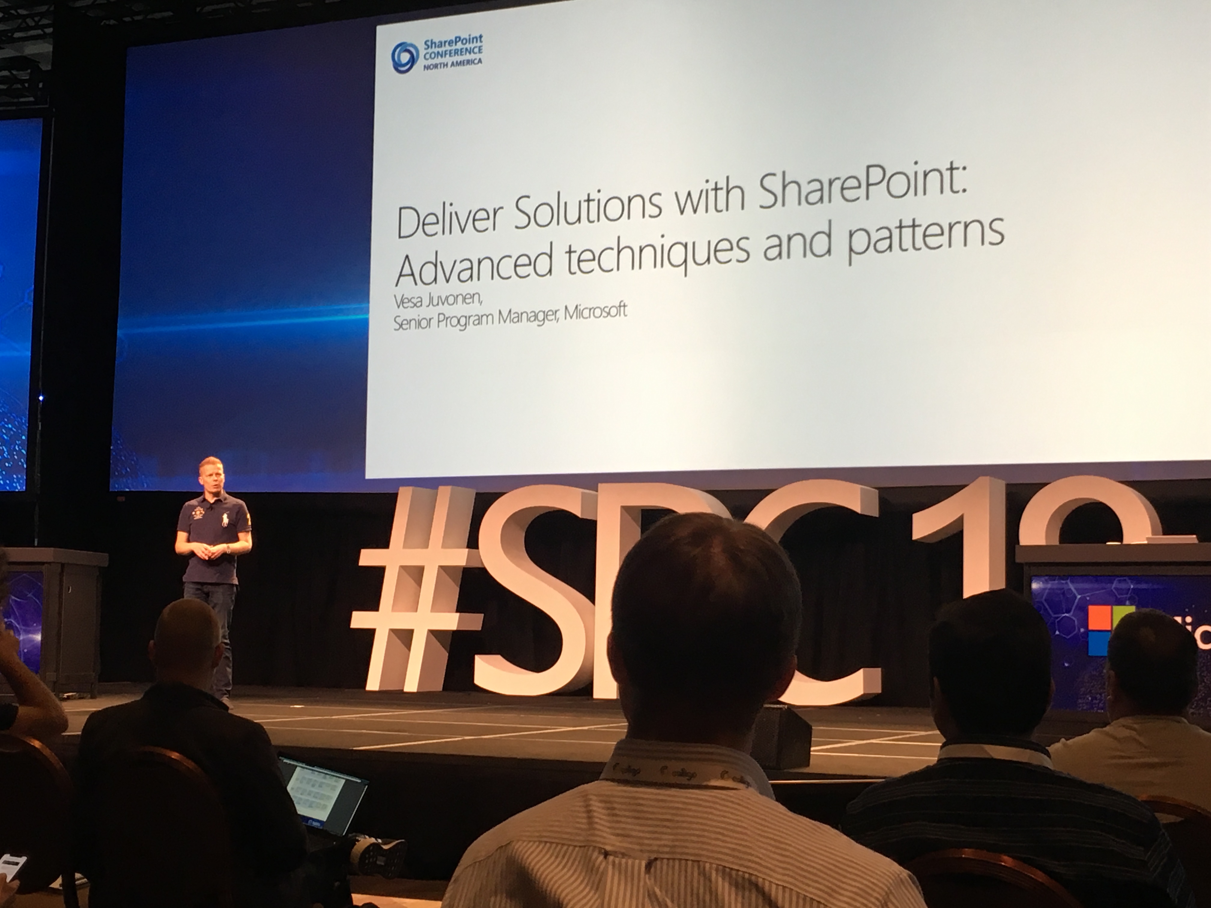
I will be speaking at the SharePoint Conference 2019 in Las Vegas, May 21st-23rd! I’m honored to have the opportunity to talk about two of my favorite SharePoint subjects: List Formatting AND SharePoint Framework (SPFx) Extensions!

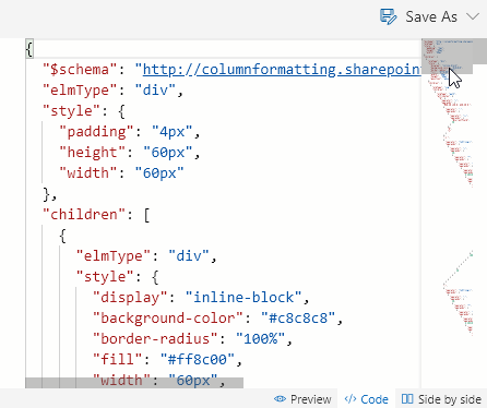
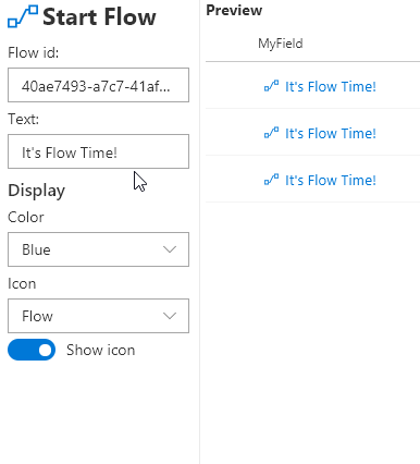
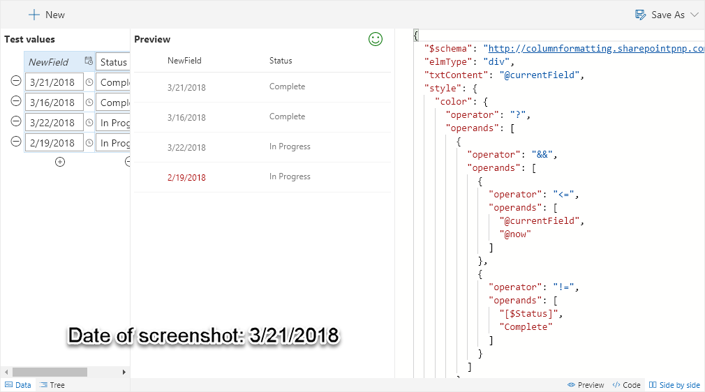
I’m, of course, super excited to be able to talk about List Formatting (see my previous post for details about that session). I am a huge proponent of using view and column formatting to customize your modern list views. There’s so much you can accomplish using simple JSON. But, I’m also fully aware of the limitations. When you hit those limitations, that’s the perfect time to use the SharePoint Framework.

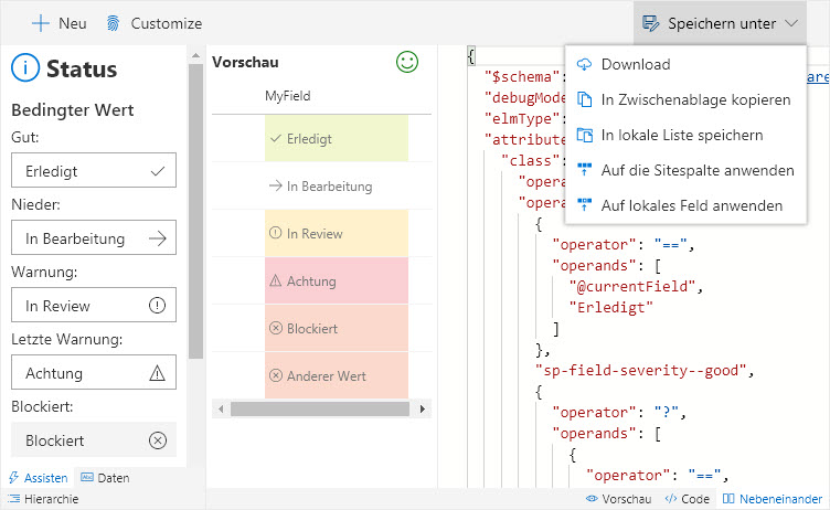
SharePoint Framework Extensions allow you to not only customize your fields (Field Customizers) to take them far beyond what Column Formatting can do, they provide extensibility and customization to modern pages using the same awesome tooling and APIs available for client-side web parts.

Need a custom footer or header? SPFx Extension. Need to provide toast notifications? SPFx Extension. Need to add a custom menu option to the action bar or the context menu? SPFx Extension. Need to add your own analytics to every page? SPFx Extension. Need to create custom field renderings that provide interactivity? SPFx Extension.

I love the SharePoint Framework. Client-side web parts are awesome and they get most of the attention (they also came out first) and I’ve created several. But, my favorite part of SPFx are Extensions. They are often easier to create than web parts (depending on how much interface you actually need), and they provide some really awesome deployment models that can really simplify global customizations across your tenant.

Understanding SharePoint Framework (SPFx) Extensions

SharePoint Framework Extensions are the replacement for Custom Actions, JS Link, and more for Modern Pages in Office 365 and SharePoint 2019. Whether you’ve started experimenting with the SharePoint Framework or not, come find out exactly what the Extensions are, when to use them, limitations, and advantages. SharePoint Framework Extensions are not only powerful and flexible tools to customize SharePoint, when it comes to modern pages, they’re the only way.

That’s the overview of my session on SPFx Extensions, but an even simpler description is just: SPFx Extensions 101.

At first glance it might seem strange that I would be presenting a session in the Business Apps track (List Formatting) and then this one within the SharePoint Development track. However, both sessions are about enabling you to customize modern pages.

Modern sites and pages are awesome and if you’re still using on-premises SharePoint 2016 or earlier or if your organization is still using a large number of classic sites, you may not even know just how awesome they are yet (another reason to attend SPC). While so many features that used to require customizations to either provide (or provide a more usable/functional implementation) are available and no longer require custom implementations, there are still cases where some minor tweaks are required. These can be anything from dynamic visualizations, to corporate logos and universal links on every page, to 3rd party integrations, to disclaimers for specific site classifications, and more.

Knowing when to use List Formatting vs SPFx Extensions and understanding what both are intended for is a key skill for not just developers, but power users, managers, architects, admins, and more. Both sessions can be attended independently, but I highly encourage you to attend both as they will work together to create a much fuller picture of modern site customization options and techniques.

SharePoint Framework extensions are available in both Office 365 and SharePoint 2019. If you are on either environment or suspect that you will be eventually, this will be an essential session to understand what can be accomplished and the tools needed to do so. This session will serve as both a comprehensive overview for admins, architects, and admins as well as provide implementation details (code/tooling/samples) for developers. I’m really looking forward to this session and hope you’ll join me!

If you still have questions or ideas, I’ll also be helping with the Patterns and Practices (PnP) booth and will be happy to talk with you further! Just come find me. We can just talk, or you can bring your laptop and we’ll take a look at your code together!
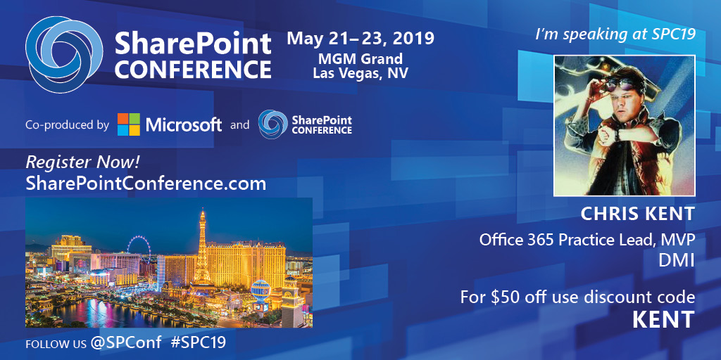
Register!

The SharePoint Conference 2018 was fantastic. It’s amazing to be in the presence of so many SharePoint (and related tech like PowerApps, Flow, OneDrive, Yammer, Teams, and more) experts and have them be so approachable. If you are a SharePoint professional (user, admin, manager, developer, etc.) then you should definitely attend SharePoint Conference 2019. Go ahead and register now. You can even save $50 by using the discount code KENT!

See and hear from the experts directly!

Whether you attend my sessions or not, I hope you’ll come and say hello. In the meantime, feel free to reach out on this blog, twitter, or attend one of the PnP Calls!

What’s new in Column Formatter 1.2?

Applies to: Office 365

Column Formatter 1.2 is now available! Column Formatter is the Easy editor for modern listview Column Formatting. It is a free webpart available from SharePoint PnP that brings the full power of VS Code editing while providing easy to use templates and browsers all within the browser – and now it’s even better!

Quick start

What’s new

Editor properties

Layout options

A height property was added in 1.1, and with 1.2 Column Formatter now supports full-width sections. With these changes you can dramatically increase the size of the editor on your page:

FullCanvasish

Line Numbers

You can optionally enable line numbers in the editor. This is especially helpful when working with longer formats:

PropertyLineNumbers

Indent Guides

The editor has always had indent guides on by default, but now you can disable them if you prefer a “cleaner” code surface:

PropertyIndentGuides

Mini Map

You can optionally enable the Mini Map navigation/preview in the editor. This is especially helpful for quickly scrolling through long formats:

MiniMap

Site column saving/loading

In addition to downloading, copying to the clipboard, saving to a document library, and applying directly to a list field, you can now save your format at the Site Column level. You can even have those changes pushed to all lists that are using your column!

ApplyToSiteColumn

You can, of course, also load site column formats as needed.

Wizards

With v1.2, Column Formatter now has 14 wizards/templates covering every column type:

WizardCoverage

New wizard: Donut

The new Donut wizard for number columns allows you to create dynamic donut or pie charts:

WizardDonut_Display

You can provide a custom range, size, colors, value display, and more.

This wizard is adapted from the number-piechart sample by Aaron Miao.

New wizard: Start Flow

The new Start Flow wizard makes it easy to create an inline button to launch a flow for a selected item:

WizardStartFlow_Options

Just provide the Flow id and then quickly customize the look and feel to make launching flows even easier for users.

This wizard is adapted from the generic-start-flow sample by Yannick Borghmans.

New template: Overdue Task

The new template Overdue Task takes the concept of highlighting a due date when it’s past due and demonstrates how to add an additional condition based on another column. In this case, the due date will only be highlighted if it’s both past due AND the status column isn’t Complete:

WizardOverdueTask

New wizard: Twitter Pic

The new wizard Twitter Pic makes displaying Twitter profile pictures super easy:

WizardTwitterPic_Options

Now it’s even easier to go bug Marc or write a Dear Vesa style tweet!

Localization

Column Formatter is now more accessible than ever!

Thanks to PooLP, Column Formatter is available in French. Magnifique!

French

Also, thanks to Thomas Goelles, we’ve got German as well. Glücksschweine!

German

Everything else

  • Theme options have moved to the property pane to clean up the editor and to ensure preferences are saved as expected.
  • Each wizard has it’s own documentation page.
  • In fact, there’s quite a bit more documentation in general.
  • New wizard controls made for reuse:
    • Standard colors dropdown (UI Fabric colors)
    • Icons dropdown (UI Fabric icons)
    • Spin button with suffix
  • Updated solution to use SPFx 1.4.1 and PnPJS
  • Several minor bugs were murdered
  • The Mini Map wizard was renamed to Tiny Map to avoid confusion with the new editor feature

Conclusion

If you’re interested in contributing, please do! If you find any bugs or have ideas or are lonely or have questions or whatever, please post in the Issues list – it is greatly appreciated!

Let me know what you think, thanks!

SPFx Extensions List Item Clone Demo

I was fortunate enough to present in the PnP Monthly Community Call yesterday. I demoed a sample I contributed to the SharePoint Framework Extensions sample repository called JS-Command-Clone. The sample is a ListView Command Set SPFx Extension that enables the creation of duplicate list items and utilizes PnP JS Core.

Ryan Schouten has provided a great summary and write-up of the full call. You can also watch the recording directly on YouTube. Of course, you can even watch it here where I’ve directly queued up my demo:

Please feel free to reach out to me with any questions or other feedback. Thanks!

Here are some related links:

SPFx Extension Toastr Notifications Demo

Applies To: SharePoint Framework

I had the honor of taking part in the PnP JS SIG call (Patterns and Practices JavaScript Special Interest Group) earlier today. On the call I was able to demo a sample I contributed for the SharePoint Framework Extensions called jQuery-Application-Toastr.

You can find a great write-up of the call on the Tech Community. You can also just watch the video directly on YouTube. You can even watch it right here, conveniently queued up to my demo, wowee!

Here are some related links:

jQuery Types Errors with the SharePoint Framework (and how to fix them)

Applies To: SharePoint Framework

The other day I was creating a SharePoint Framework solution and I decided to reference jQuery (cause I’m hip and modern). So, I created a webpart with no framework, added jQuery from a CDN to the externals section of my config/config.json, installed the jQuery types, and then slapped an import statement on my code. When I typed gulp serve, however, all I got was sadness. Specifically this sadness:

jQuery Types Errors

It’s tough to screenshot, but that’s 1000+ errors all related to the @types/jQuery node module. Most were some variation of:

Error – typescript – node_modules\@types\jQuery\index.d.ts(40,45): error TS1005: ‘,’ expected.

Why did this happen? I’ve literally only written one import statement! After some investigation, I found the cause of the issue and, fortunately, a solution.

The Problem

The issue can be found in the version of TypeScript included in the Yeoman Generator for the SharePoint Framework (currently 1.1.1). You can find the version in use by typing this command:

npm list typescript versions

This will show you the version installed in the local solution. The result will look something like this:

SPFx typescript

So, the SharePoint Framework is using TypeScript 2.2.2. What’s the big deal?

Well, if you get as desperate as I did, you might take a look at the barrel for @types/jquery (index.d.ts) where you’ll find a comment stating it requires TypeScript Version 2.3:

jQuery TypeScript.PNG

This mismatch is causing all the build errors for this dependency! ARG!!

The Solution

This fix is actually pretty simple once you know the problem. All you need to do is use a version of the @types/jQuery package that supports TypeScript 2.2.2.

The first step is to remove the current version:

npm uninstall @types/jquery

Then install a previous version compatible with TypeScript 2.2.2:

npm install @types/jquery@2.0.48 --save-dev

Now when you run gulp serve everything should work as expected!


Other Stuff

If you’re still having trouble, or you found this article while trying to figure out how to reference jQuery (or some other library), here’s some important details I skipped over previously:

Referencing jQuery

To reference an external library, you adjust the externals section of your config/config.json file. You can do this the easy way if the code is a Module or a slightly less easy way if it isn’t. You can determine which your external library is by using this helpful tool: SPFx Script Check

jQuery is a Module so you can just do this:

jquery config

Importing jQuery

To use jQuery in your code, just add the following import statement near the top of your file:

import * as $ from 'jQuery';


Extending SharePoint Framework Build Tasks

Applies To: SharePoint Framework

The SharePoint Framework (SPFx) uses gulp as the task runner that builds your solution. You can find out what tasks are available by typing gulp --tasks in the console in the root of your solution. But what if you want to extend these tasks?

There’s an excellent tutorial by Chaks Chandran that demonstrates how to do this: Integrate gulp tasks in SharePoint Framework toolchain. You can find the corresponding sample here: js-extend-gulp.

In this post, I’m going to demonstrate a few items that weren’t addressed in that tutorial including:

  • Checking for a custom parameter
  • Ending your task without a stream and not killing the pipeline
  • Getting a value from one of the Config files
  • Copying a solution file to another location

What Are We Building

I previously discussed how to specify your SharePoint Framework App Icon and in that post I noted that you should not only specify your icon in the solution package itself, but you should make it available outside as well so that you can set the App Catalog Icon URL property.

The best place to host this image is with the rest of your assets in your CDN. So, wouldn’t it be nice if the App Icon image file was copied to the dist folder when the rest of your solution was bundled? Let’s do it!

Basic Rigging

If your familiar with gulp you know that generally gulp tasks are defined in the gulpfile.js file in the root of your solution. More likely, however, you’re not familiar with gulp and don’t really know what a gulp task is for outside of the idea that they do things when you type them in the console.

A gulp task is just a JavaScript function that gets registered with a name (the command) and you can make it do whatever you want. In SPFx, however, all the gulp tasks are defined deep within the node_modules/@microsoft/gulp* folders. You don’t need to do anything with these (although they are worth checking out if your curious how they’re doing all this magic).

To jump in on the fun, you’ll need to use the build object and either rig your task into the pipeline or register it as a standalone task. Again, more detail can be found in the official tutorial. For our purposes, we don’t want a standalone task that we would have to call separately. We want our task to be executed along with the build.

Defining the Task

Open up your gulpfile.js file. Before the build.initialze(gulp) command add your sub task definition:

'use strict';

const gulp = require('gulp');
const build = require('@microsoft/sp-build-web');

let appIconToBundle = build.subTask('app-icon-to-bundle', function(gulp, buildOptions, done) {
	this.log('Wowee!');
});

build.initialize(gulp);

In line 6, we’re simply calling the build.subTask function provided by Microsoft to register our function with the name app-icon-to-bundle (there’s nothing special about this name, just following the same over-hypenation as the default sub tasks).

This doesn’t actually do anything yet because we’ve neither registered it as a standalone task or integrated it into the build pipeline.

Rigging the Task to the Build

You can “rig” your task in 3 spots: PreBuild, PostTypescript, and PostBuild. You can think of these as specifying an event handler and the handler is your sub task. We’re going to add ours to the end of the build by adding line 10 below:

'use strict';

const gulp = require('gulp');
const build = require('@microsoft/sp-build-web');

let appIconToBundle = build.subTask('app-icon-to-bundle', function(gulp, buildOptions, done) {
	this.log('Wowee!');
});

build.rig.addPostBuildTask(appIconToBundle);

build.initialize(gulp);

Now if we execute one of the building tasks (like “bundle” for instance) you’ll see our amazing task getting executed:

Basic Run

Properly Ending Your Task

Some of you may have noticed that there is a message about terminating early. In fact, if you run the gulp serve command you may be surprised to see it stops at the same spot and does none of the actual fanciness of serving your solution. WHAT DID YOU DO!?

The easiest way to fix this is by returning a stream and that’s exactly what is demonstrated in the official sample. But what about when you aren’t doing that? For our task we want to check some things and only proceed when it makes sense. This is hard to do in the context of a stream. The other option is to simply take advantage of the done callback parameter you are provided:

let appIconToBundle = build.subTask('app-icon-to-bundle', function(gulp, buildOptions, done) {
	this.log('Wowee!');
	done();
});

Now when you run the standard tasks you’ll still see our message but the pipeline doesn’t come to a screeching halt. Wowee, indeed.

Checking for a Custom Parameter

For our task, we only want to move the icon file if the --bundleicon parameter is specified. This is a custom parameter and detecting it is surprisingly easy:

let appIconToBundle = build.subTask('app-icon-to-bundle', function(gulp, buildOptions, done) {
	var bundleIcon = (process.argv.indexOf('--bundleicon') !== -1);
	this.log(bundleIcon ? 'Bundling!' : 'Nope!');
	done();
});

In line 7, we simply check for the presence of our custom parameter in the arguments and set a Boolean value. In line 8, we change the message based on the parameter’s inclusion. This could “easily” be extended to actually pull in values after your parameter.

To test this, simply run gulp bundle and then gulp bundle --bundleicon to see the 2 different messages. Our custom parameter works!

Getting a Value From One of the Config Files

Now we know when to actually move the icon based on the parameter, but how do we know where the icon actually is? The App Icon is an image file stored somewhere in the sharepoint folder. It is specified as the solution.iconPath property in the config/package-solution.json file.  More details here: SharePoint Framework App Icon

So, how do we get a value from one of the config files? First, we’ll need 2 helper objects. These objects are already included in your node_modules folder since they are used by the Microsoft build tasks. To gain access to them simply add some require statements below the existing require statements:

const gulp = require('gulp');
const build = require('@microsoft/sp-build-web');

const path = require('path');
const fs = require('fs');

let appIconToBundle = build.subTask('app-icon-to-bundle', function(gulp, buildOptions, done) {
...

Specifically line 6 and 7 above add the path and fs objects which make it easy to work with file paths and reading files. Here’s how we use them:

let appIconToBundle = build.subTask('app-icon-to-bundle', function(gulp, buildOptions, done) {
	var bundleIcon = (process.argv.indexOf('--bundleicon') !== -1);

	if(bundleIcon){
		//Get the config file path
		var psConfigPath = path.join(process.cwd(), 'config', "package-solution.json");

		//read the config file into a JSON object
		var psConfig = undefined;
        try {
            var content = fs.readFileSync(psConfigPath, 'utf8');
            psConfig = JSON.parse(content);
        }
        catch (e) { }

		//Verify an iconPath has been provided
        if(psConfig && psConfig.solution && psConfig.solution.iconPath){
			this.log('./sharepoint/' + psConfig.solution.iconPath)
		}
	}

	done();
});

In line 14 we use the path object to get an absolute path to the package-solution.json config file. Then in line 19 we use the fs object to read the text of the config file. Since the config files are all JSON files, we can simply parse it into an object in line 20.

In line 25 we verify that the property was actually set and has a value. If so, we write it to the log in line 26. We are adding the ‘./sharepoint/’ because the iconPath property is relative to the sharepoint folder in the root of our project.

Copying the App Icon to the Dist Folder

Copying the file to the dist folder can be done using standard gulp:

        if(psConfig && psConfig.solution && psConfig.solution.iconPath){
			gulp.src('./sharepoint/' + psConfig.solution.iconPath)
				.pipe(gulp.dest('./dist'));
		}

The Final Solution

Here’s the final gulpfile.js:

'use strict';

const gulp = require('gulp');
const build = require('@microsoft/sp-build-web');

const path = require('path');
const fs = require('fs');

//When the --bundleicon parameter is used, copies the App Icon image file (when specified) to the dist folder
let appIconToBundle = build.subTask('app-icon-to-bundle', function(gulp, buildOptions, done) {
	//Look for the --bundleicon parameter
	var bundleIcon = (process.argv.indexOf('--bundleicon') !== -1);

	if(bundleIcon){
		//Get the config file path
		var psConfigPath = path.join(process.cwd(), 'config', "package-solution.json");

		//read the config file into a JSON object
		var psConfig = undefined;
        try {
            var content = fs.readFileSync(psConfigPath, 'utf8');
            psConfig = JSON.parse(content);
        }
        catch (e) { }

		//Verify an iconPath has been provided
        if(psConfig && psConfig.solution && psConfig.solution.iconPath){
			//Copy the icon to the assets destination
			gulp.src('./sharepoint/' + psConfig.solution.iconPath)
				.pipe(gulp.dest('./dist'));
		}
	}

	done();
});

build.rig.addPostBuildTask(appIconToBundle);

build.initialize(gulp);

You can find the full solution here: https://github.com/thechriskent/spfx-AppIcon

SharePoint Framework App Icon

Applies To: SharePoint Framework

Recently, I showed you how to set your WebPart Icon (the image used in the authoring canvas toolbox). But there is another image, called the App Icon that is also important to set. This applies to both client-side webparts and SPFx extension apps.

The concept of an AppIcon is nothing new. When creating an Add-In, you could simply specify the icon property of the AppManifest (although it wasn’t actually stored in this file) and the appropriate rels and feature manifest files would be added to your app package. This is the image that was then used in the Site Contents view of your site.

The SharePoint Framework (SPFx) supports this same type of property. Although, as we’ll see, it’s of limited use on modern pages. Regardless, it is still a nice way to add a professional touch to your app.

Classic Site Contents
Look at that sweet cactus! Professionalism!!

Specifying an SPFx app App Icon

Create a suitable image file. App Icons must be 96×96 px. It’s also good practice to make them PNG files with only a white image on a transparent background. This allows them to match the native app icons and to maintain consistency with a site’s theme.

Super Easy Icon Generation

Here’s a terrible way to generate one using PowerPoint (everyone’s favorite image editor). Use the new Icons button on the Insert tab in the ribbon and choose one of the many beautiful icons:

PowerPoint Icons

Set the Graphics Fill color to white and set the size to 2.6″ (at least that’s the size that seems to equate to 96×96 px). Then right-click on the image object and choose Save as Picture…:

PowerPoint Save

Navigate to your SPFx solution folder. In the root folder, select the sharepoint folder (if it doesn’t exist, add it). Then save the image somewhere in there as a PNG file. I created a folder called Images and saved it in there:

Icon in VSCode

Configuring SPFx to Use Your AppIcon

In your SPFx solution, open the config/package-solution.json file. Under solution, add the iconPath property and give it a relative path within your sharepoint folder:

iconPath Property

From your console in your project directory, run gulp bundle. When that finishes, run gulp package-solution.

The bundle task has nothing to do with what we’re doing except to point out that the image does not get copied to your dist folder along with your other assets (this will be important later).

Rather, if you look in your sharepoint/solution folder you’ll find your sppkg file. In the accompanying debug folder you can see the contents of your sppkg file and you’ll see your AppIcon and all the rels and feature manifest files were added as expected.

Navigate to your app catalog and upload your sppkg file into the Apps for SharePoint library. Click the Deploy button when prompted.

You’ll find that when you add your app to a site that the tiny icon shown on the Modern version of the Site Contents page does not use your fancy new icon. Clicking for details of the app shows the generic app icon as well. However, switching to classic view for the site contents page does show your icon. Success!?

Providing an App Catalog Icon

Just like with Add-Ins, you’ll also need to provide a separate file for your app catalog icon. This can be done by copying your icon file to the same CDN location (or any URL really) where your bundle assets are going to go.

You then edit the properties of your app in the app catalog and specify that URL as the Icon URL property:

AppCatalog Icon

Now your custom icon will be used on the App Details page as well as within classic views:

App Profile

Conclusion

For modern pages, the SPFx iconPath (AppIcon) property has little to no effect. However, while the option to switch to Classic View still exists and especially while there is no easy option to switch back to the modern view (delete the cookie), providing both the app catalog icon and the AppIcon within your app is the best way to ensure your SPFx app looks professional and consistent to end users.

Stopping the Allow Debug Manifests Insanity

Applies to the SharePoint Framework

I recently followed the excellent SharePoint Framework (SPFx) Extensions tutorials and ran into an annoying issue. While working through the tutorial you will be correctly prompted to Allow Debug Manifests:

ext-app-debug-manifest-message

This allows JavaScript files being served from your localhost through the gulp serve command to be loaded on the page and your SPFx Extension to run. It’s really pretty awesome.

When I went to follow the next tutorial I found that despite my files being hosted in a SharePoint library turned CDN, I was still being prompted to Allow Debug Manifests.

I found that clicking Load debug scripts did nothing. This makes sense since I was not running gulp serve and so no local files would be loading. In fact, a check in the console didn’t show any file not found errors (as would be expected when debugging and gulp serve is not running so local JS files wouldn’t be found).

Strangely, if I chose Don’t load debug scripts my extension would run (the app had been added to the site and the assets loaded into the CDN)! So it was great that things were running, but really weird that I kept getting that prompt.

I uninstalled the app (Site Contents classic view and chose Remove) and even made sure it was deleted out of both stages of recycle bins. But I was still prompted on every modern page every time I visited them!

Aha! The custom action is still in place! So I used the Powershell PnP Cmdlet Remove-PnPCustomAction and ensured that there were no custom actions lingering anywhere. Still prompted! AHHHHHHHHHHHH!

Insanity

Finally, I posted it as an issue on the sp-dev-docs github repository and Pat Miller quickly provided the answer. Just add ?reset=true to the URL. You only need to do it once and it will clear everything up for the whole site. Apparently a debug cookie gets set sometimes and using this querystring will clear it out.

Fixing Dependency issues with the SPFx Generator

Applies to the SharePoint Framework

I’ve been playing with the new SharePoint Framework (SPFx) Extensions lately and ran into strange error when attempting to create a new one. I ran the yo @microsoft/sharepoint command and filled out the prompts to create a new Field Customizer extension. Things looked like they were working for about 15 seconds when I got this sadness:

Yeoman Error
“Congratulations”

Here’s the relevant text of the error:

No compatible version found: @microsoft/decorators@~1.0.1
Valid install targets:
1.1.0, 1.0.0, 0.2.1, 0.0.0
This is most likely not a problem with npm itself.
In most cases you or one of your dependencies are requesting
a package version that doesn't exist.

It was specified as a dependency of '@microsoft/sp-application-base'

So what happened? I could use this generator just a few days ago!

The first thing you should do when troubleshooting issues with the generator is check your version vs the available versions.

To check your version just use the following npm command:

npm list -g @microsoft/generator-sharepoint


When I did, I found I had version 1.1.0 so I checked what versions were available:

npm view @microsoft/generator-sharepoint versions


Sure enough, the latest version was 1.1.1 so I updated my generator:

npm install -g @microsoft/generator-sharepoint


Now running the generator again worked!

You can find more details about this particular issue on the sp-dev-docs Github repo issues list.

Setting Your SharePoint Framework WebPart Icon

Applies To: SharePoint Framework

When you create a SharePoint Framework (SPFx) webpart, you can customize the icon displayed in the Authoring Canvas Toolbox. Here’s what it looks like by default:

DefaultToolboxIcon
Default “Page” icon for your webpart

By default, the Office Fabric Page icon is used but this can and should be changed before packaging up your app. This makes sure your webpart doesn’t get lost among all the other webparts and is a very simple way to add a professional touch.

There are 2 ways to customize this icon. You can specify the name of an icon from the Office UI Fabric icons or you can provide a URL to a custom image.

Both of these are accomplished by editing your webpart’s manifest.json file and changing a simple property.

Office UI Fabric Icon

The easiest way to customize your icon is to simply specify the name of an icon class in the Office UI Fabric. You can find all the icons here: https://dev.office.com/fabric#/styles/icons

The Page icon shown above is doing exactly this. You can find this setting in the src/webparts/[YOURWEBPARTNAME]/[YOURWEBPARTNAME].manifest.json file in the preconfiguredEntries/officeFabricIconFontName property:

DefaultManifest

You can simply change this value from Page to any of the available icon names. Here’s what it looks like with a value of Emoji2:

SmileyToolboxIcon

Keep in mind that this value is CASE SENSITIVE. Also, note that changes to your manifest file (unlike your code files) will require you to stop the gulp serve command and do it again to have those changes reflected in the workbench.

If you inspect the actual toolbox you’ll see that the class name for the span is simply concatenating “ms-Icon–“ and the property value:

IconMarkup

This approach is super easy (just change the name) and ensures your webpart matches the official Office styles. But what if you want your own custom icon or logo?

Custom Icon

There is another property available called preconfiguredEntries/iconImageUrl and allows you to specify an image URL.

In order to use this property, create a 40x28px icon and upload it somewhere. For this example I’m just going to use my blog, but ideally you would include it in the webpart and then pull this value from your CDN.

You’ll also have to remove the preconfiguredEntries/officeFabricFontIconName property (or the iconImageUrl will be ignored). Here’s what my property looks like:

imageIconUrlManifest

Again, note that changes to your manifest file (unlike your code files) will require you to stop the gulp serve command and do it again to have those changes reflected in the workbench.

So here’s what it looks like in my local workbench:

iconImageUrlLocalWorkbench
Smells like a bug to me

What happened!?! For whatever reason, the local workbench continues to try and use a class icon as seen above (You can even see it sets a class of ms-Icon–undefined). However, the O365 workbench (/_layouts/15/workbench.aspx) works just fine:

iconImageUrl365Workbench

A quick inspection shows that the property value is just being inserted as the src attribute for an img tag.

This means (and I’m not suggesting you should) that if you happen to have a weird Christopher Walken eyeball gif:

WalkenEyes

You could simply resize it and get something like this:

AnimatedIcon
Why you make Vesa cry?

Documentation Discrepancies

Looking at the documentation for the manifest properties (json schema) you may see some misleading outdated information. (If you haven’t setup config file intellisense in VSCode, go do it now! Here’s an awesome guide.)

The description for the officeFabricIconFontName property looks like this:

officeFabricFontIconNameTooltip

It directs you to a site with 600+ icons many of which are present in the UI Fabric Icon styles. However, these names do NOT often match the actual class names and so cannot be reliably depended on to locate your icons (for example, the “Emoji2” icon we used in the sample above is listed as “smiley2” on the font site. It took going to the Office UI Fabric Icons page to find the correct class name).

The description for the iconImageUrl property looks like this:

iconImageUrlTooltip

You are instructed to use an icon that is exactly 38x38px. This is no longer accurate. You can use whatever size you want but it will be scaled to 40x28px.