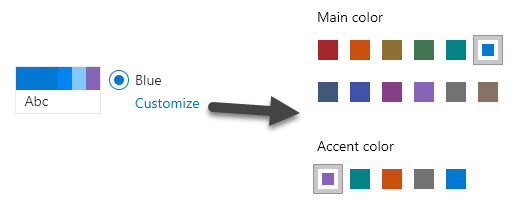
Modern pages in Office 365 let you “Change the Look” by providing a number of themes (sets of colors) that can be applied to your site (available from the gear menu in the top-right of the screen). The interface is pretty slick, it takes immediate effect, and the default options are so much better than those weird sets of themes from the classic days.
You can even do minor customization by clicking the customize link under your chosen theme. You can choose from one of the preselected primary colors and an accent color (designed to match your primary). Generally, these colors are great and have been selected to look good in most scenarios.
But I can’t pick the exact shade of red marketing has decreed that all things must be! Fortunately, you can create your own theme with the exact colors you want. You can even generate these using the UI Fabric Theme Generator. This is pretty easy, and Mikael Svenson wrote up a nice guide on doing this using PnP PowerShell.
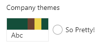
If you follow his guide, and the official documentation, you can easily get a nice custom theme. However, one annoying and not obvious part is setting the accent color. If you use the generated theme you might end up with something like this:
For this theme, I used the Theme Generator. By default, you specify the primary color (the big rectangle on the left in the theme) and then all the other colors are variations of it. However, you can click on any of the generated colors to override them. I did this as you can see above by overriding themeSecondary (2nd box in the theme) and themeTertiary (3rd box in the theme):
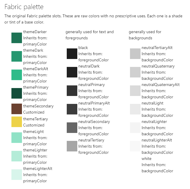
But what about that 4th box, the accent color? This wasn’t part of the generator and I couldn’t find it documented anywhere. You also don’t get the nice Customize link to let you set it. Instead, the accent color is set to the same as the primary color. This results in things like that weird square in the hero part being the exact color as your buttons, etc.:

Turns out setting this isn’t hard, it’s just not obvious. All you do is add an “accent” value to your generated list of colors like so:
@{
"themePrimary" = "#144e3a";
"themeLighterAlt" = "#d8f5eb";
"themeLighter" = "#b4ecd8";
"themeLight" = "#90e2c6";
"themeTertiary" = "#edd249";
"themeSecondary" = "#6b4130";
"themeDarkAlt" = "#30bb8a";
"themeDark" = "#279770";
"themeDarker" = "#1e7355";
"neutralLighterAlt" = "#f8f8f8";
"neutralLighter" = "#f4f4f4";
"neutralLight" = "#eaeaea";
"neutralQuaternaryAlt" = "#dadada";
"neutralQuaternary" = "#d0d0d0";
"neutralTertiaryAlt" = "#c8c8c8";
"neutralTertiary" = "#a6a6a6";
"neutralSecondary" = "#666666";
"neutralPrimaryAlt" = "#3c3c3c";
"neutralPrimary" = "#333333";
"neutralDark" = "#212121";
"black" = "#1c1c1c";
"white" = "#ffffff";
"primaryBackground" = "#ffffff";
"primaryText" = "#333333";
"bodyBackground" = "#ffffff";
"bodyText" = "#333333";
"disabledBackground" = "#f4f4f4";
"disabledText" = "#c8c8c8";
"accent" = "#B81344";
}
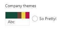
Adding that last line results in this:

Looks like there are a couple of other values you can add (and possibly more) such as “neutralSecondaryAlt”, “blackTranslucent40”, and “error”. Just like most of the entries, however, it’s not totally obvious when they’re used.
Now you no longer have an excuse not to set that sweet accent color to the boring shade dictated by your corporate style guide!