Extending csrShim for Custom XML (JSLink)

Applies to SharePoint 2013, 2016, Office 365

Introduction

csrShim can be used to enable Client Side Rendering (CSR) with a variety of XML Feeds when used with the XMLViewer web part (RSS, RDF, Atom, and Atom2). Additionally, csrShim provides easy extension points to map Custom XML into the ContextInfo (ctx) object allowing developers to use CSR (JSLink) capabilities with custom XML formats.

This is not a comprehensive guide to the XMLViewer web part or csrShim but provides the information necessary to extend csrShim. For additional details about how to use csrShim see the csrShim Documentation on GitHub. For additional details about using csrShim with the XMLViewer web part see the Client Side Rendering (JSLink) with XML Feeds tutorial.

How to Get the Code

The example created using the steps in this document can be found in full as part of the csrShim repository:
https://github.com/thechriskent/csrShim/tree/master/Examples/Custom%20XML

The full project can be found on GitHub:
https://github.com/thechriskent/csrShim

You can download or clone the repository directly from that site. You can also view the code directly on the site.

Background

Standard Client Side Rendering

Client Side Rendering (CSR), often referred to as JSLink, is a technology introduced with SharePoint 2013 that provides extension points to use JavaScript to render SharePoint data. CSR continues to be supported in SharePoint 2016 and Office 365.

Additional information about how to use standard client side rendering with list views can be found in my earlier List View Client Side Rendering (JSLink) Primer series.

SharePoint does not support using standard CSR with XMLViewers (No JS Link property is defined). However, csrShim exposes parameters that will enable this functionality including the same set of event callbacks and templates described in the above guide.

csrShim

csrShim is an open source solution that fills the gap of many of the limitations presented by the OOTB client side rendering.

csrShim is an XSLT solution that can be used to:

csrShim is available through GitHub at:
https://github.com/thechriskent/csrShim

Getting Started

In the following example, we will be targeting on premise SharePoint 2013. We will be using a publicly available XML feed from the City of New York providing statistics about the average daily population of inmates year over year. We will be taking advantage of csrShim’s JSLink parameter’s multiple file option to also load Google’s charting API.

csrShim Setup

To use csrShim, an XMLViewer web part only needs the csrShim.xsl stylesheet from the csrShim project. However, an XSL Wrapper will also be required to pass parameters.

Upload the csrShim.xsl stylesheet to a library on your site (The Style Library of the root site of a site collection is a great spot for this!).

XSL Wrapper

The XMLViewer webpart does not expose XSLT Parameter properties as do the XSLTListView and Content by Query web parts. There are no ParameterBindings elements to be found in their definition.

In order to pass parameters to csrShim, an XSL Wrapper stylesheet is required. This is a very simple file (A sample wrapper is included in the csrShim Examples folder). Here is what ours will look like:

<?xml version="1.0" encoding="utf-8"?>
<xsl:stylesheet xmlns:x="http://www.w3.org/2001/XMLSchema"
   xmlns:d="http://schemas.microsoft.com/sharepoint/dsp"
   version="1.0"
   exclude-result-prefixes="xsl msxsl x d ddwrt asp SharePoint ddwrt2 o __designer"
   xmlns:ddwrt="http://schemas.microsoft.com/WebParts/v2/DataView/runtime"
   xmlns:asp="http://schemas.microsoft.com/ASPNET/20"
   xmlns:__designer="http://schemas.microsoft.com/WebParts/v2/DataView/designer"
   xmlns:xsl="http://www.w3.org/1999/XSL/Transform"
   xmlns:msxsl="urn:schemas-microsoft-com:xslt"
   xmlns:SharePoint="Microsoft.SharePoint.WebControls"
   xmlns:ddwrt2="urn:frontpage:internal"
   xmlns:o="urn:schemas-microsoft-com:office:office"
   ddwrt:ghost="show_all">

    <xsl:import href="/Style Library/csrShim/csrShim.xsl"/>
    <xsl:variable name="BaseViewID" select="55"/>
    <xsl:variable name="JSLink" select="'https://www.gstatic.com/charts/loader.js|/intranet/Style Library/csrShim/inmates.js'"/>
</xsl:stylesheet>

This is a standard XSL Wrapper for csrShim. However, your custom XML will be ignored currently since there is no defined handler for your XML as of yet. In actuality, csrShim will attempt to map the root element and set the ShimType to Unknown. This won’t throw any errors, but it isn’t really the result you want either.

The only other item of note is that we are taking advantage of the JSLink parameter’s ability to load multiple files by separating them with a pipe | character. In this case we are bringing in Google Charts.

Enabling Support for your Custom XML

To enable support for correct ctx generation we have to tell csrShim how to map our custom XML to rows.

First, we must create an XSL template to catch our custom XML. In the case of the feed from New York City, we can target the root element since this is not used in any of the standard csrShim templates.

Sample of XML from NYC feed:

<response>
    <row>
        <row _id="1" _uuid="5FFABA05-6B70-4B11-8233-2F03C549AB00" _position="1" _address="http://data.cityofnewyork.us/resource/_26ze-s5bx/1">
            <fiscal_year>2010</fiscal_year>
            <inmate_population>13049</inmate_population>
        </row>
        <row _id="2" _uuid="643F7B18-2480-4C29-9F78-520D2D2042A7" _position="2" _address="http://data.cityofnewyork.us/resource/_26ze-s5bx/2">
            <fiscal_year>2009</fiscal_year>
            <inmate_population>13362</inmate_population>
        </row>
        ...
    </row>
</response>

Just add the following template to your XSL Wrapper after your xsl:variable elements:

    <xsl:template match="response">
        <xsl:call-template name="routeToShim">
            <xsl:with-param name="dsType" select="'NY'"/>
            <xsl:with-param name="Rows" select="/response/row/row"/>
            <xsl:with-param name="Rows_UseElements" select="true()"/>
        </xsl:call-template>
    </xsl:template>

A completed version of this wrapper is available here: inmateWrapper.xsl

What’s happening up there:

  • Line 21 is a template that will match the root response node
  • Line 22 is the template that will hook your data into csrShim
  • Line 23 passes the dsType parameter which will be used as the ShimType property on the ctx object
  • Line 24 passes the Rows parameter which will be used to extract the properties to the final ctx.ListData.Row array
  • Line 25 indicates that the row properties should come from element values. If this is omitted, then attributes are extracted from the rows instead

routeToShim Parameters

  • dsType
    • Optional, defaults to Unknown
    • DataSource type
    • This property will be used in the ctx.ShimType property (unless overridden by the ShimType parameter)
  • Rows
    • Required
    • The elements to be used in the row mapping (ctx.ListData.Row array)
  • Rows_UseElements
    • Optional, defaults to false
    • When false, row element attributes will be mapped to the properties
    • When true, row children values will be mapped to the properties
  • Root
    • Optional
    • When included, the ctx.RootData object will pull it’s properties from this element
  • Root_UseElements
    • Optional, defaults to false
    • When false, the root element’s attributes will be mapped to the RootData properties
    • When true, the root element’s children values will be mapped to the RootData properties
  • Root_Exclude
    • Optional
    • This is the name of an element you want to exclude when pulling root data’s children (Root_UseElements is true)
    • This is necessary in cases like RSS where the channel element contains both the root properties and all all items (rows)

Examples of all of the above can be found in csrShim itself.

Upload the XSL Wrapper stylesheet to a library within your site (The Style Library of the root site of a site collection is a great spot!).

Script Setup

A simple JSLink file, inmates.js, has been put together (available in the Example folder in the csrShim project) to display this particular feed.

For details about how CSR templates and event callbacks work see the List View Client Side Rendering (JSLink) Primer series. For this sample, we’ll just take a look at the parts unique to this solution.

The inmates JSLink file supplies a Header and Item template and takes advantage of the PostRender event callback.

The Header template is a simple placeholder with some sizing information. This is just a div that Google Charts will use to contain the generated chart.

The Item template is just a blank string. This prevents the default template from drawing the values out.

The PostRender event callback is where the real work happens. We load the charts from Google. Once those are loaded, we process the ctx.ListData.Row array to build a dataArray to be used by Google Charts to build a simple Bar Chart. Details about how this charting works can be found in their documentation: https://developers.google.com/chart/interactive/docs/gallery/columnchart

Upload the inmates.js file to a library within your site (The Style Library of the root site of a site collection is a great spot!).

Configuring an XMLViewer to use csrShim

Adding an XMLViewer to a Page

On a web part page where you want to display your feed:

  1. Edit the page
  2. Click the Add a Web Part button in the zone where you wish your feed to end up
  3. Choose XML Viewer under Content Rollup

XMLViewer Configuration

  1. Using the web part dropdown, choose Edit Web Part to open the toolpane
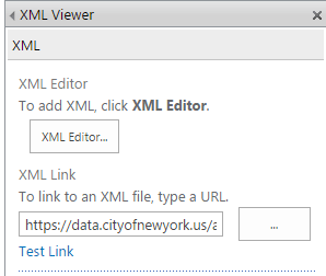
  2. Set the value of the XML Link property to:
    https://data.cityofnewyork.us/api/views/26ze-s5bx/rows.xml?accessType=DOWNLOAD
    csrcxml01

Using csrShim

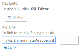
  1. Set the value of the XSL Link to the XSL Wrapper uploaded earlier (NOT csrShim directly):
    csrcxml02
  2. Click OK
  3. Stop Editing the Page

The XMLViewer should now use the custom display:

csrcxml03

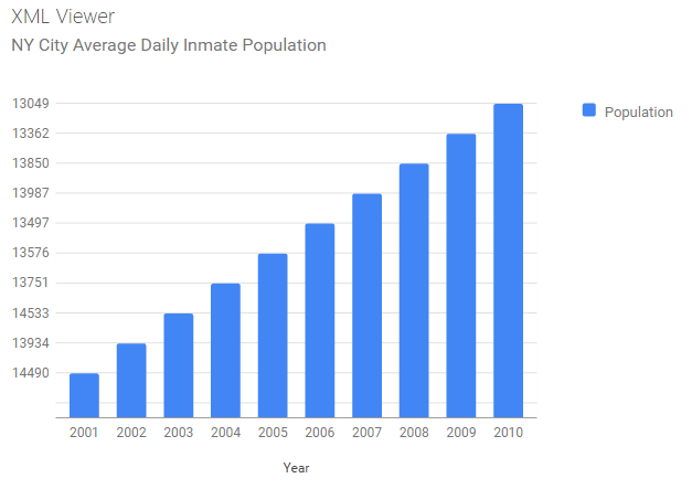
Extending csrShim to map Custom XML formats is super easy! If you map a common format that is not yet included in csrShim, consider contributing to the open source project!

Dates With Relative Countdowns and Pretty Colors in List Views

Applies To: SharePoint 2010

Every list in SharePoint automatically comes with two date columns (Created & Modified). Often times other date columns get added in there and it can be nice to format these to make the lists more intuitive. Out of the box you can format these a few different ways (mostly whether to show the time or not). With a little XSL you can use the ddwrt:formatdatetime function to really customize things (you’ll see a couple of examples of this below) – but can’t we do more?

Large lists of data (whether they are numbers, statuses, dates, etc.) can be overwhelming. One of the greatest improvements we can make is to provide visual clues or analysis on this data to help end-users understand what they are looking at. When it comes to dates, what most people really want to know is what that date means relative to now. This is especially true when it comes to Due Dates such as seen in a Tasks list:

TaskList

We’ve greatly improved the readability of this list with some quick icons as demonstrated in my previous post: Showing Icons in a List View, but those due dates don’t really mean much at quick glance. We can do a couple of things to make these instantly understandable. We can add some color to indicate when the due date is near and/or missed. Even more powerful is showing how much time is left until the Due Date.

Adding Some Color

Flagging these dates with some quick color is pretty straightforward using SharePoint Designer. Designer will be generating some XSL and we’ll take a look at it at the end of this section, but we’ll be using the wizards and so no knowledge of XSL will be needed.

Open the site in SharePoint Designer (Site Actions > Edit in SharePoint Designer) and browse to the page/view you want to edit, or if this is a specific view just choose the Modify View dropdown and select Modify in SharePoint Designer (Advanced):

ModifyView

In Design view, click on one of the date values in the list and choose Format Column in the Conditional Formatting dropdown on the Options tab in the ribbon:

FormatDate

Our goal is to turn the cell red if the due date has passed; So in the Condition Criteria dialog set Field Name to Due Date, the Comparison to Less Than and the Value should remain the default of [Current Date]. Then press the Set Style button:

ConditionCriteriaPastDue

This formula reads: if the Due Date is older than (less) than now, set this style. We’re now setting up that style in the Modify Style dialog. In the Font category set the font-weight to bold (I’m also setting the color to Black since the default theme’s grayish font color doesn’t look great with a red background). Switch to the Background category and select a shade of red for the background-color and press OK:

PastDueStyle

I also like to provide a little warning before things get past due; So let’s make things turn yellow on the Due Date. So again, click on one of the date values in the list and choose Format Column in the Conditional Formatting dropdown on the Options tab in the ribbon. In the Condition Criteria dialog set Field Name to Due Date, the Comparison to Equal and the Value should remain the default of [Current Date]. Then press the Set Style button:

ConditionCriteriaWarning

This formula reads: if the Due Date is today, set this style. We’re now setting up that style in the Modify Style dialog. In the Font category set the font-weight to bold (I’m also setting the color to Black since the default theme’s grayish font color doesn’t look great with the yellow background either). Switch to the Background category and select a shade of yellow for the background-color and press OK:

WarningStyle

Save the view in Designer and refresh the view in the browser and you should see something similar to this (The date this screenshot was taken was 2/7/2013):

TaskListWithColors

For those that are interested, here’s the XSL that designer generated:

<xsl:attribute name="style">
	<xsl:if test="ddwrt:DateTimeTick(ddwrt:GenDisplayName(string($thisNode/@DueDate))) &lt; ddwrt:DateTimeTick(ddwrt:GenDisplayName(string($Today)))"
	 ddwrt:cf_explicit="1">
		font-weight: bold; background-color: #DF1515; color: #000000;
	</xsl:if>
	<xsl:if test="ddwrt:DateTimeTick(ddwrt:GenDisplayName(string($thisNode/@DueDate))) = ddwrt:DateTimeTick(ddwrt:GenDisplayName(string($Today)))"
	 ddwrt:cf_explicit="1">
		font-weight: bold; color: #000000; background-color: #FAE032;
	</xsl:if>
</xsl:attribute>

Relative Dates

With Due Dates there are 2 things you want to know: which ones have been missed and how much time is left. Quick color indicators are very effective in drawing the eye to important information and the red and yellow rules we put in place above help quickly answer the first question.

So how do we communicate how much time is left? Calculated columns are no help here (you can’t use Today and even when you hack it, they only get evaluated on modifications, NOT on view). The answer is some XSL tweaking. We won’t be using the same wizard-like interface as above, but I promise the type of XSL we’re going to be doing isn’t too scary.

The first thing we need to do is add some XSL templates to help us perform some basic date calculations. The easiest way is to use Andy Lewis’ DateTemplates. We’re going to pull out the needed templates and paste them directly into our XSL (since I’ve had a lot of trouble referencing external XSL when using Designer). Here’s the templates we want:

<xsl:template name="getDayDelta">
	<xsl:param name="paramDateA"/>
	<xsl:param name="paramDateB"/>
	<xsl:variable name="dateADays">
		<xsl:call-template name="countDaysInDateWithLeapYearDays">
			<xsl:with-param name="paramDate" select="$paramDateA"/>
		</xsl:call-template>
	</xsl:variable>
	<xsl:variable name="dateBDays">
		<xsl:call-template name="countDaysInDateWithLeapYearDays">
			<xsl:with-param name="paramDate" select="$paramDateB"/>
		</xsl:call-template>
	</xsl:variable>
	<xsl:value-of select="number($dateADays) - number($dateBDays)"/>
</xsl:template>

<xsl:template name="countDaysInDateWithLeapYearDays">
	<xsl:param name="paramDate"/>
	<xsl:variable name="year" select="substring-before($paramDate,'-')"/>
	<xsl:variable name="month" select="substring(substring-after($paramDate,'-'),1,2)"/>
	<xsl:variable name="day" select="substring(substring-after(substring-after($paramDate,'-'),'-'),1,2)"/>
	<xsl:variable name="rawYearDays" select="number($year) * 365"/>
	<xsl:variable name="rawLeapYears" select="floor($year div 4)"/>
	<xsl:variable name="centurySpan" select="floor($year div 100)"/>
	<xsl:variable name="fourCenturySpan" select="floor($year div 400)"/>
	<xsl:variable name="boolYearLeap">
		<xsl:call-template name="isLeapYear">
			<xsl:with-param name="paramYear" select="$year"/>
		</xsl:call-template>
	</xsl:variable>
	<xsl:variable name="yearLeapAdjust">
		<xsl:choose>
			<xsl:when test="$boolYearLeap = 1 and (($month = 1) or ($month = 2 and $day != 29))">-1</xsl:when>
			<xsl:otherwise>0</xsl:otherwise>
		</xsl:choose>
	</xsl:variable>
	<xsl:variable name="yearDays" select="$rawYearDays + $rawLeapYears - $centurySpan + $fourCenturySpan + $yearLeapAdjust "/>
	<xsl:variable name="monthDays">
		<xsl:call-template name="ConvertMonthToTotalDays">
			<xsl:with-param name="paramMonth" select="$month"/>
		</xsl:call-template>
	</xsl:variable>
	<xsl:variable name="totalDays" select="$yearDays + number($monthDays) + number($day)"/>
	<xsl:value-of select="$totalDays"/>
</xsl:template>

<xsl:template name="isLeapYear">
	<xsl:param name="paramYear"/>
	<xsl:choose>
		<xsl:when test="$paramYear mod 4 = 0 and ($paramYear mod 100 != 0) or ($paramYear mod 400 = 0)">1</xsl:when>
		<xsl:otherwise>0</xsl:otherwise>
	</xsl:choose>
</xsl:template>

<xsl:template name="ConvertMonthToTotalDays">
	<xsl:param name="paramMonth"/>
	<xsl:choose>
		<xsl:when test="$paramMonth=01">0</xsl:when>
		<xsl:when test="$paramMonth=02">31</xsl:when>
		<xsl:when test="$paramMonth=03">59</xsl:when>
		<xsl:when test="$paramMonth=04">90</xsl:when>
		<xsl:when test="$paramMonth=05">120</xsl:when>
		<xsl:when test="$paramMonth=06">151</xsl:when>
		<xsl:when test="$paramMonth=07">181</xsl:when>
		<xsl:when test="$paramMonth=08">212</xsl:when>
		<xsl:when test="$paramMonth=09">243</xsl:when>
		<xsl:when test="$paramMonth=10">273</xsl:when>
		<xsl:when test="$paramMonth=11">304</xsl:when>
		<xsl:when test="$paramMonth=12">334</xsl:when>
	</xsl:choose>
</xsl:template>

There are several templates above. We’re only going to call the getDayDelta function (it calls all the others). Copy the above XSL and in the Code view for your view of SharePoint Designer find the <Xsl> element. Skip a few lines down just past the last <xsl:param> element and paste the above. It should look something like this:

DateTemplates

Just putting these templates in the XSL doesn’t actually do anything yet. So switch to the Split view and select one of the Due Date values. The corresponding XSL should be highlighted in the code section:

DueDateOriginalXSL

Replace the highlighted section from above with the following:

<xsl:variable name="DateDueDayDelta">
	<xsl:call-template name="getDayDelta">
		<xsl:with-param name="paramDateA" select="ddwrt:FormatDateTime(string($thisNode/@*[name()=current()/@Name]),1033,'yyyy-MM-dd')"/>
		<xsl:with-param name="paramDateB" select="ddwrt:FormatDateTime(string(ddwrt:Today()),1033,'yyyy-MM-dd')"/>
	</xsl:call-template>
</xsl:variable>

<xsl:choose>
	<xsl:when test="$DateDueDayDelta=0">
		<xsl:text>Today</xsl:text>
	</xsl:when>
	<xsl:when test="$DateDueDayDelta=1">
		<xsl:text>1 Day</xsl:text>
	</xsl:when>
	<xsl:when test="$DateDueDayDelta=-1">
		<xsl:text>Yesterday!</xsl:text>
	</xsl:when>
	<xsl:when test="$DateDueDayDelta&lt;-1">
		<xsl:value-of select="concat($DateDueDayDelta,' Days!')"/>
	</xsl:when>
	<xsl:when test="$DateDueDayDelta&gt;1">
		<xsl:value-of select="concat($DateDueDayDelta,' Days')"/>
	</xsl:when>
</xsl:choose>

In lines 1-6 we’re calling the getDayDelta function from the DateTemplates and storing the value in a new variable called DateDueDayDelta. This value is the number of days between the first parameter, Due Date, and the second parameter, Today. We’re using the ddwrt:FormatDateTime function to ensure the parameters are in the form expected by the template. We’re also using the ddwrt:Today() function to get the current date.

Lines 8-24 is an XSL switch statement. We’re using it to give friendly text based on the number of days between. If the dates are the same, then we print “Today“. If the Due Date is still 1 day in the future, we print “1 Day“. If the Due Date is 1 day in the past (-1), we print “Yesterday!“. If the Due Date is even further in the past (< -1), we print “# Days!“. If the Due Date is more than a day away (> 1), we print “# Days“. This will probably make more sense if you just save the view and refresh it in the browser:

TasksWithRelativeDates

WOO HOO! That’s a huge improvement – but it could be better. Although I think it makes more sense to see the dates as relative for quickly glancing at the list, I don’t like losing that information altogether. So let’s put it back in as a tooltip.

In the code view, right above where you pasted the <xsl:variable> element, paste the following:

<span>
	<xsl:attribute name="title">
		<xsl:value-of select="ddwrt:FormatDateTime(string($thisNode/@DueDate),1033,'dddd, M/d/yy ')"/>
	</xsl:attribute>

Then scroll down to the closing <xsl:choose> element and close the <span> tag. Altogether, things should look similar to this:

FinalDueDateXSL

We just wrapped everything in a span so that we could set the title attribute (tooltip). We are again using the ddwrt:FormatDateTime function so that we can format the Due Date to show not just the date but the day of the week as well since this really helps people visualize the date when a calendar isn’t available. Save the view, refresh it in the browser and you should have something like this (The date this screenshot was taken was 2/7/2013):

FinalTasksList

You can quickly see how stacking these techniques can start to make lists much more intuitive and useful. WOWEE!

Showing Icons in a List View

Applies To: SharePoint 2010

Displaying icons in a list view is a great way to make things immediately more understandable, look awesome and make things oh so pretty. It’s a pretty common request and there are some interesting methods out there to get it done. There’s everything from deployed solutions to give you specialized columns to throwing some magical jQuery on the page. I personally prefer to keep things simple with some quick use of conditional formatting in SharePoint Designer.

Technically this solution uses some XSL which I’ll show you at the end, but you don’t need to know anything about that to get it to work. A good example of a list this works really well for is a Task list. I most often show icons based on Choice columns (since there’s a nice one-to-one mapping between icon and choice value), but you can easily adapt this solution to apply icons based off of other calculations or combination of columns (for instance, showing a frowny face when a due date has been missed and the status is not completed).

Here’s the standard Tasks list that we’re going to iconize:

BasicTaskList

Right away you’ll notice there’s at least 2 easy targets for icons. Both the Status and the Priority columns would really get a big upgrade if turned into icons.

You can put your icons wherever you want, but the easiest place is going to be a picture library right on the site. So create a new picture library called Icons (Site Actions > More Options > Library > Picture Library):

PictureLibrary

Head to the Icons library you just added and upload some icons. We’re going to upload 5 status icons and 3 priority icons. They should all be the same size (16×16 works well, but I’ll leave that up to you). There’s plenty of great icon sets out there (famfamfam and all it’s varients work very well). I’ll be using icons from the Fugue Icons collection since they look nice, there’s tons of them and they’re free:

Status Icons Priority Icons
  • StatusNotStarted  StatusNotStarted.png
  • StatusInProgress  StatusInProgress.png
  • StatusDeferred  StatusDeferred.png
  • StatusWaiting  StatusWaiting.png
  • StatusCompleted  StatusCompleted.png
  • PriorityLow  PriorityLow.png
  • PriorityNormal  PriorityNormal.png
  • PriorityHigh  PriorityHigh.png

Now that the icons are uploaded, it’ll be easy to select them in Designer (You can also have designer upload them directly from your computer while you’re working but there is a bug that sometimes keeps the path relative to your machine rather than the picture library).

Open the site in SharePoint Designer (Site Actions > Edit in SharePoint Designer) and browse to the page/view you want to edit, or if this is a specific view just choose the Modify View dropdown and select Modify in SharePoint Designer (Advanced):

ModifyView

The basic steps we are going to perform 8 times (one for each image):

  1. In Design view click in one of the cells for the column we are iconizing (Status or Priority)
  2. On the Insert tab in the ribbon, choose Picture:

    InsertPicture
  3. Choose the Icons library (double-click), and pick the appropriate icon image:
    OpenPicture
  4. Fill out the Accessibility Properties dialog with the appropriate information:
    AccessibilityProperties
  5. With the new icon selected, type the value in the title field of the Tag Properties window (This will be the tooltip):TitleProperty
  6. With the new image still selected, choose Hide Content in the Conditional Formatting dropdown in the Options tab on the ribbon:
    HideContent
  7. In the Condition Criteria dialog, select the Field Name as the column, the Comparison as Not Equal and the Value to the value the icon should represent. This basically says when the value of this field isn’t the value this icon is meant for, then don’t show this icon:
    ConditionCriteria
  8. Repeat for all remaining icons

Once you save in SharePoint Designer you should see something like this on the page (after a refresh of course):

TasksWithIcons

That’s it, so super pretty! I’d recommend taking the actual text values away (you’ve got them in the tooltip) or at least adding some spacing.

For those that are interested, what designer’s really doing is generating some XSL templates for you. It’s the equivalent of choosing Customize Item in the Customize XSLT dropdown on the Design tab and adding some extra XSL. The XSL we’re talking about is a simple <xsl:if> element with the <img> tag inside. For instance the Completed Status icon looks like this in XSL:

<xsl:if test="not(normalize-space($thisNode/@Status) != 'Completed')"
  ddwrt:cf_explicit="1">
  	<img alt="Complete" longdesc="Complete"
  	  src="../../Icons/StatusCompleted.png" width="16" height="16"
  	  title="Complete" />
</xsl:if>

XSL isn’t nearly as scary as it seems, but Designer does a pretty good job of wrapping up a lot of basic formatting and conditional checks with some nice wizards – so why not use them?

Links List with Favicons and Under the QuickLaunch

Applies To: SharePoint

SharePoint has a handy list called Links that makes putting together a list of links with a display name pretty simple. Since it’s a normal list you can use views or even XSLT to make it look nice wherever you display it on the page. By default, here’s what a small links list looks like using the Summary View:

It’s not too bad, especially for a simple team site. But with just a little extra work you can have that same list of links display with their favicons and you can move them to some relatively unused real estate – under the QuickLaunch, and on every page in your site.

I’m combining these techniques because that was what I did. Fortunately, you can use the bulk of my tips to get nearly any web part to show up below the QuickLaunch. You can also just use the Favicon information to make your link display snazzy. Also, although I’m demonstrating all of this in SharePoint 2010, you should be able to do everything in SharePoint 2007 as well.

Displaying a Web Part Beneath the QuickLaunch

In order to place a Web Part below the QuickLaunch, you’re going to have to edit the Master Page. There are a couple of options. You can add a Web Part Zone and then customize this area on a page by page basis, or you can do what I’m going to demonstrate: add a specific web part to every page on your site.

Open your site in SharePoint Designer (Site Actions -> Edit in SharePoint Designer). Choose Master Pages in the Navigation pane and right-click on v4.master and choose Copy then right-click and choose Paste. Right-click on the new Master Page, v4_copy(1).master, and choose Rename. Once you’ve renamed it, right-click on it and select Edit File in Advanced Mode:

Depending on your site’s settings, you might have to check it out. If so, make sure you check it back in when done and verify you’ve published a major version so that those without full control can see your changes.

We’re going to place our web part right below the quicklaunch. So scroll down to approximately line 594 (in Code view) where you should see two closing divs shortly below the PlaceHolderQuickLaunchBottomV4 UIVersionedContent control. If you want your web part to be included in the leftpanel then press enter after the closing div in line 592, if you want it placed below the box press enter after the closing div in line 594:

Type <br /> and press enter again. Press Save. You’ll get a warning about customizing the page, go ahead and click Yes.

Now switch to the Insert ribbon and select Web Part > Content Query:

Switch to the Design view and right-click on your new web part and choose Web Part Properties. In the dialog window expand the Query section. Choose Show items from the following list under Source and click Browse… and choose your Links list.

Expand the Presentation section. Set Sort items by to <None> (This is to ensure the custom ordering allowed by Links lists is used). Uncheck the Limit the number of items to display checkbox.

In the Fields to display section enter Url [Custom Columns]; for the Link and remove the Title entry:

Choose any other display options you want (I expanded Apperance and chose Chrome Type: None). Press OK to close the dialog. Save the master page. In the navigation pane on the left, right-click on your master page and choose Set as Default Master Page:

Now when you refresh your site you should see the changes (Be sure to publish a major version and/or check in the file if required to ensure everyone can see it):

Adding Favicons to the Links

The above screenshot is pretty cool. Unfortunately, instead of using the display text, it just uses the link. It also doesn’t open the links in a new window. We’ll fix these issues and add a favicon using some simple XSL.

I found the basic XSL to fix the Links display on Marc D Anderson’s blog who apparently got it from this Microsoft forum thread. We’re going to straight up copy that XSL and tweak it just a little to add our favicons. Here’s our customized XSL:

<xsl:template name="LinkList" match="Row[@Style='LinkList']" mode="itemstyle">
	<xsl:variable name="SafeLinkUrl">
		<xsl:call-template name="OuterTemplate.GetSafeLink">
			<xsl:with-param name="UrlColumnName" select="@URL"/>
		</xsl:call-template>
	</xsl:variable>
	<xsl:variable name="DisplayTitle">
		<xsl:call-template name="OuterTemplate.GetTitle">
			<xsl:with-param name="Title" select="@URL"/>
			<xsl:with-param name="UrlColumnName" select="'LinkUrl'"/>
		</xsl:call-template>
	</xsl:variable>
	<xsl:variable name="TheLink">
		<xsl:value-of select="substring-before($DisplayTitle,',')"/>
	</xsl:variable>
	<div id="linkitem" class="item link-item" style="padding-left:10px;">
		<xsl:call-template name="OuterTemplate.CallPresenceStatusIconTemplate"/>
		<img src="http://www.google.com/s2/favicons?domain_url={$TheLink}" align="middle" style="padding-right:2px;" />
		<a href="{$TheLink}" target="_blank" title="This link opens in a new window">
			<xsl:value-of select="substring-after($DisplayTitle,',')"/>
		</a>
	</div>
</xsl:template>

The main changes I made were the additional padding added to the div in line 16 to get everything to line up with the QuickLaunch links and the img element in line 18.

The img element uses a special link from Google (found on the Coding Clues blog) concatenated with our link’s URL. This link allows us to dynamically retrieve the favicons without having to store them within SharePoint or maintain them as links get added or changed.

So where do we put the above XSL? In your site collection’s Style Library there is a folder called XSL Style Sheets. Open the ItemStyle.xsl file and scroll all the way to the bottom. Just before the final node, </xsl:stylesheet>, paste the above XSL. Since this is just a named template, this won’t affect anything else within your site collection. Upload the changed ItemStyle to the XSL Style Sheets folder and make sure to Publish a major version of the file so everyone can see it:

Now we need to tell our Links Content Query web part to use this item style. So, back in SharePoint Designer, right-click on your Content Query web part and choose Properties. Scroll down to ItemStyle and change it from Default to LinkList:

Save the master page and refresh your site and you should see something similar to this:

Isn’t that pretty!? Now everyone loves you!

Open a Link in SharePoint 2010’s Modal Dialog

Applies To: SharePoint 2010

Recently I’ve been customizing the XSLT of some of my XsltListViewWebParts. Getting all of that to work is worth another post in itself, but I wanted to talk briefly about a small frustration I had. I was customizing an announcement’s list part and I stripped out most of the nearly 1700 lines of XSLT used by default. However, one of the things I liked was being able to open the announcement in the modal dialog (sometimes called the Lightbox or the popup window):

Some searching through the autogenerated XSL for my view, I came across this section in the LinkTitleNoMenu.LinkTitle template:

<a onfocus="OnLink(this)" href="{$FORM_DISPLAY}&amp;ID={$ID}&amp;ContentTypeID={$thisNode/@ContentTypeId}" onclick="EditLink2(this,{$ViewCounter});return false;" target="_self">
	<xsl:call-template name="LinkTitleValue.LinkTitle">
		<xsl:with-param name="thisNode" select="$thisNode"/>
		<xsl:with-param name="ShowAccessibleIcon" select="$ShowAccessibleIcon"/>
	</xsl:call-template>
</a>

I’m going to dissect what’s happening in terms of XSL for the next couple of paragraphs. If you’re just looking for the format needed, skip to the Link Format section.

Basically this is the link that gets generated inside the view’s table. The call-template element is used to fill the contents (link text), but I already had that covered and am mostly just interested in the formatting of the link to do the modal dialog magic.

Some quick experimentation shows that the onfocus call was not needed for the popup (This is what causes the menu to display and the box around the row in a standard view). Also not needed is the target=”_self” since this is equivalent to leaving the target attribute out entirely. There are really just 2 key items:

HREF

This is the URL to display in the modal dialog. In this case, it’s generated using a number of variables defined automatically. The $FORM_DISPLAY is the absolute path to the item display page. The $ID is generated using a simple Template call (we’ll come back to this). and the $thisNode/@ContentTypeId is pulling the ContentTypeId attribute from the current Row element in the $AllRows variable populated by the dsQueryResponse XML. For now, all you need to know is that it is automatically finding the display form URL and populating the necessary ID and ContentTypeId query strings for the specific item URL.

OnClick

This calls the EditLink2 javascript method defined in Core.js. This extracts the link with the webpart’s ID ($ViewCounter) and shows it in the modal dialog. Then it returns false to prevent the browser from following the link like normal.

Trying to implement this exactly in my code wasn’t too hard. Unfortunately, it wouldn’t load in the popup and always just opened the page directly. Doing some searching, I came across a quick explanation and solution on technet. The EditLink2 function attempts to use a window object referenced by my webpart’s id ($ViewCounter). Whatever code sets this all up wasn’t firing in my XSL causing the window reference to be NULL and making the function default to just opening the link. Instead of tracking it down somewhere in the default generation, I did something similar to the proposed solution on technet.

Link Format

Ultimately my goal was to have a link generated using this format:

<a href="http://mysharepoint.com/sites/thesite/_layouts/listform.aspx?PageType=4&amp;ListId={SomeGUID}&amp;ID=SomeID&amp;ContentTypeID=SomeContentTypeID" onclick="ShowPopupDialog(GetGotoLinkUrl(this));return false;">Click Me</a>

So, I’m using the same link generation (but this could be any link). The real difference is that instead of calling EditLink2 I’m calling ShowPopupDialog. For the URL, I’m using a technique found in the EditLink2 method of calling GetGotoLinkUrl which extracts the URL from the link element.

XSL Implementation

To get this to work in XSL, you can do something similar to this:

<xsl:for-each select="$AllRows">
	<xsl:variable name="thisNode" select="."/>
	<xsl:variable name="link">
		<xsl:value-of select="$FORM_DISPLAY" />
		<xsl:text>&amp;ID=</xsl:text>
		<xsl:call-template name="ResolveId">
			<xsl:with-param name="thisNode" select ="$thisNode"/>
		</xsl:call-template>
		<xsl:text>&amp;ContentTypeID=</xsl:text>
		<xsl:value-of select="$thisNode/@ContentTypeId"/>
	</xsl:variable>

	<a onclick="ShowPopupDialog(GetGotoLinkUrl(this));return false;">
		<xsl:attribute name="href">
			<xsl:value-of select="$link"/>
		</xsl:attribute>
		<xsl:text>View Announcement</xsl:text>
	</a>
</xsl:for-each>

In the above XSL, we’re looping through each row returned by your view’s CAML query. We setup a link variable that builds the full HREF attribute in lines 3-11. The thing to note is the call to the ResolveId template to pull the item’s ID from the row. This is a standard template that will automatically be referenced as long as you keep the standard includes (main.xsl and internal.xsl).

Then we generate the actual html link in lines 13-17 using the $link variable we created above. This could be consolidated some, but hopefully it’s relatively easy to follow in this format.

That’s it! Now you can generate those links using XSL or follow the link format to make them on your own (like in a content editor web part).