Unpublished View

Applies To: SharePoint

Versioning is a great feature in SharePoint but can cause administrators headaches when it comes to something like branding or other resource files. I’ve previously shown you how to automatically publish a major version and to approve documents as your solution deploys. In a perfect world you’ll never touch these files except through your solution.

However, sometimes you’ll need to quickly fix something or tweak something and you end up in a common situation: You can see the change but no one else can. This happens when versioning is turned on and you either haven’t published a major version (versions below 1) or the changes you’ve made are in draft state (ie 1.1 instead of 2.0).

Tracking these down can be frustrating since everything works for those with the right permissions. So here’s a quick view to add to your library to help you identify these problems. We’ll be filtering the library on 2 columns: Approval Status and Checked Out To.

First thing to do is to create a new view (I’ve named mine Unpublished). Choose whatever columns you want but some helpful ones are Type, Name, Modified, Modified By, Checked Out To and Version. You’ll also want to scroll down to the Folders settings and choose Show all items without folders.

You’ll notice that your view is now showing everything in a giant list because we didn’t apply any kind of filter. The reason for this is that the browser based view editor won’t let us select either IsNotNull as our comparison type or the Approval Status column. Fortunately, both of these things can be done very easily in SharePoint Designer. So switch to the Library ribbon and choose Modify in SharePoint Designer (Advanced) from the Modify View dropdown.

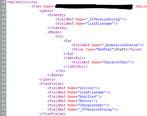
In the Code view just paste the following into your View’s XML inside the Query element:

<Where>
	<Or>
		<Eq>
			<FieldRef Name="_ModerationStatus"/>
			<Value Type="ModStat">Draft</Value>
		</Eq>
		<IsNotNull>
			<FieldRef Name="CheckoutUser"/>
		</IsNotNull>
	</Or>
</Where>

Things should look similar to this:

ViewCAML

What our view is doing is showing any files that are checked out (so the CheckoutUser column is not blank) or that don’t have a major version. For whatever reason Microsoft won’t give you easy access to the _ModerationStatus column unless your library is requiring approvals, but we can still use it. When it’s set to Draft then it’s a minor version.

Save and refresh in the browser and you should only see those documents that may be causing you problems. Check them in or Publish a Major Version as needed and things should be good. We’ve found this simple view to be very helpful, hopefully you do as well.

Showing Icons in a List View

Applies To: SharePoint 2010

Displaying icons in a list view is a great way to make things immediately more understandable, look awesome and make things oh so pretty. It’s a pretty common request and there are some interesting methods out there to get it done. There’s everything from deployed solutions to give you specialized columns to throwing some magical jQuery on the page. I personally prefer to keep things simple with some quick use of conditional formatting in SharePoint Designer.

Technically this solution uses some XSL which I’ll show you at the end, but you don’t need to know anything about that to get it to work. A good example of a list this works really well for is a Task list. I most often show icons based on Choice columns (since there’s a nice one-to-one mapping between icon and choice value), but you can easily adapt this solution to apply icons based off of other calculations or combination of columns (for instance, showing a frowny face when a due date has been missed and the status is not completed).

Here’s the standard Tasks list that we’re going to iconize:

BasicTaskList

Right away you’ll notice there’s at least 2 easy targets for icons. Both the Status and the Priority columns would really get a big upgrade if turned into icons.

You can put your icons wherever you want, but the easiest place is going to be a picture library right on the site. So create a new picture library called Icons (Site Actions > More Options > Library > Picture Library):

PictureLibrary

Head to the Icons library you just added and upload some icons. We’re going to upload 5 status icons and 3 priority icons. They should all be the same size (16×16 works well, but I’ll leave that up to you). There’s plenty of great icon sets out there (famfamfam and all it’s varients work very well). I’ll be using icons from the Fugue Icons collection since they look nice, there’s tons of them and they’re free:

Status Icons Priority Icons
  • StatusNotStarted  StatusNotStarted.png
  • StatusInProgress  StatusInProgress.png
  • StatusDeferred  StatusDeferred.png
  • StatusWaiting  StatusWaiting.png
  • StatusCompleted  StatusCompleted.png
  • PriorityLow  PriorityLow.png
  • PriorityNormal  PriorityNormal.png
  • PriorityHigh  PriorityHigh.png

Now that the icons are uploaded, it’ll be easy to select them in Designer (You can also have designer upload them directly from your computer while you’re working but there is a bug that sometimes keeps the path relative to your machine rather than the picture library).

Open the site in SharePoint Designer (Site Actions > Edit in SharePoint Designer) and browse to the page/view you want to edit, or if this is a specific view just choose the Modify View dropdown and select Modify in SharePoint Designer (Advanced):

ModifyView

The basic steps we are going to perform 8 times (one for each image):

  1. In Design view click in one of the cells for the column we are iconizing (Status or Priority)
  2. On the Insert tab in the ribbon, choose Picture:

    InsertPicture
  3. Choose the Icons library (double-click), and pick the appropriate icon image:
    OpenPicture
  4. Fill out the Accessibility Properties dialog with the appropriate information:
    AccessibilityProperties
  5. With the new icon selected, type the value in the title field of the Tag Properties window (This will be the tooltip):TitleProperty
  6. With the new image still selected, choose Hide Content in the Conditional Formatting dropdown in the Options tab on the ribbon:
    HideContent
  7. In the Condition Criteria dialog, select the Field Name as the column, the Comparison as Not Equal and the Value to the value the icon should represent. This basically says when the value of this field isn’t the value this icon is meant for, then don’t show this icon:
    ConditionCriteria
  8. Repeat for all remaining icons

Once you save in SharePoint Designer you should see something like this on the page (after a refresh of course):

TasksWithIcons

That’s it, so super pretty! I’d recommend taking the actual text values away (you’ve got them in the tooltip) or at least adding some spacing.

For those that are interested, what designer’s really doing is generating some XSL templates for you. It’s the equivalent of choosing Customize Item in the Customize XSLT dropdown on the Design tab and adding some extra XSL. The XSL we’re talking about is a simple <xsl:if> element with the <img> tag inside. For instance the Completed Status icon looks like this in XSL:

<xsl:if test="not(normalize-space($thisNode/@Status) != 'Completed')"
  ddwrt:cf_explicit="1">
  	<img alt="Complete" longdesc="Complete"
  	  src="../../Icons/StatusCompleted.png" width="16" height="16"
  	  title="Complete" />
</xsl:if>

XSL isn’t nearly as scary as it seems, but Designer does a pretty good job of wrapping up a lot of basic formatting and conditional checks with some nice wizards – so why not use them?