Applies To: Windows Phone 7
The new Windows Phone 7 (WP7) introduces Microsoft’s Metro style (Okay, it’s not the first Microsoft product to use it but it will probably be the first time many users encounter it). We’ve gone back and forth on it. It seems most people (by people I mean developer’s and tech gurus) are convinced of it’s genius.
It is simple and there is a sort of beauty to it when done correctly. However, it will be interesting to see how main stream consumers who are used to the styles introduced through the iOS and Android devices take to it. As developers of multiple platforms we’ve struggled with it a bit. It seems to fit some Apps remarkably well, but others not at all.
If you have developed apps for other software platforms like iOS it can be tempting to try and port your apps to look and behave as it does on the other platforms. Admittedly this was our first approach and we found it didn’t work too well. Ultimately we’ve come to the conclusion that existing apps were made to match the OS they were created for and the same should be true of the various versions we create.
In other words, if the consumer wanted an iOS style app they would have bought an iOS device. By purchasing a WP7 device the consumer has shown their preference for WP7 styles, which inevitably means Metro.
This isn’t always appropriate and should be decided on an App by App basis. WP7 style is also a moving target and we shouldn’t hold back on innovation just to match existing patterns. But there should be an evolution to our innovations so that they don’t clash with those patterns but rather enhance them.
So now that you are all about Metro, here is at least one technique we use to take advantage of this design pattern. The SDK comes with a variety of StaticResources that map directly to the user’s theme settings. Ironically, these “Static” resources can be used to dynamically match a user’s design preferences. Using these allows you to match a style your user obviously likes and allows their personalization to carry all the way through the phone into your apps. This is a powerful and easy way to provide customization to your app for “Free”.
Note – By default your app will be doing this and if you wish to explicitly control your colors you will need to do so on each control. Be sure to adjust your theme and accent color multiple times during the testing of your app to ensure your app remains readable and reasonably pretty.
This can be done from either ExpressionBlend or directly in the XAML. The nice thing about doing it in ExpressionBlend is that it allows you to choose the resource from a list:
Doing this with text or built in shapes is pretty simple. For instance, to create a textblock control that matches a user’s accent color (PhoneAccentBrush) you can just use this XAML:
<TextBlock Text="I'm so Pretty!"
 Foreground="{StaticResource PhoneAccentBrush}"/>
You could also create a Circle filled with the accent color using this XAML:
<Ellipse Fill="{StaticResource PhoneAccentBrush}" Width="25" Height="25"/>
There are some other basic shapes and a lot can be done with these. But what do you do when you want something a little more complex? You could draw it from shapes, include an image for each possible theme, or try this technique using an OpacityMask combined with an ImageBrush:
<Rectangle x:Name="Star"
 Fill="{StaticResource PhoneAccentBrush}"
 Width="15" Height="15">
  <Rectangle.OpacityMask>
    <ImageBrush ImageSource="/Images/Star.png"/>
  </Rectangle.OpacityMask>
</Rectangle>
Note – the image used above has it’s Build Action property set to Content.
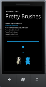
This allows us to use an image with transparency to determine our shape. The image itself doesn’t need to be any particular color it just needs to have an alpha layer. This allows for complex shapes that match a user’s theme without a whole lot of work!
 |
 |
Both of the above screenshots use the same XAML:
<Grid x:Name="ContentPanel" Grid.Row="1" Margin="12,0,12,0">
  <StackPanel HorizontalAlignment="Left" VerticalAlignment="Top" Width="456">
    <TextBlock TextWrapping="Wrap" Text="PhoneForegroundBrush"
     Margin="0,0,-75,0" d:LayoutOverrides="Width"
     Foreground="{StaticResource PhoneForegroundBrush}"/>
    <TextBlock TextWrapping="Wrap" Text="PhoneAccentBrush"
     Margin="0,0,15,0" d:LayoutOverrides="Width"
     Foreground="{StaticResource PhoneAccentBrush}"/>
    <TextBlock TextWrapping="Wrap" Text="PhoneContrastBackgroundBrush"
     Foreground="{StaticResource PhoneContrastBackgroundBrush}"/>
    <TextBlock TextWrapping="Wrap" Text="PhoneDisabledBrush"
     Foreground="{StaticResource PhoneDisabledBrush}"/>
    <TextBlock TextWrapping="Wrap" Text="PhoneSubtleBrush"
     Foreground="{StaticResource PhoneSubtleBrush}"/>
    <TextBlock TextWrapping="Wrap" Text="PhoneBorderBrush"
     Foreground="{StaticResource PhoneBorderBrush}"/>
    <TextBlock TextWrapping="Wrap" Text="PhoneChromeBrush"
     Foreground="{StaticResource PhoneChromeBrush}"/>
    <Line X2="400" StrokeThickness="4" Height="4"
     Stroke="{StaticResource PhoneAccentBrush}" Margin="0,50,0,0"
     HorizontalAlignment="Center"/>
    <Ellipse Fill="{StaticResource PhoneAccentBrush}"
     Width="25" Height="25" Margin="0,50,0,0" HorizontalAlignment="Center"/>
    <Rectangle x:Name="Star" Fill="{StaticResource PhoneAccentBrush}"
     Width="15" Height="15" VerticalAlignment="Center"
     HorizontalAlignment="Center" Margin="0,50,0,0">
      <Rectangle.OpacityMask>
        <ImageBrush ImageSource="/Images/Star.png"/>
      </Rectangle.OpacityMask>
    </Rectangle>
    <StackPanel Orientation="Horizontal" HorizontalAlignment="Center"
     Margin="0,50,0,0">
      <Image Source="/Images/Bear.png" Stretch="Fill"
       Width="63" Height="92" HorizontalAlignment="Center"/>
      <Rectangle x:Name="Bear" Fill="{StaticResource PhoneAccentBrush}"
       Width="63" Height="92" HorizontalAlignment="Center" Margin="50,0,0,0">
        <Rectangle.OpacityMask>
          <ImageBrush ImageSource="/Images/Bear.png"/>
        </Rectangle.OpacityMask>
      </Rectangle>
    </StackPanel>
  </StackPanel>
</Grid>
You can use this technique in all sorts of situations, but our favorite is to combine it with databinding and use a little icon to mark something about the entry (such as unread in an article reader). This is an easy way to wow your users while maintaining consistency with the Metro style.
