SPFx Extension Toastr Notifications Demo

Applies To: SharePoint Framework

I had the honor of taking part in the PnP JS SIG call (Patterns and Practices JavaScript Special Interest Group) earlier today. On the call I was able to demo a sample I contributed for the SharePoint Framework Extensions called jQuery-Application-Toastr.

You can find a great write-up of the call on the Tech Community. You can also just watch the video directly on YouTube. You can even watch it right here, conveniently queued up to my demo, wowee!

Here are some related links:

Scroll SharePoint Search Results Back to the Top on Paging

Applies To: SharePoint 2013+

By default, when you click on a different page using SharePoint’s Search Results web part’s paging links (shown underneath the search results) the next page of results is shown but you remain at the bottom of the page. This is super dumb.

Paging

This is really easy to fix and requires no custom code at all! There is a property (not exposed in the UI for some reason) called ScrollToTopOnRedraw that is False by default.

To apply this setting to your Search Results web part, simply export the web part. You can do this by choosing to Edit the page and choosing Export… in the web part dropdown menu:

ExportWP

Now, open the .webpart file in a text editor like Notepad and do a quick find for ScrollToTopOnRedraw. Then change the value from False to True and save the file:

ScrcollToTopOnRedraw

Now, choose Delete in that same web part dropdown menu on the current Search Results web part. Then click the Add a Web Part button. Choose Upload a Web Part under the list of categories, then click Choose File and pick the .webpart file we saved a minute ago. Finally click the Upload button:

UploadWebPart

You’ll probably be asked if you want to leave the site. It’s safe to choose Leave.

Click the Add a Web Part button again. Choose the Imported Web Parts category and find your newly uploaded Search Results web part and click Add. You’ll likely have to update the Refinement Target for any refinement web parts on the page as well.

Now, when you page results you’ll be taken back to the top of the results each time!

Join me at Charlotte SharePoint Saturday on August 26th!

I will be presenting Understanding SharePoint Framework Extensions on Saturday, August 26th, 2017 in Charlotte, NC as part of SPS Charlotte!

I’m sure you’ll all attend just for my session – but stay for everything else. Just look at this lineup!

SPSCLT

Andrew Connell will be delivering the keynote, Where are We and Where are We Going?

My session is at 11:15 am and will focus is on understanding how the SharePoint Framework (SPFx) and the Extensions fit within the historical and modern approaches to SharePoint development. The goal is for attendees to know what SPFx is and when to use it, how the extensions fit in the framework, and to know where to go to get additional details. This session is perfect for power users, managers, and developers new to SPFx.

After my session, stick around for the unofficial “Part 2” at 2:15 pm, Andrew Connell’s Modern UI Extensions with the SharePoint Framework – Command Sets, Application, and Field Customizers where he’ll be providing additional depth, details, and demos.

After attending these 2 sessions you should have everything you need to dive into SPFx extensions just in time for the upcoming Release Candidate 1 and General Availability coming later this year!

Extending SharePoint Framework Build Tasks

Applies To: SharePoint Framework

The SharePoint Framework (SPFx) uses gulp as the task runner that builds your solution. You can find out what tasks are available by typing gulp --tasks in the console in the root of your solution. But what if you want to extend these tasks?

There’s an excellent tutorial by Chaks Chandran that demonstrates how to do this: Integrate gulp tasks in SharePoint Framework toolchain. You can find the corresponding sample here: js-extend-gulp.

In this post, I’m going to demonstrate a few items that weren’t addressed in that tutorial including:

  • Checking for a custom parameter
  • Ending your task without a stream and not killing the pipeline
  • Getting a value from one of the Config files
  • Copying a solution file to another location

What Are We Building

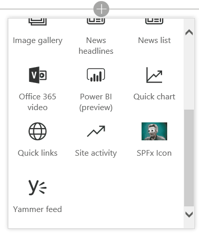
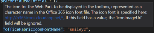
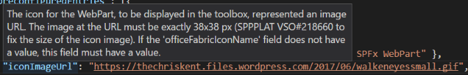
I previously discussed how to specify your SharePoint Framework App Icon and in that post I noted that you should not only specify your icon in the solution package itself, but you should make it available outside as well so that you can set the App Catalog Icon URL property.

The best place to host this image is with the rest of your assets in your CDN. So, wouldn’t it be nice if the App Icon image file was copied to the dist folder when the rest of your solution was bundled? Let’s do it!

Basic Rigging

If your familiar with gulp you know that generally gulp tasks are defined in the gulpfile.js file in the root of your solution. More likely, however, you’re not familiar with gulp and don’t really know what a gulp task is for outside of the idea that they do things when you type them in the console.

A gulp task is just a JavaScript function that gets registered with a name (the command) and you can make it do whatever you want. In SPFx, however, all the gulp tasks are defined deep within the node_modules/@microsoft/gulp* folders. You don’t need to do anything with these (although they are worth checking out if your curious how they’re doing all this magic).

To jump in on the fun, you’ll need to use the build object and either rig your task into the pipeline or register it as a standalone task. Again, more detail can be found in the official tutorial. For our purposes, we don’t want a standalone task that we would have to call separately. We want our task to be executed along with the build.

Defining the Task

Open up your gulpfile.js file. Before the build.initialze(gulp) command add your sub task definition:

'use strict';

const gulp = require('gulp');
const build = require('@microsoft/sp-build-web');

let appIconToBundle = build.subTask('app-icon-to-bundle', function(gulp, buildOptions, done) {
	this.log('Wowee!');
});

build.initialize(gulp);

In line 6, we’re simply calling the build.subTask function provided by Microsoft to register our function with the name app-icon-to-bundle (there’s nothing special about this name, just following the same over-hypenation as the default sub tasks).

This doesn’t actually do anything yet because we’ve neither registered it as a standalone task or integrated it into the build pipeline.

Rigging the Task to the Build

You can “rig” your task in 3 spots: PreBuild, PostTypescript, and PostBuild. You can think of these as specifying an event handler and the handler is your sub task. We’re going to add ours to the end of the build by adding line 10 below:

'use strict';

const gulp = require('gulp');
const build = require('@microsoft/sp-build-web');

let appIconToBundle = build.subTask('app-icon-to-bundle', function(gulp, buildOptions, done) {
	this.log('Wowee!');
});

build.rig.addPostBuildTask(appIconToBundle);

build.initialize(gulp);

Now if we execute one of the building tasks (like “bundle” for instance) you’ll see our amazing task getting executed:

Basic Run

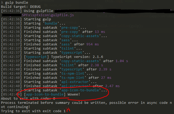
Properly Ending Your Task

Some of you may have noticed that there is a message about terminating early. In fact, if you run the gulp serve command you may be surprised to see it stops at the same spot and does none of the actual fanciness of serving your solution. WHAT DID YOU DO!?

The easiest way to fix this is by returning a stream and that’s exactly what is demonstrated in the official sample. But what about when you aren’t doing that? For our task we want to check some things and only proceed when it makes sense. This is hard to do in the context of a stream. The other option is to simply take advantage of the done callback parameter you are provided:

let appIconToBundle = build.subTask('app-icon-to-bundle', function(gulp, buildOptions, done) {
	this.log('Wowee!');
	done();
});

Now when you run the standard tasks you’ll still see our message but the pipeline doesn’t come to a screeching halt. Wowee, indeed.

Checking for a Custom Parameter

For our task, we only want to move the icon file if the --bundleicon parameter is specified. This is a custom parameter and detecting it is surprisingly easy:

let appIconToBundle = build.subTask('app-icon-to-bundle', function(gulp, buildOptions, done) {
	var bundleIcon = (process.argv.indexOf('--bundleicon') !== -1);
	this.log(bundleIcon ? 'Bundling!' : 'Nope!');
	done();
});

In line 7, we simply check for the presence of our custom parameter in the arguments and set a Boolean value. In line 8, we change the message based on the parameter’s inclusion. This could “easily” be extended to actually pull in values after your parameter.

To test this, simply run gulp bundle and then gulp bundle --bundleicon to see the 2 different messages. Our custom parameter works!

Getting a Value From One of the Config Files

Now we know when to actually move the icon based on the parameter, but how do we know where the icon actually is? The App Icon is an image file stored somewhere in the sharepoint folder. It is specified as the solution.iconPath property in the config/package-solution.json file.  More details here: SharePoint Framework App Icon

So, how do we get a value from one of the config files? First, we’ll need 2 helper objects. These objects are already included in your node_modules folder since they are used by the Microsoft build tasks. To gain access to them simply add some require statements below the existing require statements:

const gulp = require('gulp');
const build = require('@microsoft/sp-build-web');

const path = require('path');
const fs = require('fs');

let appIconToBundle = build.subTask('app-icon-to-bundle', function(gulp, buildOptions, done) {
...

Specifically line 6 and 7 above add the path and fs objects which make it easy to work with file paths and reading files. Here’s how we use them:

let appIconToBundle = build.subTask('app-icon-to-bundle', function(gulp, buildOptions, done) {
	var bundleIcon = (process.argv.indexOf('--bundleicon') !== -1);

	if(bundleIcon){
		//Get the config file path
		var psConfigPath = path.join(process.cwd(), 'config', "package-solution.json");

		//read the config file into a JSON object
		var psConfig = undefined;
        try {
            var content = fs.readFileSync(psConfigPath, 'utf8');
            psConfig = JSON.parse(content);
        }
        catch (e) { }

		//Verify an iconPath has been provided
        if(psConfig && psConfig.solution && psConfig.solution.iconPath){
			this.log('./sharepoint/' + psConfig.solution.iconPath)
		}
	}

	done();
});

In line 14 we use the path object to get an absolute path to the package-solution.json config file. Then in line 19 we use the fs object to read the text of the config file. Since the config files are all JSON files, we can simply parse it into an object in line 20.

In line 25 we verify that the property was actually set and has a value. If so, we write it to the log in line 26. We are adding the ‘./sharepoint/’ because the iconPath property is relative to the sharepoint folder in the root of our project.

Copying the App Icon to the Dist Folder

Copying the file to the dist folder can be done using standard gulp:

        if(psConfig && psConfig.solution && psConfig.solution.iconPath){
			gulp.src('./sharepoint/' + psConfig.solution.iconPath)
				.pipe(gulp.dest('./dist'));
		}

The Final Solution

Here’s the final gulpfile.js:

'use strict';

const gulp = require('gulp');
const build = require('@microsoft/sp-build-web');

const path = require('path');
const fs = require('fs');

//When the --bundleicon parameter is used, copies the App Icon image file (when specified) to the dist folder
let appIconToBundle = build.subTask('app-icon-to-bundle', function(gulp, buildOptions, done) {
	//Look for the --bundleicon parameter
	var bundleIcon = (process.argv.indexOf('--bundleicon') !== -1);

	if(bundleIcon){
		//Get the config file path
		var psConfigPath = path.join(process.cwd(), 'config', "package-solution.json");

		//read the config file into a JSON object
		var psConfig = undefined;
        try {
            var content = fs.readFileSync(psConfigPath, 'utf8');
            psConfig = JSON.parse(content);
        }
        catch (e) { }

		//Verify an iconPath has been provided
        if(psConfig && psConfig.solution && psConfig.solution.iconPath){
			//Copy the icon to the assets destination
			gulp.src('./sharepoint/' + psConfig.solution.iconPath)
				.pipe(gulp.dest('./dist'));
		}
	}

	done();
});

build.rig.addPostBuildTask(appIconToBundle);

build.initialize(gulp);

You can find the full solution here: https://github.com/thechriskent/spfx-AppIcon

SharePoint Framework App Icon

Applies To: SharePoint Framework

Recently, I showed you how to set your WebPart Icon (the image used in the authoring canvas toolbox). But there is another image, called the App Icon that is also important to set. This applies to both client-side webparts and SPFx extension apps.

The concept of an AppIcon is nothing new. When creating an Add-In, you could simply specify the icon property of the AppManifest (although it wasn’t actually stored in this file) and the appropriate rels and feature manifest files would be added to your app package. This is the image that was then used in the Site Contents view of your site.

The SharePoint Framework (SPFx) supports this same type of property. Although, as we’ll see, it’s of limited use on modern pages. Regardless, it is still a nice way to add a professional touch to your app.

Classic Site Contents
Look at that sweet cactus! Professionalism!!

Specifying an SPFx app App Icon

Create a suitable image file. App Icons must be 96×96 px. It’s also good practice to make them PNG files with only a white image on a transparent background. This allows them to match the native app icons and to maintain consistency with a site’s theme.

Super Easy Icon Generation

Here’s a terrible way to generate one using PowerPoint (everyone’s favorite image editor). Use the new Icons button on the Insert tab in the ribbon and choose one of the many beautiful icons:

PowerPoint Icons

Set the Graphics Fill color to white and set the size to 2.6″ (at least that’s the size that seems to equate to 96×96 px). Then right-click on the image object and choose Save as Picture…:

PowerPoint Save

Navigate to your SPFx solution folder. In the root folder, select the sharepoint folder (if it doesn’t exist, add it). Then save the image somewhere in there as a PNG file. I created a folder called Images and saved it in there:

Icon in VSCode

Configuring SPFx to Use Your AppIcon

In your SPFx solution, open the config/package-solution.json file. Under solution, add the iconPath property and give it a relative path within your sharepoint folder:

iconPath Property

From your console in your project directory, run gulp bundle. When that finishes, run gulp package-solution.

The bundle task has nothing to do with what we’re doing except to point out that the image does not get copied to your dist folder along with your other assets (this will be important later).

Rather, if you look in your sharepoint/solution folder you’ll find your sppkg file. In the accompanying debug folder you can see the contents of your sppkg file and you’ll see your AppIcon and all the rels and feature manifest files were added as expected.

Navigate to your app catalog and upload your sppkg file into the Apps for SharePoint library. Click the Deploy button when prompted.

You’ll find that when you add your app to a site that the tiny icon shown on the Modern version of the Site Contents page does not use your fancy new icon. Clicking for details of the app shows the generic app icon as well. However, switching to classic view for the site contents page does show your icon. Success!?

Providing an App Catalog Icon

Just like with Add-Ins, you’ll also need to provide a separate file for your app catalog icon. This can be done by copying your icon file to the same CDN location (or any URL really) where your bundle assets are going to go.

You then edit the properties of your app in the app catalog and specify that URL as the Icon URL property:

AppCatalog Icon

Now your custom icon will be used on the App Details page as well as within classic views:

App Profile

Conclusion

For modern pages, the SPFx iconPath (AppIcon) property has little to no effect. However, while the option to switch to Classic View still exists and especially while there is no easy option to switch back to the modern view (delete the cookie), providing both the app catalog icon and the AppIcon within your app is the best way to ensure your SPFx app looks professional and consistent to end users.

Stopping the Allow Debug Manifests Insanity

Applies to the SharePoint Framework

I recently followed the excellent SharePoint Framework (SPFx) Extensions tutorials and ran into an annoying issue. While working through the tutorial you will be correctly prompted to Allow Debug Manifests:

ext-app-debug-manifest-message

This allows JavaScript files being served from your localhost through the gulp serve command to be loaded on the page and your SPFx Extension to run. It’s really pretty awesome.

When I went to follow the next tutorial I found that despite my files being hosted in a SharePoint library turned CDN, I was still being prompted to Allow Debug Manifests.

I found that clicking Load debug scripts did nothing. This makes sense since I was not running gulp serve and so no local files would be loading. In fact, a check in the console didn’t show any file not found errors (as would be expected when debugging and gulp serve is not running so local JS files wouldn’t be found).

Strangely, if I chose Don’t load debug scripts my extension would run (the app had been added to the site and the assets loaded into the CDN)! So it was great that things were running, but really weird that I kept getting that prompt.

I uninstalled the app (Site Contents classic view and chose Remove) and even made sure it was deleted out of both stages of recycle bins. But I was still prompted on every modern page every time I visited them!

Aha! The custom action is still in place! So I used the Powershell PnP Cmdlet Remove-PnPCustomAction and ensured that there were no custom actions lingering anywhere. Still prompted! AHHHHHHHHHHHH!

Insanity

Finally, I posted it as an issue on the sp-dev-docs github repository and Pat Miller quickly provided the answer. Just add ?reset=true to the URL. You only need to do it once and it will clear everything up for the whole site. Apparently a debug cookie gets set sometimes and using this querystring will clear it out.

Fixing Dependency issues with the SPFx Generator

Applies to the SharePoint Framework

I’ve been playing with the new SharePoint Framework (SPFx) Extensions lately and ran into strange error when attempting to create a new one. I ran the yo @microsoft/sharepoint command and filled out the prompts to create a new Field Customizer extension. Things looked like they were working for about 15 seconds when I got this sadness:

Yeoman Error
“Congratulations”

Here’s the relevant text of the error:

No compatible version found: @microsoft/decorators@~1.0.1
Valid install targets:
1.1.0, 1.0.0, 0.2.1, 0.0.0
This is most likely not a problem with npm itself.
In most cases you or one of your dependencies are requesting
a package version that doesn't exist.

It was specified as a dependency of '@microsoft/sp-application-base'

So what happened? I could use this generator just a few days ago!

The first thing you should do when troubleshooting issues with the generator is check your version vs the available versions.

To check your version just use the following npm command:

npm list -g @microsoft/generator-sharepoint


When I did, I found I had version 1.1.0 so I checked what versions were available:

npm view @microsoft/generator-sharepoint versions


Sure enough, the latest version was 1.1.1 so I updated my generator:

npm install -g @microsoft/generator-sharepoint


Now running the generator again worked!

You can find more details about this particular issue on the sp-dev-docs Github repo issues list.

Setting Your SharePoint Framework WebPart Icon

Applies To: SharePoint Framework

When you create a SharePoint Framework (SPFx) webpart, you can customize the icon displayed in the Authoring Canvas Toolbox. Here’s what it looks like by default:

DefaultToolboxIcon
Default “Page” icon for your webpart

By default, the Office Fabric Page icon is used but this can and should be changed before packaging up your app. This makes sure your webpart doesn’t get lost among all the other webparts and is a very simple way to add a professional touch.

There are 2 ways to customize this icon. You can specify the name of an icon from the Office UI Fabric icons or you can provide a URL to a custom image.

Both of these are accomplished by editing your webpart’s manifest.json file and changing a simple property.

Office UI Fabric Icon

The easiest way to customize your icon is to simply specify the name of an icon class in the Office UI Fabric. You can find all the icons here: https://dev.office.com/fabric#/styles/icons

The Page icon shown above is doing exactly this. You can find this setting in the src/webparts/[YOURWEBPARTNAME]/[YOURWEBPARTNAME].manifest.json file in the preconfiguredEntries/officeFabricIconFontName property:

DefaultManifest

You can simply change this value from Page to any of the available icon names. Here’s what it looks like with a value of Emoji2:

SmileyToolboxIcon

Keep in mind that this value is CASE SENSITIVE. Also, note that changes to your manifest file (unlike your code files) will require you to stop the gulp serve command and do it again to have those changes reflected in the workbench.

If you inspect the actual toolbox you’ll see that the class name for the span is simply concatenating “ms-Icon–“ and the property value:

IconMarkup

This approach is super easy (just change the name) and ensures your webpart matches the official Office styles. But what if you want your own custom icon or logo?

Custom Icon

There is another property available called preconfiguredEntries/iconImageUrl and allows you to specify an image URL.

In order to use this property, create a 40x28px icon and upload it somewhere. For this example I’m just going to use my blog, but ideally you would include it in the webpart and then pull this value from your CDN.

You’ll also have to remove the preconfiguredEntries/officeFabricFontIconName property (or the iconImageUrl will be ignored). Here’s what my property looks like:

imageIconUrlManifest

Again, note that changes to your manifest file (unlike your code files) will require you to stop the gulp serve command and do it again to have those changes reflected in the workbench.

So here’s what it looks like in my local workbench:

iconImageUrlLocalWorkbench
Smells like a bug to me

What happened!?! For whatever reason, the local workbench continues to try and use a class icon as seen above (You can even see it sets a class of ms-Icon–undefined). However, the O365 workbench (/_layouts/15/workbench.aspx) works just fine:

iconImageUrl365Workbench

A quick inspection shows that the property value is just being inserted as the src attribute for an img tag.

This means (and I’m not suggesting you should) that if you happen to have a weird Christopher Walken eyeball gif:

WalkenEyes

You could simply resize it and get something like this:

AnimatedIcon
Why you make Vesa cry?

Documentation Discrepancies

Looking at the documentation for the manifest properties (json schema) you may see some misleading outdated information. (If you haven’t setup config file intellisense in VSCode, go do it now! Here’s an awesome guide.)

The description for the officeFabricIconFontName property looks like this:

officeFabricFontIconNameTooltip

It directs you to a site with 600+ icons many of which are present in the UI Fabric Icon styles. However, these names do NOT often match the actual class names and so cannot be reliably depended on to locate your icons (for example, the “Emoji2” icon we used in the sample above is listed as “smiley2” on the font site. It took going to the Office UI Fabric Icons page to find the correct class name).

The description for the iconImageUrl property looks like this:

iconImageUrlTooltip

You are instructed to use an icon that is exactly 38x38px. This is no longer accurate. You can use whatever size you want but it will be scaled to 40x28px.

Targeted JSLink for List View Web Parts

Introduction

Standard Client Side Rendering (CSR) is a powerful technology introduced in SharePoint 2013. Out Of The Box (OOTB) you can apply this technology to list view web parts through use of the JS Link property. Using this technique, developers can quickly and easily apply display logic through JavaScript.

Unfortunately, despite its continued support in SharePoint 2016 and Office365, CSR with list view web parts still suffers from a major flaw. When you have multiple web parts that display list items from lists that share a ListTemplateType and BaseViewID, OOTB CSR provides no way to correctly target your display logic (JSLink) to individual web parts.

How to Get the Code

The example code used in this document can be found in full as part of the csrShim repository:
https://github.com/thechriskent/csrShim/tree/master/Examples/Multiple%20List%20Views

The full project can be found on GitHub:
https://github.com/thechriskent/csrShim

You can download or clone the repository directly from that site. You can also view the code directly on the site.

The Problem

When a user adds 2 or more web parts displaying list items from a list that share a ListTemplateType and BaseViewID, standard CSR has no way of distinguishing between the web parts.

The result is that if only a single web part has a JS Link property specified, all matching web parts will be drawn with that logic (even ones intended to use the OOTB display!). If more than one web part has the JS Link property, then only the last one loaded will be applied.

This is especially problematic because custom lists all share a ListTemplateType of 100 and will present with a BaseViewID of 1. This issue often surprises developers that have developed their web part in isolation where they worked perfectly just to have them break entirely when placed on a page with other web parts.

A Demonstration

  1. We will add a web part using JSLink as configured in the List View Client Side Rendering (JSLink) Primer to have a web part using JS Link (The example code can be downloaded from the repository mentioned above):
    Single CSR
    This is a pretty standard team site page with a Site Feed, a Document Library, and a custom list with JSLink applied using standard CSR (Hall of Fame)
  2. Now if we add another Custom List web part (just an OOTB view):
    Broken CSR
    Immediately we see the someList web part is full of errors (these are JS errors from missing fields where the CSR attempted to apply the JSLink file)
  3. Removing the Hall Of Fame web part from the page fixes the someList web part:
    No CSR Fixed

There are many solutions for this to be found online. Most of these solutions are hacky workarounds at best, at worst they create fragile code and dependencies on management code outside of the web parts themselves.

It is often suggested to “override” the standard CSR template registration function and then create your own system to route CSR requests by dynamically changing the BaseViewID of the ContextInfo (ctx) objects. This technique requires you to have knowledge ahead of time of all possible web parts on the page or to have some additional way to uniquely identify/register your parts. The override is just taking advantage of JavaScript’s ability to alter objects you don’t own and introduces serious risk to your solutions (upgrades, users adding unknown web parts, and more).

The Solution

Fortunately, there is a solution that addresses many of the risks laid out above. The best part is that it can be independently implemented for individual web parts. These web parts never need to know or care about other web parts on the page (no management system required).

The solution is to use csrShim with your list view web parts. csrShim was originally developed to bring CSR capabilities to web parts without JS Link properties (Content by Query Web Parts and XMLViewer), but it can easily be applied to XSLTListView web parts. When doing so, you can specify a BaseViewID that is not tied to the original value allowing you to target web parts very specifically to CSR templates!

In addition, using csrShim this way allows you to add as many web parts to the page with the same underlying ListTemplateTypes and BaseViewIDs as needed and each can direct which CSR (JSLink) should be used for themselves. This technique can even be used alongside the standard CSR JS Link usage without causing issues for those parts or themselves.

A Demonstration

  1. Going back to our csrSad page from above, let’s add the Hall Of Fame web part back to the page but this time we’ll skip specifying the JS Link property:
    No JSLink
    When the JS Link property is not used, the OOTB views of custom lists can live side by side on a single page. But that’s not very exciting!
  2. Instead of specifying the JS Link property, we will specify the csrShim Parameters of BaseViewID and JSLink:
    Parameters
  3. Now when we refresh the page:
    WorkingWow
    Voila, someList web part is just fine! (If you don’t have any profile pictures showing up be sure you used the halloffame.js for this example)
  4. We can even add additional views of the Hall of Fame list:
    Multiple Hall Of Fame
    We could apply CSR to this web part without issue as well by simply specifying a different BaseViewID (assuming we wanted it to render differently).

Benefits

  • A single property is all that’s required to distinguish web parts (BaseViewID)
    • This property is exported with the web part so that it can be added to the web part gallery and safely added to any unknown page without causing conflict
  • Utilizes OOTB XSL system
  • Utilizes OOTB Rendering system

Drawbacks

  • Some properties must be accessed differently
    • An example can be seen with how the user id was pulled to generate the link for the hall of fame. Standard CSR provides an array of user objects with individual properties. csrShim provides multiple strings for those values. Using the ctx.csrShim boolean property, you can easily create a JSLink file that can handle either:
var sip, userId;
if(ctx.csrShim){
    sip = ctx.CurrentItem["Person.sip"];
    userId = ctx.CurrentItem["Person.id"];
} else {
    sip = ctx.CurrentItem.Person[0].sip;
    userId = ctx.CurrentItem.Person[0].id
}
  • Reliance on another component (csrShim)
    • To solve this problem, you would have to introduce something, likely something requiring more overhead and support issues
  • csrShim only returns a subset of properties that standard CSR returns (all list values are returned) but nearly every property used in rendering is included

Extending csrShim for Custom XML (JSLink)

Applies to SharePoint 2013, 2016, Office 365

Introduction

csrShim can be used to enable Client Side Rendering (CSR) with a variety of XML Feeds when used with the XMLViewer web part (RSS, RDF, Atom, and Atom2). Additionally, csrShim provides easy extension points to map Custom XML into the ContextInfo (ctx) object allowing developers to use CSR (JSLink) capabilities with custom XML formats.

This is not a comprehensive guide to the XMLViewer web part or csrShim but provides the information necessary to extend csrShim. For additional details about how to use csrShim see the csrShim Documentation on GitHub. For additional details about using csrShim with the XMLViewer web part see the Client Side Rendering (JSLink) with XML Feeds tutorial.

How to Get the Code

The example created using the steps in this document can be found in full as part of the csrShim repository:
https://github.com/thechriskent/csrShim/tree/master/Examples/Custom%20XML

The full project can be found on GitHub:
https://github.com/thechriskent/csrShim

You can download or clone the repository directly from that site. You can also view the code directly on the site.

Background

Standard Client Side Rendering

Client Side Rendering (CSR), often referred to as JSLink, is a technology introduced with SharePoint 2013 that provides extension points to use JavaScript to render SharePoint data. CSR continues to be supported in SharePoint 2016 and Office 365.

Additional information about how to use standard client side rendering with list views can be found in my earlier List View Client Side Rendering (JSLink) Primer series.

SharePoint does not support using standard CSR with XMLViewers (No JS Link property is defined). However, csrShim exposes parameters that will enable this functionality including the same set of event callbacks and templates described in the above guide.

csrShim

csrShim is an open source solution that fills the gap of many of the limitations presented by the OOTB client side rendering.

csrShim is an XSLT solution that can be used to:

csrShim is available through GitHub at:
https://github.com/thechriskent/csrShim

Getting Started

In the following example, we will be targeting on premise SharePoint 2013. We will be using a publicly available XML feed from the City of New York providing statistics about the average daily population of inmates year over year. We will be taking advantage of csrShim’s JSLink parameter’s multiple file option to also load Google’s charting API.

csrShim Setup

To use csrShim, an XMLViewer web part only needs the csrShim.xsl stylesheet from the csrShim project. However, an XSL Wrapper will also be required to pass parameters.

Upload the csrShim.xsl stylesheet to a library on your site (The Style Library of the root site of a site collection is a great spot for this!).

XSL Wrapper

The XMLViewer webpart does not expose XSLT Parameter properties as do the XSLTListView and Content by Query web parts. There are no ParameterBindings elements to be found in their definition.

In order to pass parameters to csrShim, an XSL Wrapper stylesheet is required. This is a very simple file (A sample wrapper is included in the csrShim Examples folder). Here is what ours will look like:

<?xml version="1.0" encoding="utf-8"?>
<xsl:stylesheet xmlns:x="http://www.w3.org/2001/XMLSchema"
   xmlns:d="http://schemas.microsoft.com/sharepoint/dsp"
   version="1.0"
   exclude-result-prefixes="xsl msxsl x d ddwrt asp SharePoint ddwrt2 o __designer"
   xmlns:ddwrt="http://schemas.microsoft.com/WebParts/v2/DataView/runtime"
   xmlns:asp="http://schemas.microsoft.com/ASPNET/20"
   xmlns:__designer="http://schemas.microsoft.com/WebParts/v2/DataView/designer"
   xmlns:xsl="http://www.w3.org/1999/XSL/Transform"
   xmlns:msxsl="urn:schemas-microsoft-com:xslt"
   xmlns:SharePoint="Microsoft.SharePoint.WebControls"
   xmlns:ddwrt2="urn:frontpage:internal"
   xmlns:o="urn:schemas-microsoft-com:office:office"
   ddwrt:ghost="show_all">

    <xsl:import href="/Style Library/csrShim/csrShim.xsl"/>
    <xsl:variable name="BaseViewID" select="55"/>
    <xsl:variable name="JSLink" select="'https://www.gstatic.com/charts/loader.js|/intranet/Style Library/csrShim/inmates.js'"/>
</xsl:stylesheet>

This is a standard XSL Wrapper for csrShim. However, your custom XML will be ignored currently since there is no defined handler for your XML as of yet. In actuality, csrShim will attempt to map the root element and set the ShimType to Unknown. This won’t throw any errors, but it isn’t really the result you want either.

The only other item of note is that we are taking advantage of the JSLink parameter’s ability to load multiple files by separating them with a pipe | character. In this case we are bringing in Google Charts.

Enabling Support for your Custom XML

To enable support for correct ctx generation we have to tell csrShim how to map our custom XML to rows.

First, we must create an XSL template to catch our custom XML. In the case of the feed from New York City, we can target the root element since this is not used in any of the standard csrShim templates.

Sample of XML from NYC feed:

<response>
    <row>
        <row _id="1" _uuid="5FFABA05-6B70-4B11-8233-2F03C549AB00" _position="1" _address="http://data.cityofnewyork.us/resource/_26ze-s5bx/1">
            <fiscal_year>2010</fiscal_year>
            <inmate_population>13049</inmate_population>
        </row>
        <row _id="2" _uuid="643F7B18-2480-4C29-9F78-520D2D2042A7" _position="2" _address="http://data.cityofnewyork.us/resource/_26ze-s5bx/2">
            <fiscal_year>2009</fiscal_year>
            <inmate_population>13362</inmate_population>
        </row>
        ...
    </row>
</response>

Just add the following template to your XSL Wrapper after your xsl:variable elements:

    <xsl:template match="response">
        <xsl:call-template name="routeToShim">
            <xsl:with-param name="dsType" select="'NY'"/>
            <xsl:with-param name="Rows" select="/response/row/row"/>
            <xsl:with-param name="Rows_UseElements" select="true()"/>
        </xsl:call-template>
    </xsl:template>

A completed version of this wrapper is available here: inmateWrapper.xsl

What’s happening up there:

  • Line 21 is a template that will match the root response node
  • Line 22 is the template that will hook your data into csrShim
  • Line 23 passes the dsType parameter which will be used as the ShimType property on the ctx object
  • Line 24 passes the Rows parameter which will be used to extract the properties to the final ctx.ListData.Row array
  • Line 25 indicates that the row properties should come from element values. If this is omitted, then attributes are extracted from the rows instead

routeToShim Parameters

  • dsType
    • Optional, defaults to Unknown
    • DataSource type
    • This property will be used in the ctx.ShimType property (unless overridden by the ShimType parameter)
  • Rows
    • Required
    • The elements to be used in the row mapping (ctx.ListData.Row array)
  • Rows_UseElements
    • Optional, defaults to false
    • When false, row element attributes will be mapped to the properties
    • When true, row children values will be mapped to the properties
  • Root
    • Optional
    • When included, the ctx.RootData object will pull it’s properties from this element
  • Root_UseElements
    • Optional, defaults to false
    • When false, the root element’s attributes will be mapped to the RootData properties
    • When true, the root element’s children values will be mapped to the RootData properties
  • Root_Exclude
    • Optional
    • This is the name of an element you want to exclude when pulling root data’s children (Root_UseElements is true)
    • This is necessary in cases like RSS where the channel element contains both the root properties and all all items (rows)

Examples of all of the above can be found in csrShim itself.

Upload the XSL Wrapper stylesheet to a library within your site (The Style Library of the root site of a site collection is a great spot!).

Script Setup

A simple JSLink file, inmates.js, has been put together (available in the Example folder in the csrShim project) to display this particular feed.

For details about how CSR templates and event callbacks work see the List View Client Side Rendering (JSLink) Primer series. For this sample, we’ll just take a look at the parts unique to this solution.

The inmates JSLink file supplies a Header and Item template and takes advantage of the PostRender event callback.

The Header template is a simple placeholder with some sizing information. This is just a div that Google Charts will use to contain the generated chart.

The Item template is just a blank string. This prevents the default template from drawing the values out.

The PostRender event callback is where the real work happens. We load the charts from Google. Once those are loaded, we process the ctx.ListData.Row array to build a dataArray to be used by Google Charts to build a simple Bar Chart. Details about how this charting works can be found in their documentation: https://developers.google.com/chart/interactive/docs/gallery/columnchart

Upload the inmates.js file to a library within your site (The Style Library of the root site of a site collection is a great spot!).

Configuring an XMLViewer to use csrShim

Adding an XMLViewer to a Page

On a web part page where you want to display your feed:

  1. Edit the page
  2. Click the Add a Web Part button in the zone where you wish your feed to end up
  3. Choose XML Viewer under Content Rollup

XMLViewer Configuration

  1. Using the web part dropdown, choose Edit Web Part to open the toolpane
  2. Set the value of the XML Link property to:
    https://data.cityofnewyork.us/api/views/26ze-s5bx/rows.xml?accessType=DOWNLOAD
    csrcxml01

Using csrShim

  1. Set the value of the XSL Link to the XSL Wrapper uploaded earlier (NOT csrShim directly):
    csrcxml02
  2. Click OK
  3. Stop Editing the Page

The XMLViewer should now use the custom display:

csrcxml03

Extending csrShim to map Custom XML formats is super easy! If you map a common format that is not yet included in csrShim, consider contributing to the open source project!